Slinging Ink® Calligraphy & Engraving

Calligrapher for Team USA - 2016 Rio Olympics

Houston calligrapher and wine bottle engraver

Interview with LaBride Australia - Houston Calligraphy

Late last year, I was contacted by La Bride Magazine in Australia for my calligraphy insight to be included in their "Wedding-O-Pedia".   They wanted my take on why brides should hire a professional calligrapher for their weddings.  Although the content was wedding specific, I believe that the core can be applied to any professional and why you would hire a professional vs someone else to create work that you desire.  Take a peek!  Click on the picture to see the full write-up! Cheers!

Enter your email address:

Delivered by FeedBurner

In love with love - Coppola Wines Houston Engraving Event

While engraving at an event late last week, there was a couple that sampled Coppola wine and decided to have it engraved by me.  This couple literally exuded the beauty of young love and it was honestly a gorgeous thing to see.  They were in love and anyone in the vicinity could see it in the way that they looked at each other and spoke to each other.  It was a beautiful thing.  When deciding on the message to be engraved, they went with something that they say to each other everyday.  ADORE!  Here it is!

Enter your email address:

Delivered by FeedBurner

Lasercut Calligraphy Featured in Artfully Wed

It's always a nice treat to see how my work has been used after it leaves my studio...especially when it is featured in a publication.  Love it!  Take a peek!  Pieces that I calligraphed for lasercut names were featured alongside the beautifully skilled calligraphy of Bien Fait Calligraphy. Click the pictures to see the full feature.  Cheers! 

This was a gorgeous shot by Lisa Kathan Photography

This was a gorgeous shot by Lisa Kathan Photography

Artist Love: 

Enter your email address:

Delivered by FeedBurner

Creating my Certificate for the Michael Sull Spencerian Masterclass - Houston Calligrapher

Yes, most of the time when you take a masterclass from a Master Penman the expectation is that you create your own certificate entirely by hand at the completion of the course.  No Photoshop, Illustrator etc allowed.  It's all old school, vintage.  Which is great because it plays right into how I work.   I'm a vintage soul......end of story.

Don't tell anyone, but I did't realize that I would have to create my certificate by hand when I originally signed up for the year-long course :).  However, I am so glad that I am doing this for multiple reasons.  1) I would not have undertaken something of this nature on my own.  2) The experience gained for each portion of creating this certificate is invaluable. 3) I am now no longer intimidated by the prospect of creating a certificate entirely by hand.  4) Quite a few techniques that are used for engrossing are no longer taught except by literally a handful of people in the United States these days.  It's a lost art that cannot be replicated on the computer.  With that said, don't expect to see everything that I learned in the course on my certificate.  There is this minor, mundane detail called time that must be factored in.. For instance, my original plan was to include masterpiece flourishing for the entire border.  Again, that minor, mundane detail better known as time...

Since upon beginning this blog post, I have roughly 1 week to complete this certificate from start to finish along with my projects that clients are paying me to do :), it will be "basic" to say the least, but here are a few pictures from the process.  Cheers!

The end result...  Yes, I went with a shaded Spencerian for the entire certificate......Blasphemy, you say :)

The end result...  Yes, I went with a shaded Spencerian for the entire certificate......Blasphemy, you say :)

Some of the script portions that will create the final certificate...mistakes and all.  I'm an artist & I'm sensitive, so don't judge me!  Poco a poco (little by little)....  

Some of the script portions that will create the final certificate...mistakes and all.  I'm an artist & I'm sensitive, so don't judge me!  Poco a poco (little by little)....  

A little Sickels alphabet action for my name.  Yes, I can do something that is not a cursive script, too.  However, this version didn't make the final cut...

A little Sickels alphabet action for my name.  Yes, I can do something that is not a cursive script, too.  However, this version didn't make the final cut...

Rough draft layout.... I see slight changes in your future....Pay no attention that that scribble in the border better known as my paper test

Rough draft layout.... I see slight changes in your future....

Pay no attention that that scribble in the border better known as my paper test

Canson deckled edge paper - This was my paper test...  Works will with Sumi ink even with an old semi-flex nib.

Canson deckled edge paper - This was my paper test...  Works will with Sumi ink even with an old semi-flex nib.

So I calligraphed it and placed the Sickles lettering on there for my name.  Then of course I called an "audible" & completely started from scratch on the certificate for the 2nd time to change my name to script.  This was the result:

The final certificate.  Approved and signed by Michael Sull, Master Penman

The final certificate.  Approved and signed by Michael Sull, Master Penman

It was an amazing year!  I learned quite a bit to say the least.  And I still have so much to learn and obviously the need to refine my work with a stronger sense of balance with my shading.  However, i must say that it was an invaluable experience & opportunity to learn from Michael Sull for an entire year.  Cheers!

Enter your email address:

Delivered by FeedBurner

Oops! Need to Make a Calligraphy Correction? Let's Do This! - Houston Calligraphy

Who says you can't erase a mistake written with sumi or acrylic ink?  Mentiras (lies), I tell you!  So as I was working on my certificate for the Spencerian Masterclass taught by Michael Sull, I made a mistake.  Yes, I am a mere mortal.  If you go to your art supply store, they may tell you that it's not possible to erase sumi ink.  It is possible to go about correcting calligraphy...with caveats.  

Caveats

1. The nicer the paper, the better the result.  Cotton papers from Canson, Fabriano, Crane, Arches....names like this are no problem.  Metallic papers, thin papers that you need to correct on...forget it.  They are not up to the task.   

2. Once you have made the mistake, skip the rest of that line and continue.  You shouldn't do anything to it until it dries.

How to Fix Inking Mistake:

Yeah so, "Penman" is not spelled "Pemman".... Mi culpa!

Yeah so, "Penman" is not spelled "Pemman".... Mi culpa!

The curved Exacto blade is your friend. Just scrape it up.

The curved Exacto blade is your friend. Just scrape it up.

Did you know that they have automatic erasers now? That would have been really helpful in the 5th grade. Use that on the spot.

Did you know that they have automatic erasers now? That would have been really helpful in the 5th grade. Use that on the spot.

Yes, your bone folder is great for something other than folding.

Yes, your bone folder is great for something other than folding.

Now rewrite it!  That's it!  Bwa ha ha ha!  They'll never know!!!  We'll just keep this between us girls :). If you need any more help correcting your calligraphy, there are tutorials that you can find online or you can take one of my courses.

Enter your email address:

Delivered by FeedBurner

Super Bowl LI & Vogue Magazine - Houston Calligraphy

During the Super Bowl festivities last week, I had the joy of being commissioned to work on site for Vogue Magazine during a dinner that they hosted in a joint project with LifeWtr.  This dinner honored artists here in Houston.  Some of these artist had work featured on the LifeWtr bottles.  Cheers to those hard-working artists.  My role was to calligraph place cards for the guests. Any calligrapher that has been fortunate to have calligraphed for businesses at events know that it can be high stress as the only thing that is constant is change and anxiety in the "back of the house".  But as always it is my pleasure and honor to have even been included at all.  Here are a few pictures of my area backstage and pictures of some of the work that I completed for them prior to going on-site.  Cheers!


Durante el Super Bowl fiestas semana pasada, yo tenía el placer de trabajando por Vogue Magazine durante una cena por un proyecto con LifeWtr.  Esta cena estaba por artistas aquí en Houston.  Algunas artistas tenían trabajo en las botellas.  Mi trabajo estaba para calígrama cartas para invitados.  Estaba un placer trabajar con ellos, como siempre.  Adios!

Favor de aceptar mis sinceras disculpas para errores mientras estoy aún aprendiendo español.  Muchísimas gracias!

Meet the newest member of the Calligraphy Studio, Charlie Brown.  He is the Yorkie that literally lives in my Lap.  Cheers!

Meet the newest member of the Calligraphy Studio, Charlie Brown.  He is the Yorkie that literally lives in my Lap.  Cheers!

Enter your email address:

Delivered by FeedBurner

WaxSeals.com Self-Adhesive Seal Review - Calligraphy

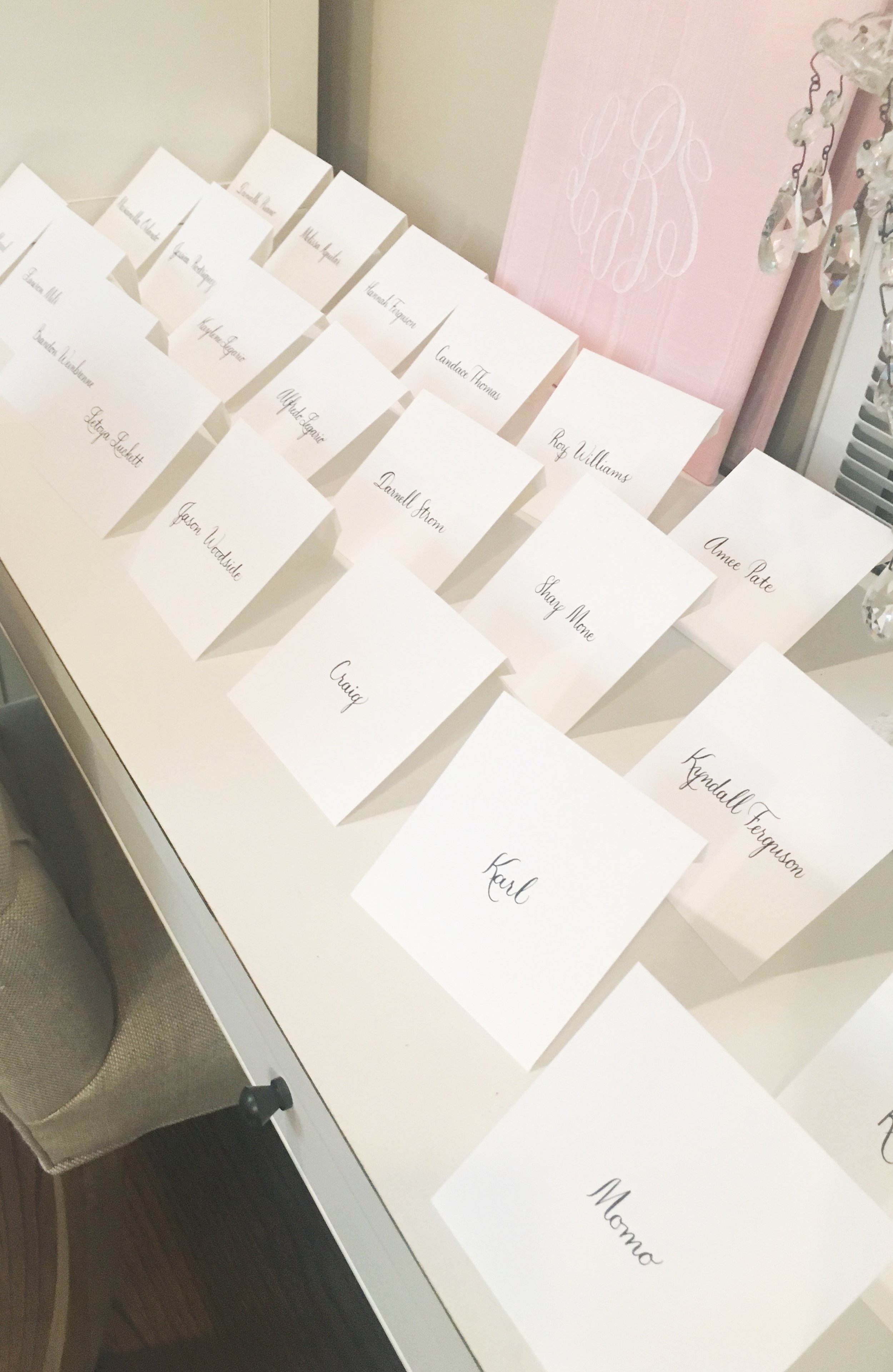
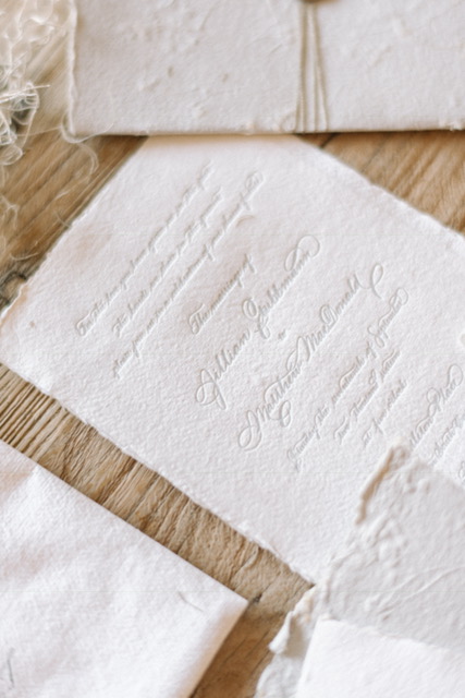
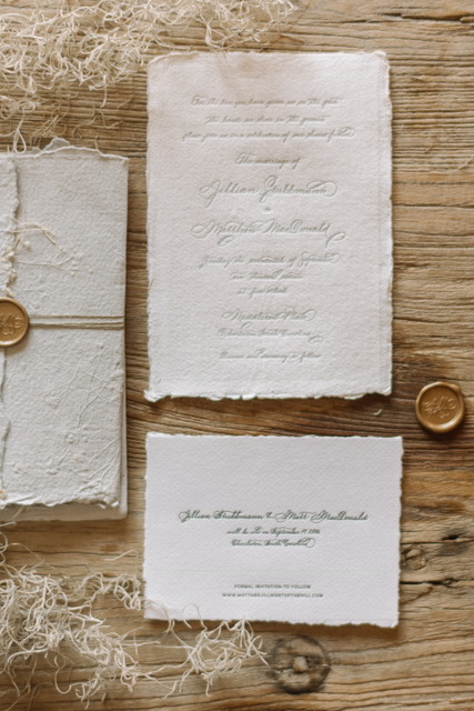
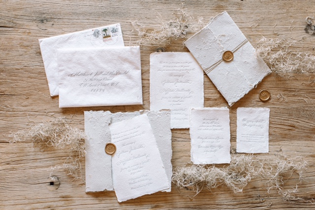
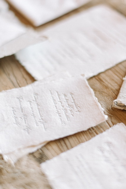
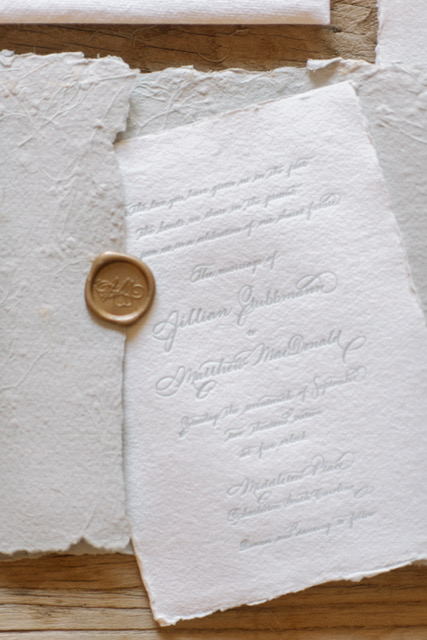
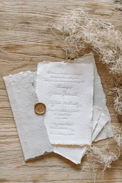
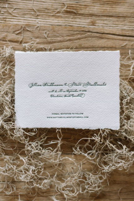
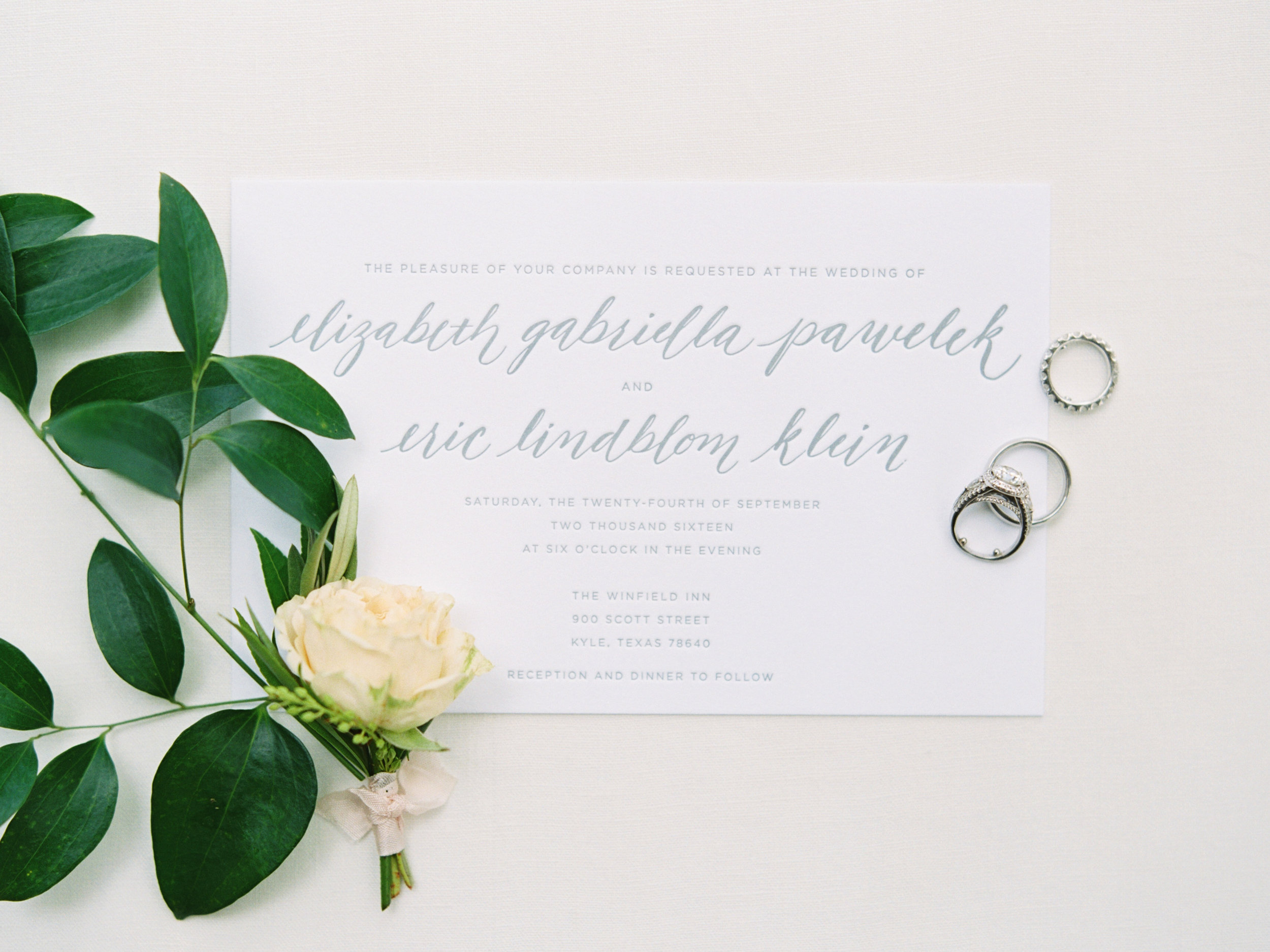
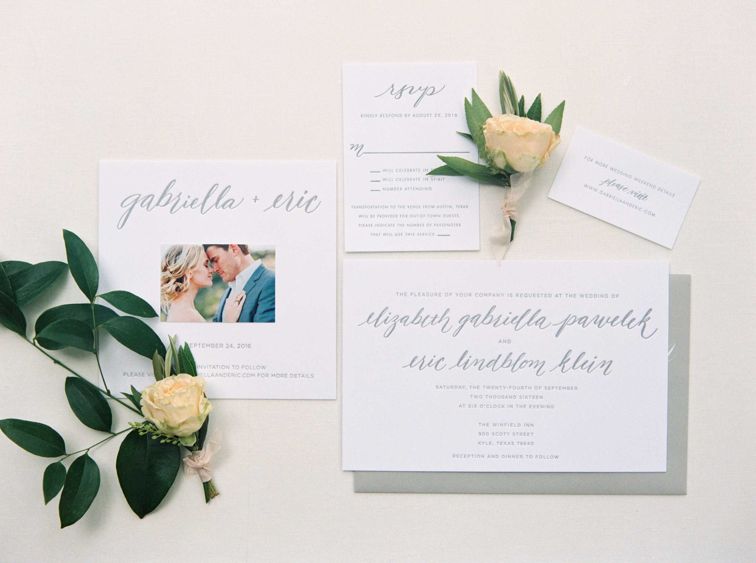
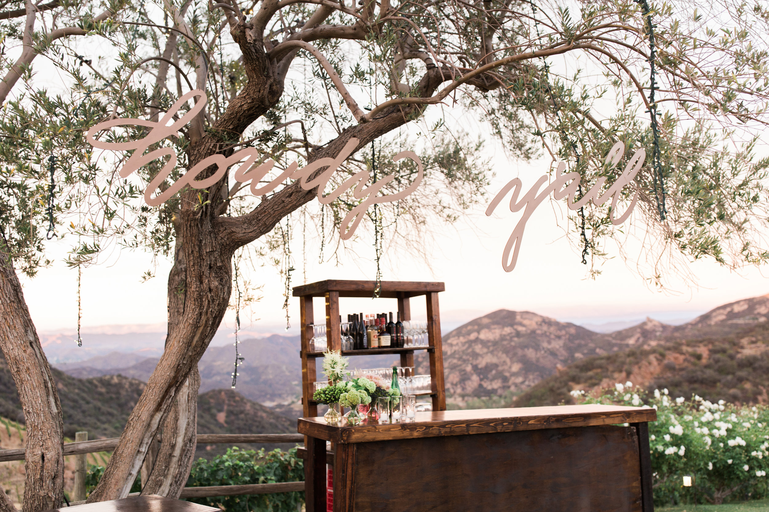
If you have received correspondence from me, you have received it with a wax seal executed by my hand.  Period...end of story.  For me, a letter that leaves my desk without a wax seal is incomplete.  I'm vintage when it comes to correspondence.  There is something about melting the wax and using my custom made seal with my initials or business information that just puts correspondence over the top.  

With that said, I understand that many people want a similar look without the added steps of melting wax and having decent aim to ensure that your seal is in the right position.  Then, of course, there is the likelihood of a few drops of wax falling in unintended places on the envelope or letter.  For me, that (mistakes & all) is part of the charm and shows the recipient that you took the time to do this specifically for them by hand.  However, not everyone shares that view.  

Enter stage left: custom self-adhesive wax seals from WaxSeals.com

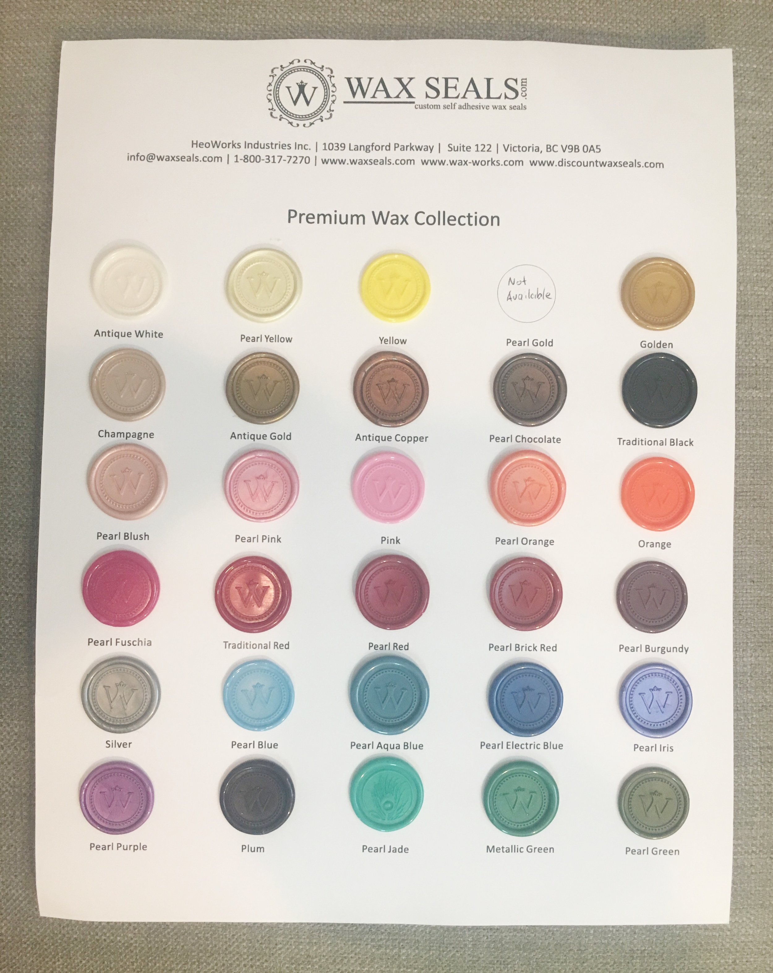
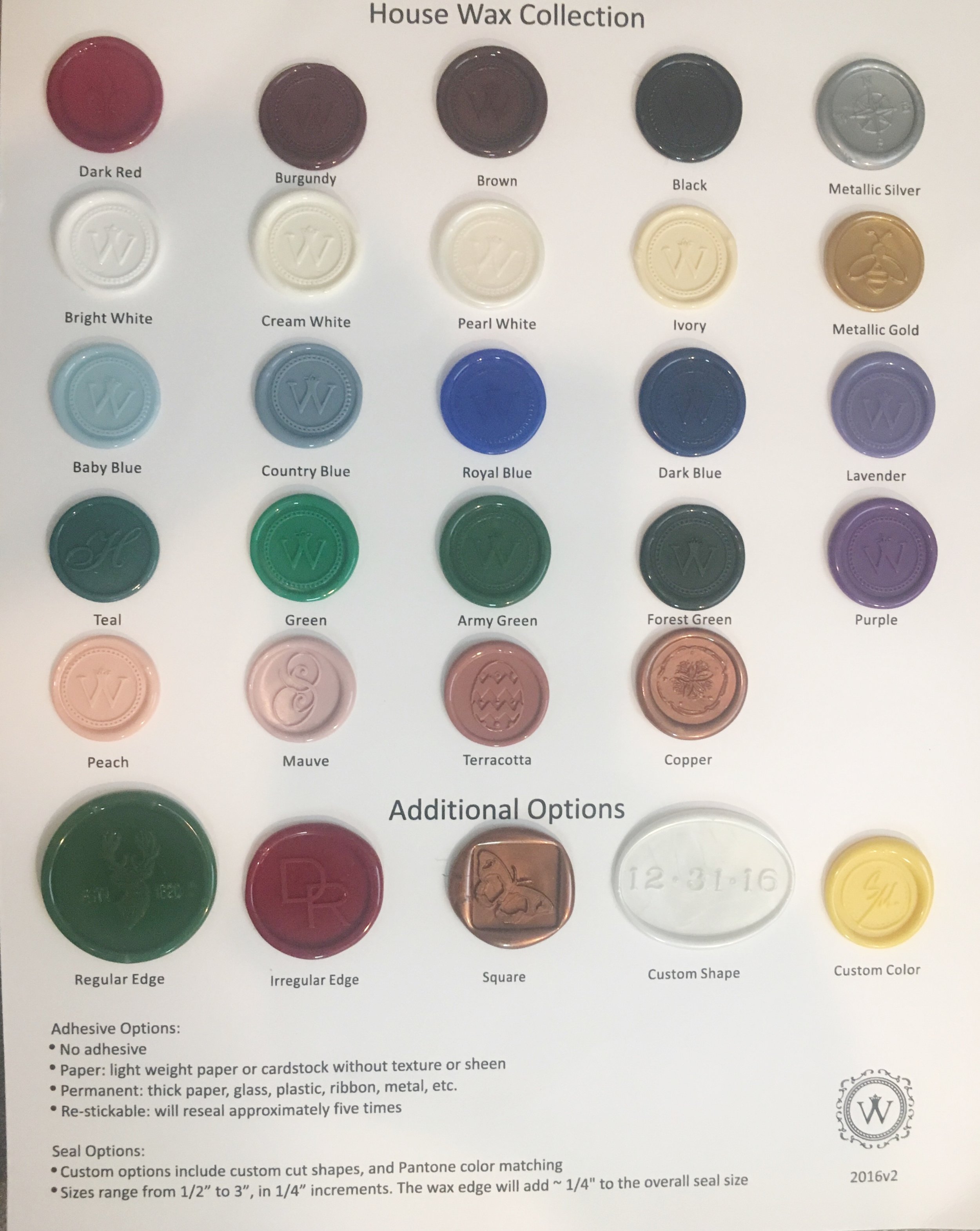
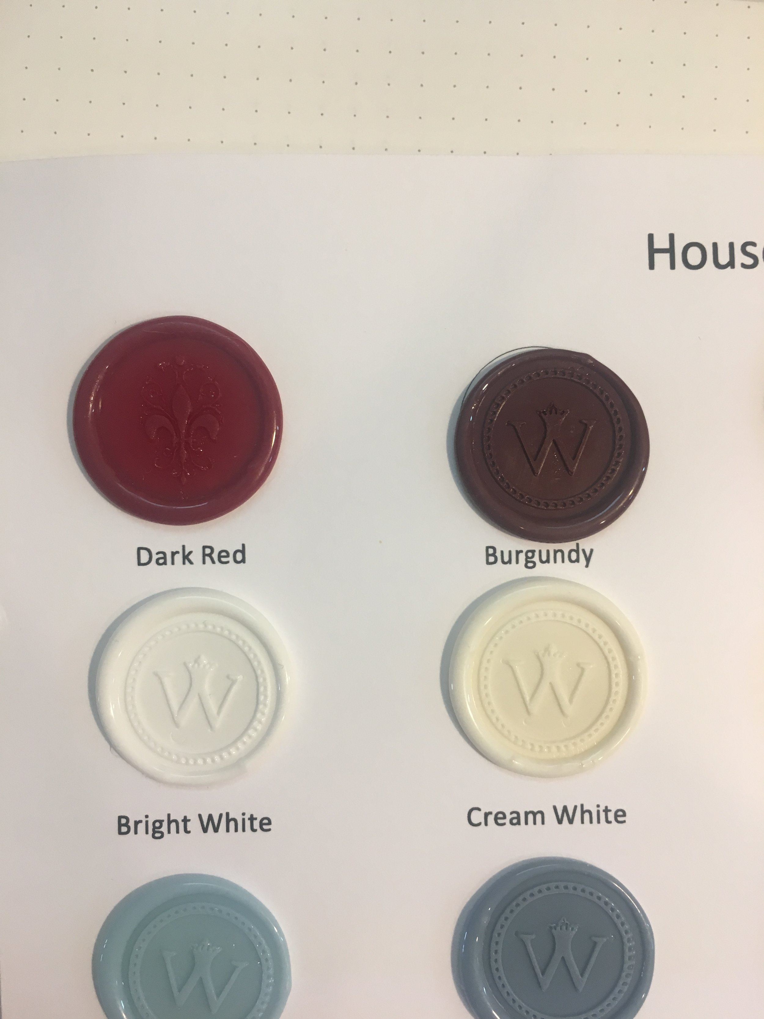
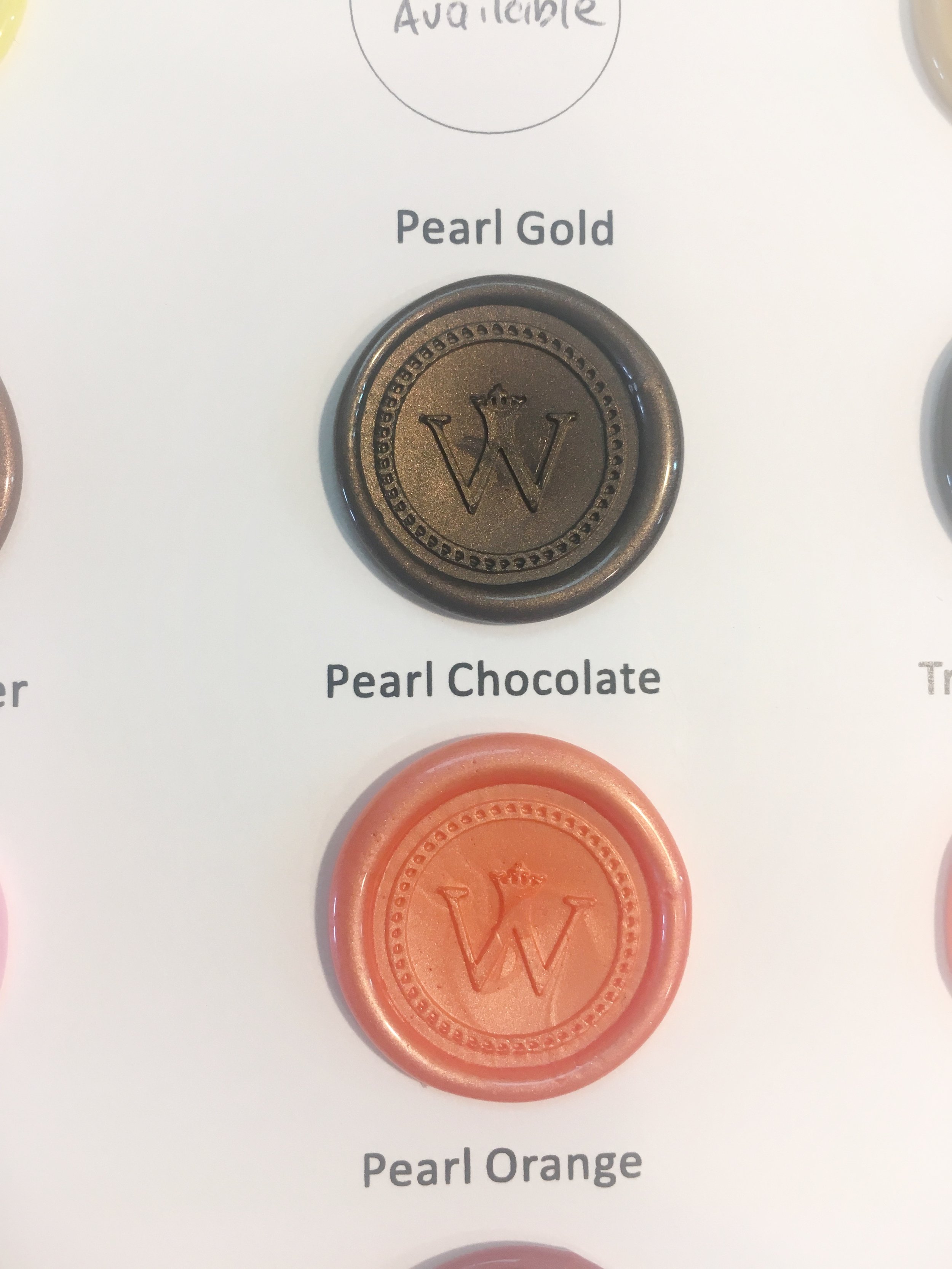
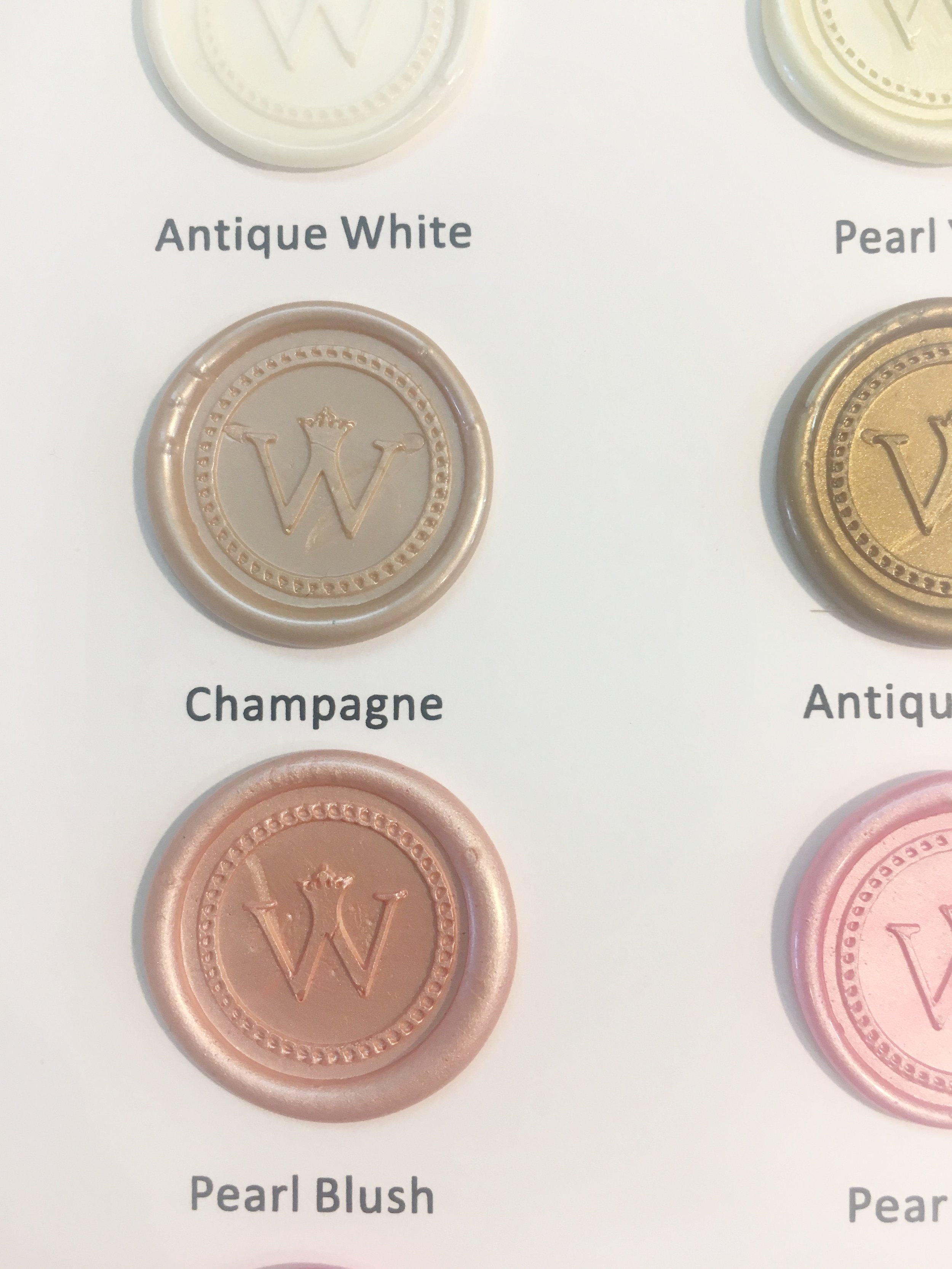
On my first observation, I see that they have SO MANY BEAUTIFUL COLORS.  My favorites were the champagne, pearl chocolate (Seriously? YES), pearl burgundy, pearl blush, dark red, burgundy, and mauve.  Yes, I love earth tones in case you did't know.

So the first seals that I used were the custom copper 3/4" and the custom metallic gold 1" (seen above).  They looked perfect, as expected.  The color was beautiful and they adhered very well.  

picture of what happens when you try to pull it back up.  So yes, it is ON THERE!  

picture of what happens when you try to pull it back up.  So yes, it is ON THERE!  

There were 2 samples of the metallic gold 1".  One that had adhesive and one that did not.  This allows for the option to place your own adhesive if you desire.  

Without adhesive

Without adhesive

Then of course they have seals that "restick".  These are perfect for those that would like to have the option of taking a mulligan.  So of course the 10 year old in me thought "but does it really lift well and allow to you restick?"  Why yes. Yes, it does!  That was pretty cool, I thought.

So all in all, I think that if you are the person that wants to increase your chances of getting the right position with a wax seal the first time and you want for each one to look exactly the same, then the self-adhesive wax seals from WaxSeals.com are a great option.  

For me, however, my vintage soul demands creating wax seals in the vintage way.  Cheers!

Enter your email address:

Delivered by FeedBurner

Marc Jacobs Fragrance Engraving Event - Houston Engraver

In the spirit of immersing myself into Spanish, this will be the first of many blog posts where I write in both English & Spanish.  Wish me luck!

As always, it is a pleasure working with the Marc Jacobs fragrance team.  Often times, my events with them are quite busy which is wonderful!  Unfortunately, that often means that I forget to take pictures.  However, here is a picture of the very last bottle of the very last event that I did with them :).  Cheers!

Estoy aún aprendiendo español.  Favor de aceptar mis sinceras disculpas por errores.

Como siempre, es un placer trabajar con el equipo de Marc Jacobs para perfume.  A veces, mis eventos con ellos son ocupados.  Desafortunadamente, olvido sacar fotos.  Sin embargo, aquí es una foto desde el día último del evento último.  Estoy agradecida por su paciencia.  Muchísimas gracias!

Enter your email address:

Delivered by FeedBurner

Engraving Events - Houston Engraver

December was amazing!  Estaba muy ocupada!  I was insanely busy!  As of the last few years, I have made it a habit to close my Etsy shop from late November through December due to the busy engraving/calligraphy calendar outside of the Etsy shop.  It is truly an honor and a pleasure to engrave at events all around the city for fragrance companies and wine & spirit companies.  The last wine event that I worked for Kenwood wines at Spec's Midtown had an unexpected request.  There was a client that purchased bottles for her loved one, but also purchased a corkscrew to include as a gift.  Makes sense...  While I was engraving her bottles, she asked if I could engrave the corkscrew as well.  When it comes to these requests, I ALWAYS direct them to the company representative that is paying for me to be there.  At the end of the day, I want for all parties involved to be pleased...especially the party that is paying me :).  The representative said, "sure, why not?"  So to make a short story shorter, I engraved her metal corkscrew with the gentleman's last name as she watched.  Voila!  Cheers!

Enter your email address:

Delivered by FeedBurner

White Marble Tile Calligraphy - Houston Calligrapher

I had a client request these marble tiles with black ink which honestly surprised me as I ADORE working with colored inks like gold, champagne and rose gold.  But for this event, they were going for the monochromatic look.  I must say that black calligraphy ink on a white or creme background truly does evoke a classic feel.  Cheers!

Enter your email address:

Delivered by FeedBurner

Green Agate Stone Calligraphy - Houston Hand Lettering

Modern calligraphy isn't exactly where my heart lies but from time to time I am asked to execute a project using it.  No big deal, as it's IMMENSELY easier than traditional calligraphy which is why I suspect that it has become so popular in the last few years.  These were used in a photo shoot a few months ago.  I like the way that they turned out as the gold ink created a nice juxtaposition against the dark green stones.  Cheers!

Enter your email address:

Delivered by FeedBurner

Wood Reception Sign - Houston Calligraphy

This custom wood calligraphy sign was created for an event where my client wanted to honor a loved one that is no longer here for an upcoming event.  I thought that this was a beautiful sentiment.  This wood plank was roughly 11" x 14".    I had it stained and then I calligraphed it.  Staining and such isn't really my department.  Trust me, you want it that way :).  

Ever feel like "this is missing something".  That's how I felt after I finished with the calligraphy.  I walked away from it to work on another job.  Then I came back and decided to add a little illustration for a little "something more".  My client loved it as she was only expecting calligraphy, but she was quite pleased with result which in turn made me pleased as well.  Cheers!

Enter your email address:

Delivered by FeedBurner

New Years Eve Feature in IBB at Home

It's always so great when you see work that you executed months prior used in a feature with a publication.  Here, a drink menu that I calligraphed on marble tile was featured in IBB at Home and The Everyday Hostess.  Check out the links: Everyday Hostess & page 52 of IBB at Home  Cheers!

Enter your email address:

Delivered by FeedBurner

Wedding Calligraphy - Houston Calligrapher

So in a matter of weeks, I have had a number of clients send photography of my work from the last few wedding suites that I calligraphed.  These came out beautifully on this gorgeous handmade paper.  Enjoy!

Vendor Love: 

Cotton Paperie: Letterpress

Sean Money & Elizabeth Fay Photography


Enter your email address:

Delivered by FeedBurner

Montblanc Writing Instruments Event - Houston Calligraphy

It was my pleasure to calligraph notes for clients of Montblanc last night.  This picture provides a view of a few of the envelopes for the personalized holiday notes within.  It was a wonderful time and as always a pleasure working with the Montblanc Houston team.  

Enter your email address:

Delivered by FeedBurner

Modern Calligraphy - Houston Calligraphy

As my focus moved this year from weddings to corporate event calligraphy work, it's been a whirlwind to say the least.  However a few weeks ago, a bride that I worked with near the end of last year (and part of this year) was kind enough to send pictures from her wedding of my work.  As most artists that work in events know, it is not frequent that you see the end product of your calligraphy work...in one place...all together.  You may have completed your portion, shipped it/scanned it and moved on to the next 3 projects that were waiting on you that same day just hoping to keep your head above water :).  So this was a bit of a delight.  Take a peek.  Cheers!

Vendor Love:  Photography by Michelle Boyd

Enter your email address:

Delivered by FeedBurner

Howdy Y'all Lasercut Calligraphy Sign - Houston Calligraphy

A few months ago, my services were retained to create a large laser cut sign (each word was roughly 2' tall & 5' long) that said "Howdy Y'all" in modern brush calligraphy.  It doesn't sound like a big deal and honestly I didn't see it as a big deal either.....until I had to load it into the back of my vehicle...pack it .....& ship it to Los Angeles, CA.  Yes, so it was a big deal :).  It was really groovy to see the end result.  I think that it came out nicely.  Cheers!


Vendor Love

Photographer: Vis Photography

Planner and Designer: Bliss Productions

Florist: Marks Gardens 

Rentals: A1 Rental Connection

Tableware: Casa De Perrin

Linens: Luxe Linens

Howdy Sign: Slinging Ink™ Calligraphy

Enter your email address:

Delivered by FeedBurner

LCI Luxury Paper Review - Houston Calligrapher

It's no secret that I am particular about my paper.  Honestly, any respectable calligrapher will shout the same from the rooftops.  I love writing on "anything but paper", but I obviously use paper for correspondence, etc ALL of the time.  So when I do use paper, it has to be of a certain level especially when used with pointed pen.  The nemesis of a pointed pen calligrapher/penman is paper that snags or bleeds/feathers.  These are bad signs, I tell you!

In that spirit, I was contacted by LCI paper company as they are launching a line of papers that are expected to fall on the luxury end.   I was actually supplied with LCI paper during my first year in business for a wedding envelope job.  To be completely honest, it got the job done but it didn't rank high on my list of preferred papers.  Fellow penman & calligraphers know exactly what I mean...  So when they contacted me last month, I was skeptical, but open to try it.  SO GLAD THAT I DID!  This is NOT the same paper from years ago....not by a long shot.  Want to hear my thoughts blow by blow?  Here we go:

DISCLAIMER:  I am providing these pictures with mistakes and all as I want for you to see where I experienced snags etc and also, I didn't have an abundance of papers to provide multiple chances for "perfect work".  So check out the "human" side of penmanship :)  Also, the pictures have received minimal to no editing to ensure that you can see the reality of what happened with the paper.
MATERIALS: So my background is in Microbiology (crazy, I know) and I worked in that field for a decade.  With that said, the scientist in me felt that it would make sense to ensure that the only "variable" with testing the LCI paper should be the paper.  I used a tried and true ink and nib--- a fresh Tachikawa G nib and Moon Palace Sumi ink.  The nib is a hybrid of Nikko G and Zebra G providing moderate tine flex with great hairlines.   Moon Palace Sumi ink is the gold standard for production work etc.  Plus, sumi ink is heavier than most inks & used by calligraphers around the world for envelopes, commission works etc.

Let's cover my pleasant surprises first.

Gmund Colors Felt Paper - Let me just skip to the point....I LOVE THIS PAPER!  This paper has a texture to it.  Yes, I know.  Pointed pen calligraphers and penman prefer minimally textured paper.  But let me tell you that this textured paper was a DREAM to write on.  The version that I tested was the "cover weight".  I seriously want some of this in the studio moving forward.  So after I got over the fact that the texture was beautiful, I was pleasantly surprised to learn that my nib just glided across this paper.  Seriously, I want more of this paper.  I tried to take pictures where you could see the texture.  Not an easy feat.  Look at the word "smooth" in the 2nd picture to see the lined texture.  ADORE this paper!!!

Gmund Colors Felt - ADORE THIS PAPER!!!

Gmund Colors Felt - ADORE THIS PAPER!!!

Gmund Colors Metallic Paper - So let's just rip off the bandaid.  I don't care to calligraph on metallic paper.  I'm not alone.  Peruse through the online portfolios of calligraphers and I assure you that the calligraphers that post their work, rarely if ever do so on metallic paper.  I can only think of 1 or 2 calligraphers that have.  Why you ask?  When compared to traditional, cotton based paper, there is no comparison.  The hairlines and even the shades look cleaner.  When it comes to metallics, calligraphers are often asked to use metallic, acrylic ink (relatively waterproof) and maybe you can get away with sumi...maybe.   So what better test than to use Moon Palace Sumi on this metallic paper?  This metallic paper is (wait for it) the best metallic paper that I have written on.  And again, I don't typically care for metallic paper.  This one performs exceptionally well.  It yielded clean hairlines and the paper was so smooth that it didn't snag and the shades were pretty clean as well.  Take a look:

Gmund Colors Metallic - To date, best metallic paper I've written on...Hands down.

Gmund Colors Metallic - To date, best metallic paper I've written on...Hands down.

Colors Matt Euro Flap Envelopes - Surprisingly, I really liked this envelope.  Remember that my first introduction to LCI was an envelope job years back.  These are very different.  Granted, I have my own stationery custom made, but in a pinch I would generally run to the local Paper Source for envelopes.  Paper Source envelopes are not the smoothest, but they are OK because I don't have to worry about bleeding, but they will snag without a doubt.  The LCI Euro Flap Envelope puts those to shame.  These are smooth....  I like these quite a bit.  (Please forgive my flourish mistakes  :()

Gmund Colors Transparent Vellum: I was introduced to tracing paper a few years ago and used it for work where I needed to replicate what I'd already done....exactly.... somewhere else.  Yeah, right...  And I'm a "vintage soul", so I have used Photoshop/Pixelmator, but it is not my strength and I reverted back to the vintage methods that have been used for centuries....tracing paper was my friend.   Then Michael Sull, Master Penman introduced me to vellum, tracing paper's sexier, yet more durable sister.  Sold!  So I love vellum and didn't realize that LCI made one.  They provided 2 weights: 30 lb and 54 lb card stock vellum.  ......And because I wanted to see how durable it was, enter sumi ink.  Well, my friends, the 30lb held up well.  Didn't wrinkle much or at all on the back side.  And of course I was curious to compare it as I am a die-hard Canson paper fan, so I pulled out my Canson vellum 55 lb.  Yes, the weights are different but that is what I had lying around the studio.  I like the LCI version, especially for that performance at the lower weight.  Canson is still my favorite, but the LCI is seriously solid.   

I also tried the LCI Vellum Card Stock (54 lb).  Definitely heavier if that is what you need and it performed exceptionally well.  

Yes, flourishing mistakes all around, but I wanted to see the comparison of the vellum....not bad.

Yes, flourishing mistakes all around, but I wanted to see the comparison of the vellum....not bad.

Gmund Colors Matt  -  The "text weight" honestly performed much better than I expected, especially at that weight.  I felt that it was solid.  Not luxurious, but solid.  I call it solid because it didn't bleed/feather or wrinkle upon placement of the heavier sumi ink.  This is not my 1st choice for paper, but I would not complain about it AT ALL.  It didn't become fibrous upon ink placement at all.  It'll get the job done with pointed pen and heavy ink.  

LCI Gmund Colors: Text Weight

LCI Gmund Colors: Text Weight

Let's play with the other various weights within Gmund Colors.  The weights provided were 89, 111 and 130 lb.  My favorite out of these was actually the 89 lb.  I have found that you don't need an incredibly high weight of paper for great execution.  TO BE FAIR, most papers will have a possibility of snagging.  It's just part of it, but some will snag more than others.  I believe that for the money and having had the ability to compare performance between these 3 weights, I would put my money towards the 89 lb vs paying for the higher weights....UNLESS the client just wanted a stiffer, heavier feel to the paper. 

LCI GMund Colors 89 lb

LCI GMund Colors 89 lb

G Mund Colors 111 lb

G Mund Colors 111 lb

Gmund 130 lb

Gmund 130 lb

In summary,  LCI dipped their toes into the higher end of stationery.  I found some pleasant surprises with the metallics, Euro flap envelopes and felt papers.  Honestly, I'm crazy about the felt paper!!!  The vellum was definitely solid (although I still have a preference for Canson) and Gmund colors were good, but I would put my money towards the 89 lb over the others for my needs.  Well, that's it.  Cheers and happy writing!

Enter your email address:

Delivered by FeedBurner

'Tis the Season for Kenwood Wine Bottle Engraving by Hand - Houston Engraver

Hello Wine Lovers!  It's that time of year again!!!  I will have the immense pleasure of engraving for Kenwood Wines this month.  So far, I have engraved calligraphy in wine bottles for this company at Randall's grocery stores in the Houston area and they have been well-received.  

So if you know anything about my style of penmanship, you know that I have a preference for derivatives of Spencerian style script.  It's rare that I will go with a Copperplate....usually when I desire a change of pace.  I'll either go with Copperplate or go to an upright script Copperplate.  I digress...  

So this bottle was for a client that wanted to get an early start on Christmas bottles for friends and family.  Hope she liked it!!!!  

I look forward to seeing you at the next few Kenwood events (Dec 9-11).  Click here for the event calendar and locations.  Cheers and have a groovy day!

Enter your email address:

Delivered by FeedBurner

Slinging Ink® of Bella Grafia Calligraphy is a Houston Based calligraphy firm that was established on the idea that sometimes the vintage way of creating art is the best. Handwritten calligraphy is the most elegant form of communication and an event focused on the art of others deserves nothing less.  As a Houston calligrapher & engraver, I believe in doing it beautifully or not at all.


Slinging Ink®  Calligraphy & Engraving of Bella Grafia, LLC retains all rights to the content of this web site, as well as all calligraphy and engraving artwork we produce on behalf of our clients. Our artwork and designs may only be used for each specific job we created them for. The client, stationer, graphic designer photographer, and printer agree that our artwork will not be copied, re-engineered, re-purposed, edited to create derivative works, resold, reprinted, given away or re-used in any way that would violate our copyright.  Photographs of our artwork are to include artwork credit to Slinging Ink® - Bella Grafia, LLC.

CITE YOUR SOURCES, Darling. © 2023 Bella Grafia, LLC. All Rights Reserved | SEO by WPamplify