In the last blog post, I referenced how 98% of what I do is probably the same as it was done in the 1800's. However, I do embrace technology when it doesn't compromise the integrity of what is the basis of calligraphy. With that said when it comes to wedding invitation suite design, Pixelmator is my savior as it saves me from having to recreate every stroke exactly the way that I may have previously created it on every single line of the design.
Here, I am integrating a name design change per request of my client. She wanted subtle changes in the names. If I were to completely rewrite the entire invitation to accommodate this, it would be just short of a nightmare as I would need to create everything else exactly the way that I did on the version that she liked. Technology makes this task a dream instead of a nightmare. Technology, I embrace thee.
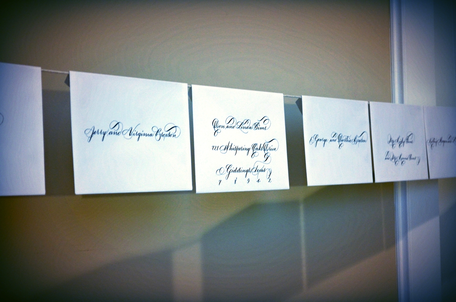
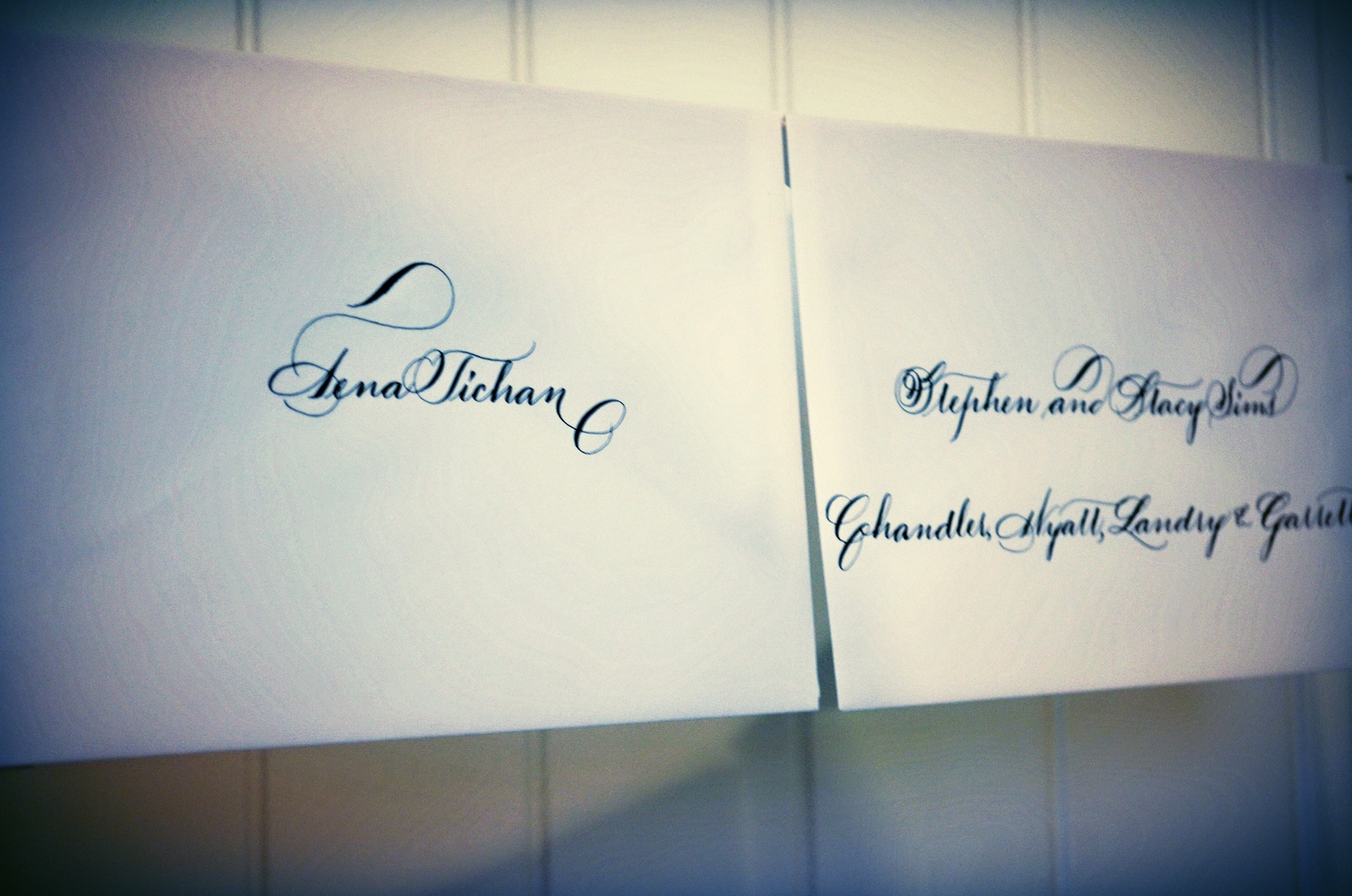
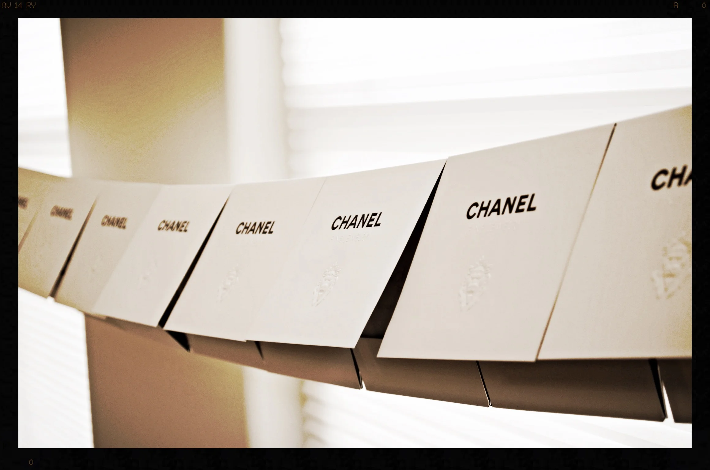
If you follow my work at all, you know that my studio is very 1800's for the majority of my work. Meaning, that I take the vintage approach to most of the work that I execute. I have found that hanging my envelope jobs to dry on what is similar to a clothesline allows for 1. easy comparison from one envelope to the other, 2. places them high above my 3 year old, Lola and obviously 3. by the time I complete the line, the earlier ones placed are dry.
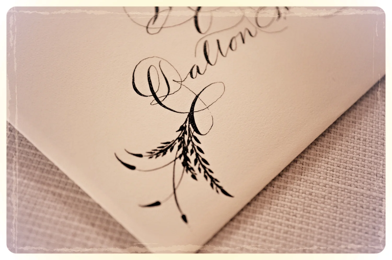
This bride opted for Ornate Roundhand in black ink. It's funny because I don't use black extensively for wedding projects except for pieces that are going for reproduction (menus, invitation/save the date designs etc). However as I was working on this job, I was reminded of how simply classic black ink is. Simplicity is absolutely beautiful and should not be overlooked. Peace & Love!
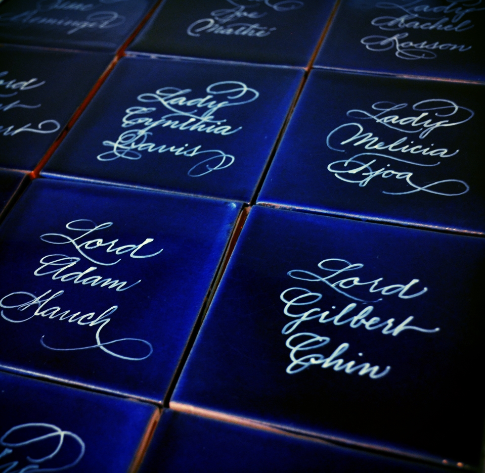
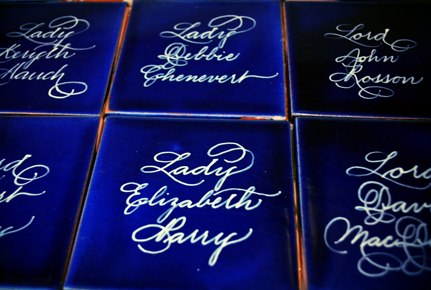
This client is clearly a lover of Downton Abbey....but who doesn't just love the Dowager. These will make for great place cards for the event and keepsakes for the guests. Brilliant!
Every time I hand out my business card, I am asked "This is beautiful. Where did you have this made?' My business card exhibits my design work set in letterpress by my favorite letterpress designer. With that in mind, I decided to team up with her to offer invitations, save the dates and menus.
Every blue moon I am asked to mail physical samples of my work to clients. For this client, it is a treat as she has requested a few of my favorite styles to execute. Off to the mail these will go!
I love this style. If you follow my work at all, you know that I love contrast and this style exudes what you don't expect to see. It's uncentered, the names are on slightly staggered levels & there are different writing forms even within one person's name. (What was I thinking?) But I love it. I Dare your computer to produce that. :)
Since it is temperamental, I decided to call it Elis after one of my favorite musical artists.
These signs (8"x10") will prove to be timeless pieces for your reception & memoirs for your special day. They are stained in either a medium brown or black and hand lettered in white ink. Timeless!
This was created for a couple to use for their Save the Date. They wanted to incorporate a cartouche and a blush of ice blue which will coincide with the bridesmaid dress. I love it. This will go to their stationer in a high resolution digital file for print. Voila!
I love duograms (basically a monogram for 2 people) as they make wonderful accents for your reception and your new home together. The size shown is 11'' in height in silver. Larger/smaller sizes & different colors are available.
Who doesn't love gold ink on purple paper? So pretty. I don't get many requests for modern calligraphy and it isn't necessarily my "go to" as I tend to be a little more on the classic side of calligraphy, but it is indeed fun to execute.
So the vast majority of my work is split between corporate events and weddings. It was quite a treat to be approached for this project of documenting a family recipe. For the 90th birthday of this family's treasured grandmother, someone had the wonderful idea of having her "famous Pecan Pie" documented with calligraphy. I absolutely love it!
Engraving wine bottles for gifts is one of my favorite things to do. This one is just right for the new year. I tried to provide a close-up on this one. If you look at the name, you can get a feel for the depth of the engraving. Very groovy! Cheers!
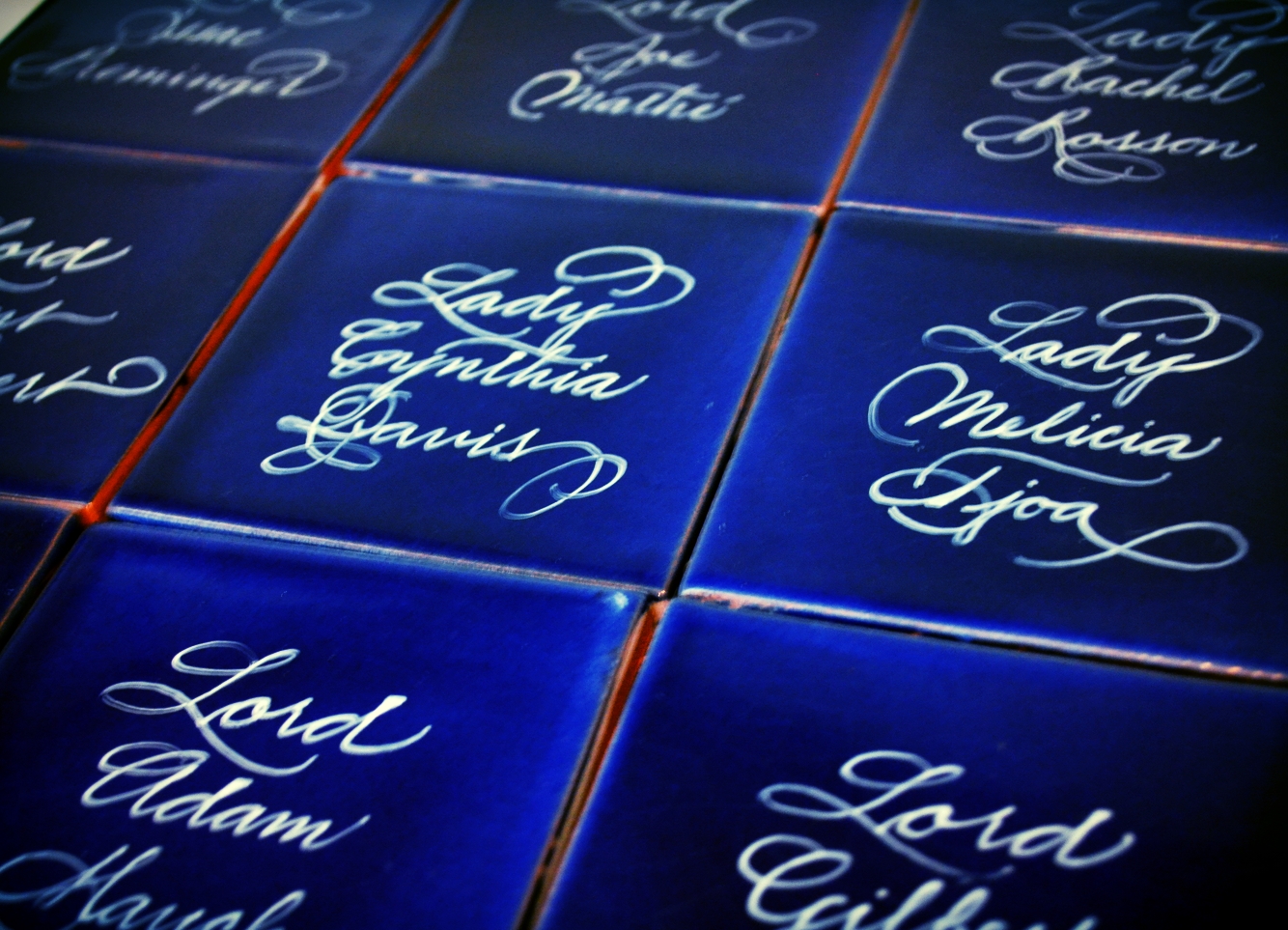
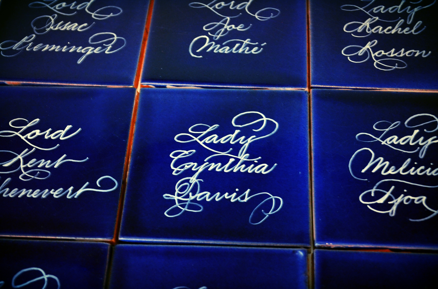
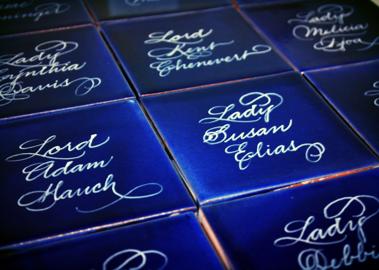
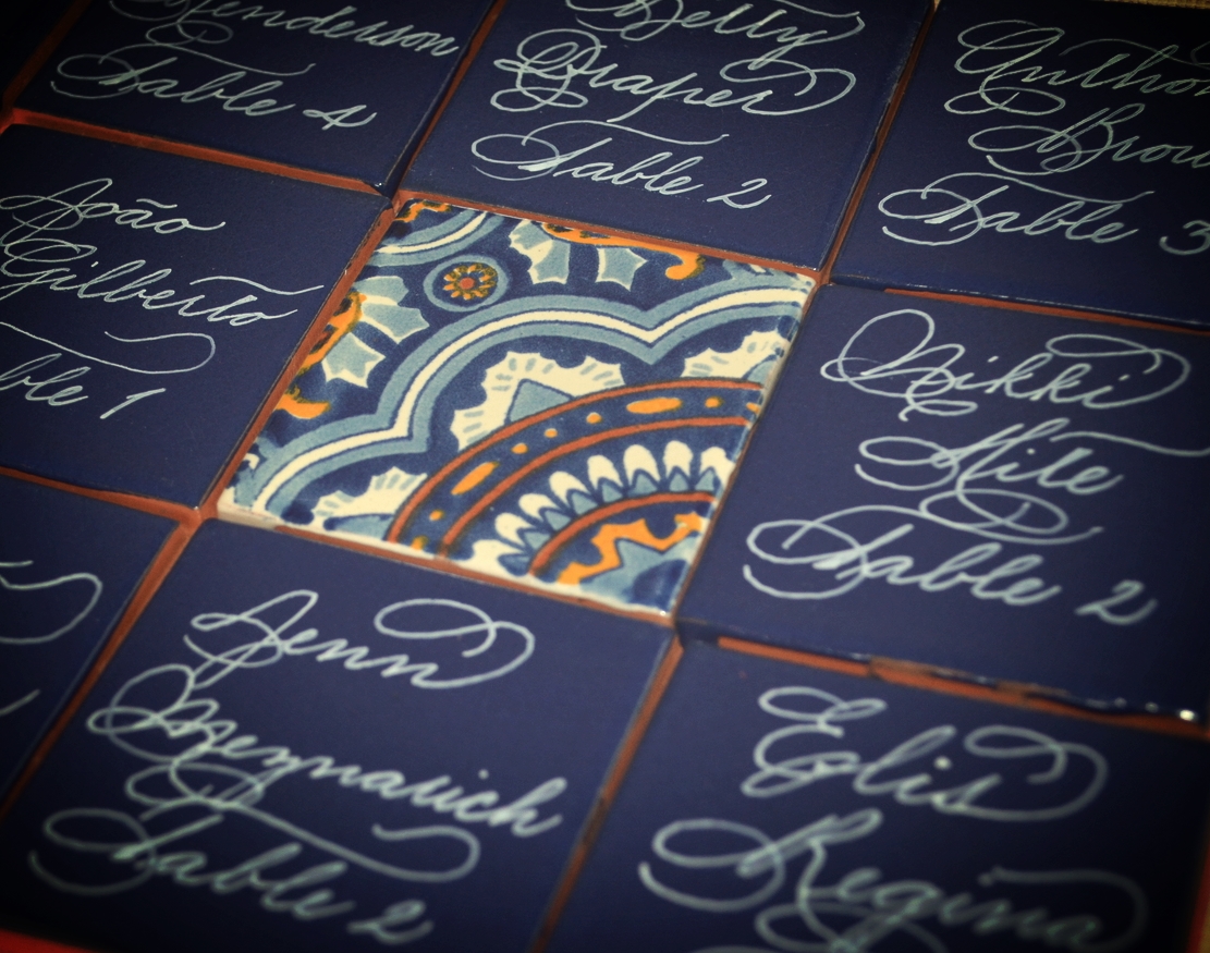
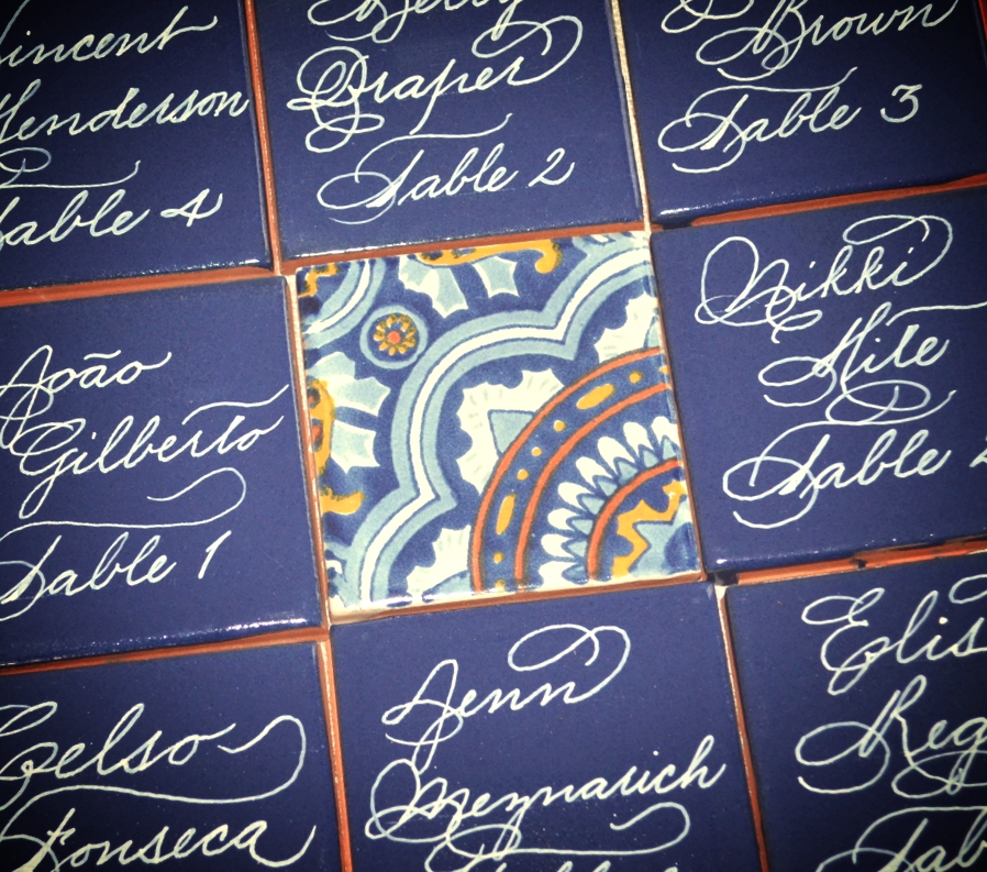
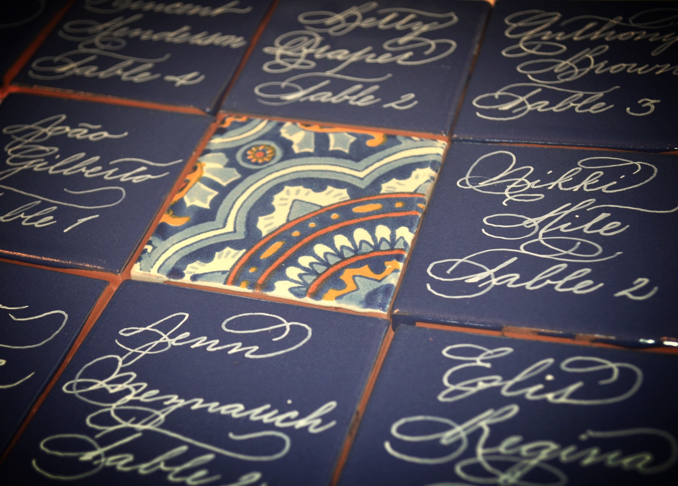
These gorgeous Andaluz tiles serve as a great place card or escort card to provide an option that is different from the norm for your guests. I absolutely love these right now!
Mirror seating charts & menus are SO GORGEOUS!!! I just love creating these as they make an event over the top by just being there.
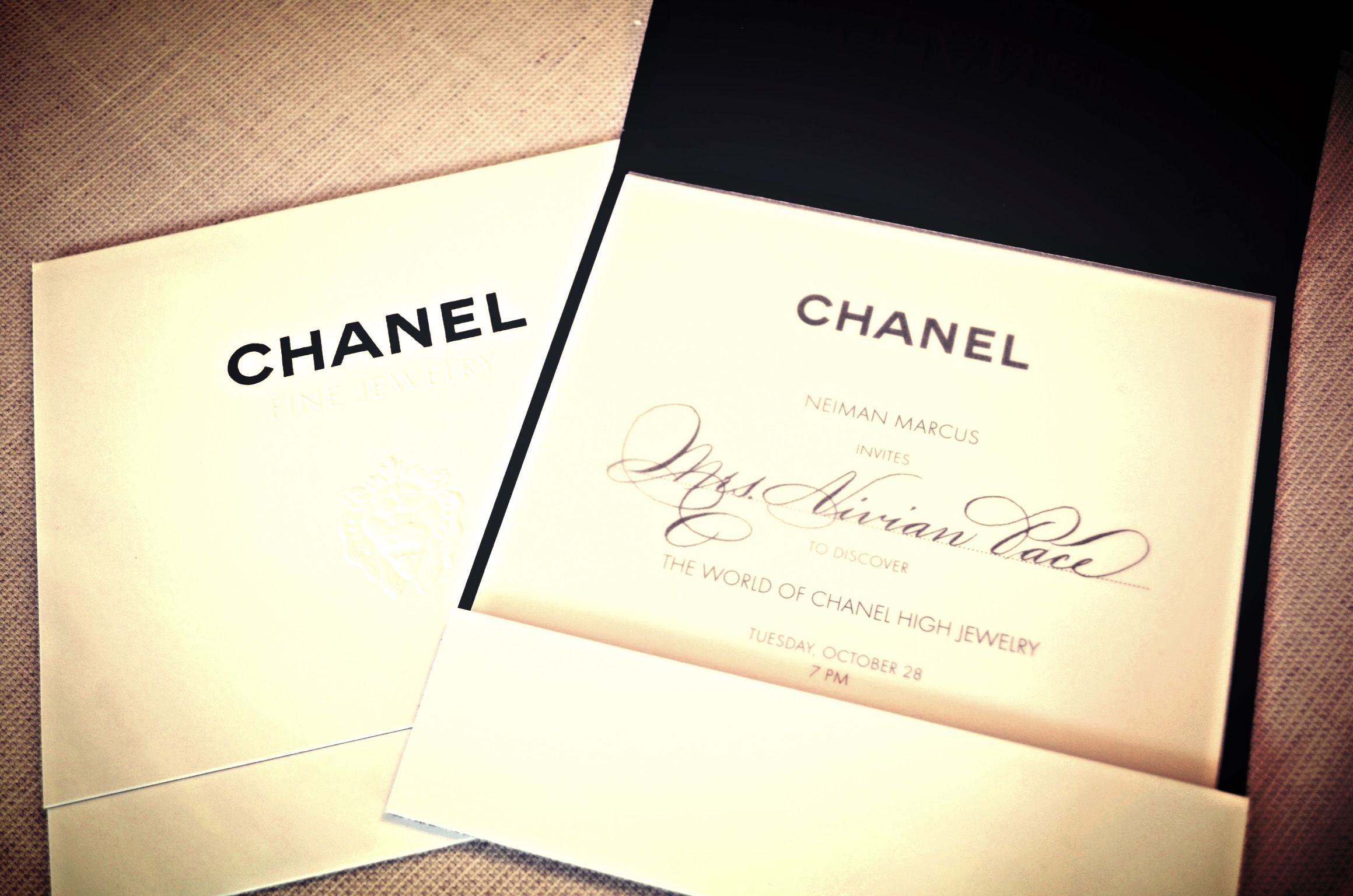
It was such a pleasure and a privilege being invited to work with Neiman Marcus and Chanel for this event. I must say that it was pretty awesome to look over and see those iconic invitations as they dried from my calligraphy. And of course, the paper was none other than Crane & Co.
I absolutely love white ink on gray paper. Love love love it. SO when one of my corporate clients from NYC needed place cards, I was happy to oblige her on my favorite colors.
SO I absolutely ADORE using white ink on black or gray paper. This ensemble for an upcoming wedding just made me swoon. The couple also chose black paper that exhibits a shimmer. It is stunning in person. Take a look at the process. You can even catch my graphite lines while they were hanging to dry before I erased them. SSSHHH!!! Don't tell anyone:)
These message in a bottle place cards are great for weddings as they make for a wonderful keepsake for your guests. These only require about a 1-2 week turnaround and can be completed in various writing styles. Love these!
I have decided to start offering Spanish Tiles as escort cards. These are great for destination weddings and look gorgeous and cool in person. With over 20 choices for designs, the tiles can match just about any color scheme. I just ADORE these!
I LOVE making cartouches as an accent to a word or name. They really add to the piece and tell the reader that this was definitely created by hand.


