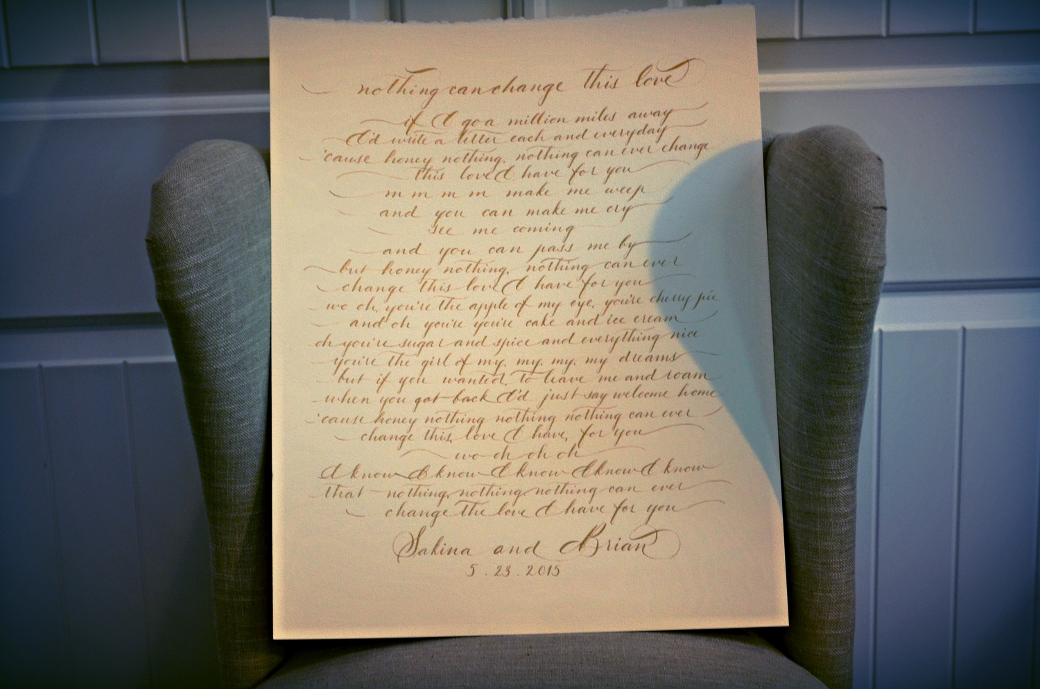
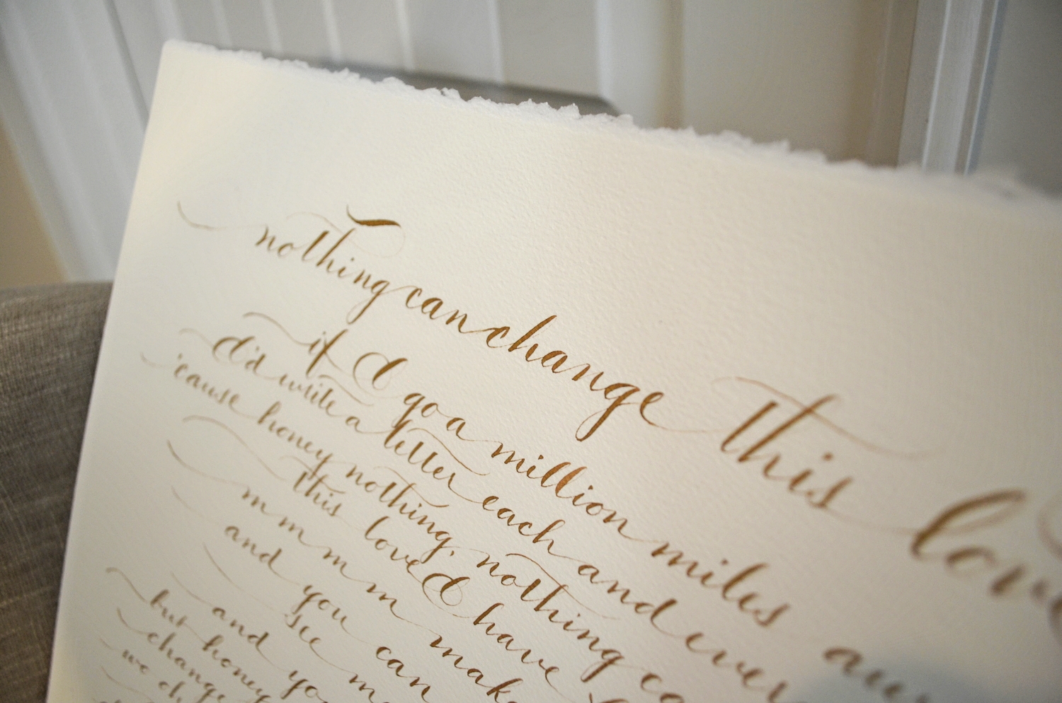
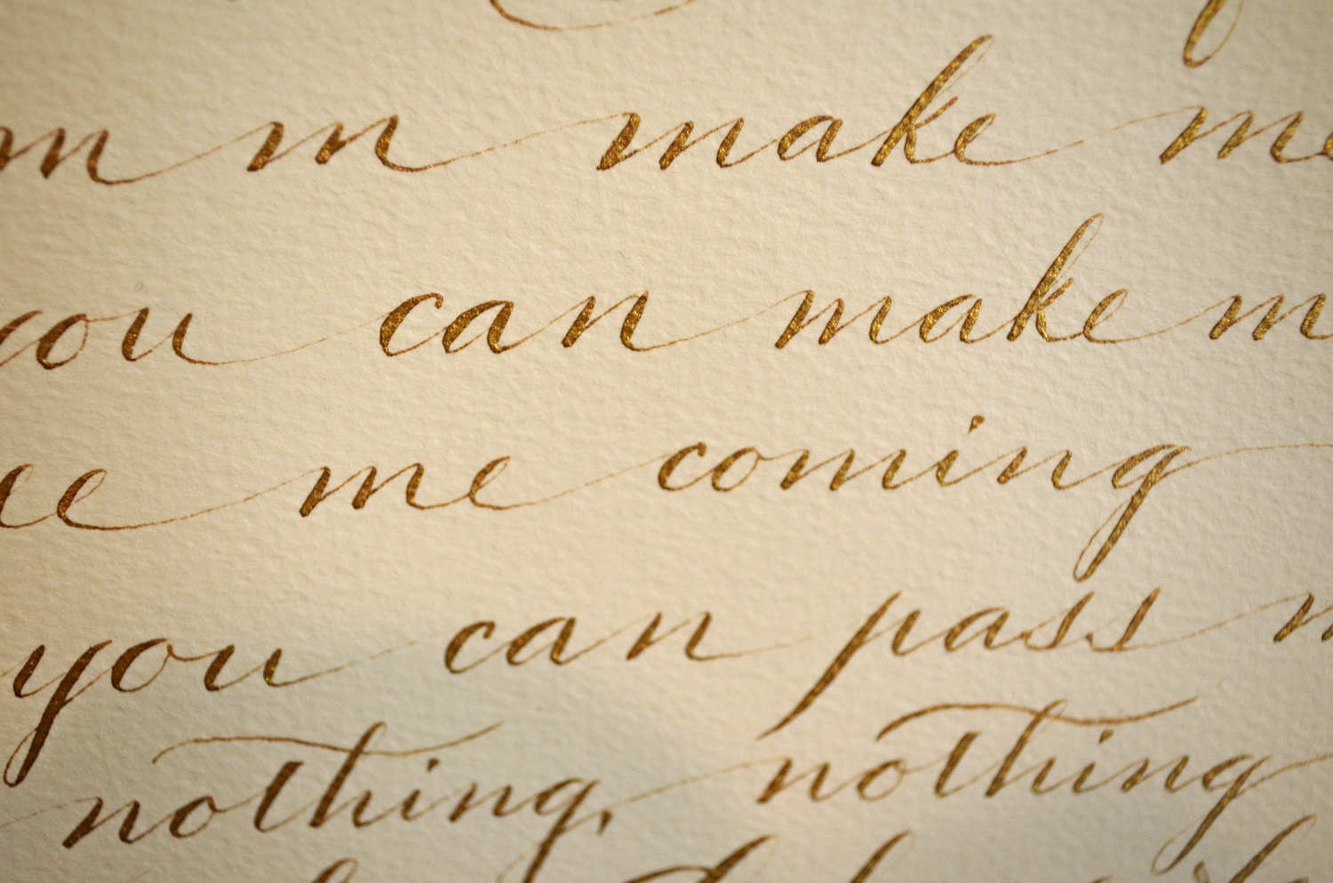
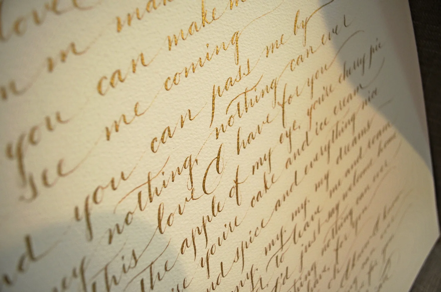
This piece was commissioned by a bride in Dallas, TX. These are the song lyrics to what will be the "first dance" at her wedding. We did something similar to the "just relax" hand as every word is connected in lowercase. We went with copperplate gold ink on ecru paper that is deckled at the top and has a slightly textured surface. Even with the texture, it calligraphed like a dream with a Zebra G nib. This is not my "go-to" nib by any stretch of the imagination, however it is like that old faithful, workhorse that you can use even when you are unsure of the "work conditions". It performs well on surfaces that I wouldn't dare use one of my treasured vintage nibs on.
I only wish that I could have found paper suitable for pointed pen that was deckled on all sides in smaller sheets....the next calligraphy materials hunt shall commence.
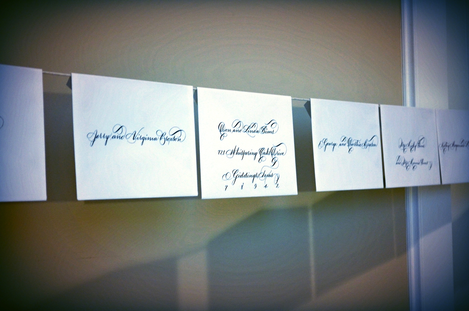
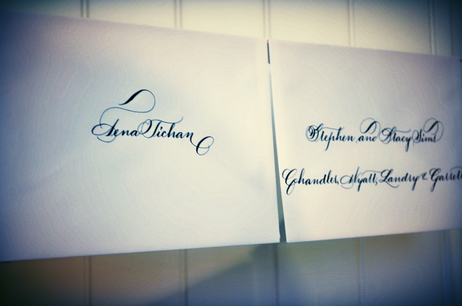
If you follow my work at all, you know that my studio is very 1800's for the majority of my work. Meaning, that I take the vintage approach to most of the work that I execute. I have found that hanging my envelope jobs to dry on what is similar to a clothesline allows for 1. easy comparison from one envelope to the other, 2. places them high above my 3 year old, Lola and obviously 3. by the time I complete the line, the earlier ones placed are dry.
This bride opted for Ornate Roundhand in black ink. It's funny because I don't use black extensively for wedding projects except for pieces that are going for reproduction (menus, invitation/save the date designs etc). However as I was working on this job, I was reminded of how simply classic black ink is. Simplicity is absolutely beautiful and should not be overlooked. Peace & Love!
I'm loving the juxtaposition of block lettering with Spencerian/Ornamental Penmanship right now.
