This year has really been my "anything but paper" year with my work. These laser cut wood names were created for a client out of St. Louis for an event. I think that these came out nicely as she will be using them as placecards. Cheers!
#houstoncalligrapher #houstoncalligraphy #weddings
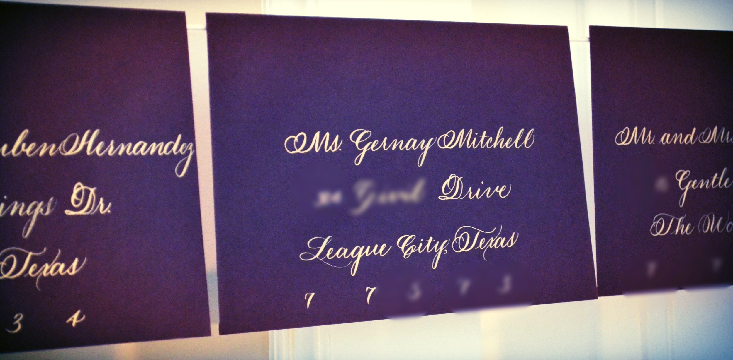
So this project was for a Houston bride that wanted something a little toned down from my norm. I can do toned down.... We went with copperplate in gold ink on eggplant paper. Copperplate is definitely that hand that separates the wheat from the chaff. You can't really hide behind fancy capitals and flourishes when a client wants copperplate without many flourishes. Similar with wine, I have had an evolution with calligraphy. With regard to pointed pen, I started out with traditional copperplate, became enticed by Spencerian with all of its sexy flourishes and semi-angular serifs and then looked back at copperplate as if it was the "old boyfriend that was so 5 years ago". However, I now know that copperplate should be respected for what it is. My first dynamic calligraphy teacher referred to it as "the mother". And that is exactly what it is. It is beautiful in its simplicity and you can't hide with it. If you are good, copperplate will show that. If you are not, copperplate will show that. In all honesty, when I have a day where I jump between 4-5 hands because I'm working on 4-5 jobs at the same time that require different hands, copperplate is the one that demands respect and I must acknowledge that in my warm-up. Always the constant student :). Cheers!
Addresses have been obscured for privacy.

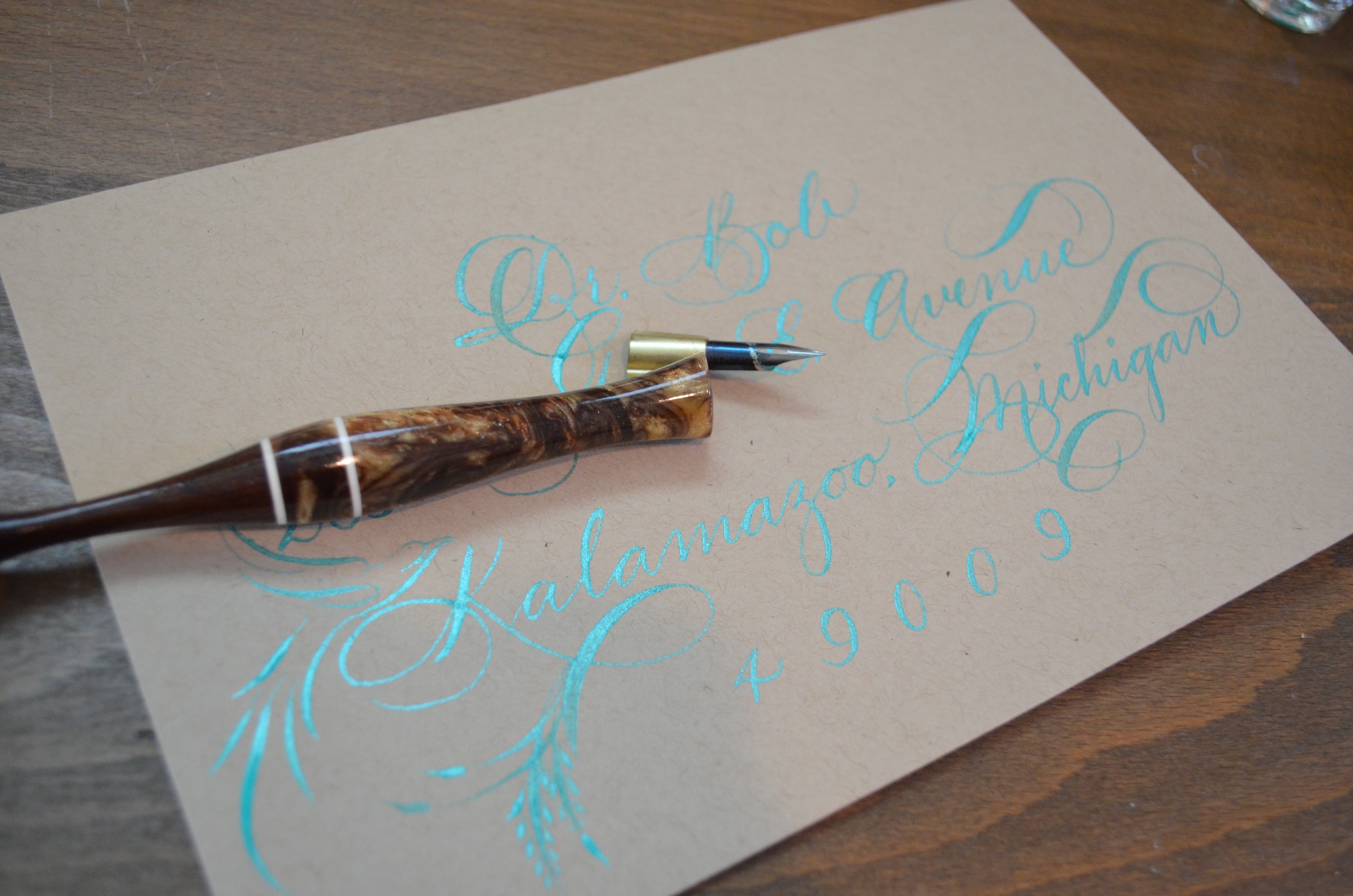
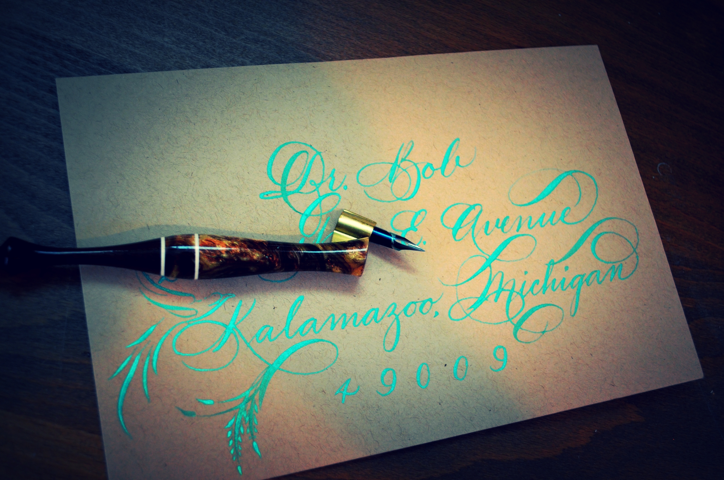
So yes, clearly I had become ridiculously behind on my thank you notes. When I was at the penman's conference (yes, we have those), I met a gentleman that was kind enough to promise to mail me engraving burs that I had yet to try. Within a few weeks of being home, they arrived. My work schedule was insane to say the least and I sent an email to convey thanks just so that I didn't seem like a complete savage. However, I take my stationery very seriously and committed to send a proper thank you note when the work schedule slowed down a bit. Here it 'tis.
Played around with the lighting a bit to make it show up better on camera. However, iridescent jade is clearly one of those colors that looks better in person than it photographs. Who knew? :) Here we go! Cheers!


