Slinging Ink® Calligraphy & Engraving

Calligrapher for Team USA - 2016 Rio Olympics

Houston calligrapher and wine bottle engraver

Modern Calligraphy - Houston Calligraphy

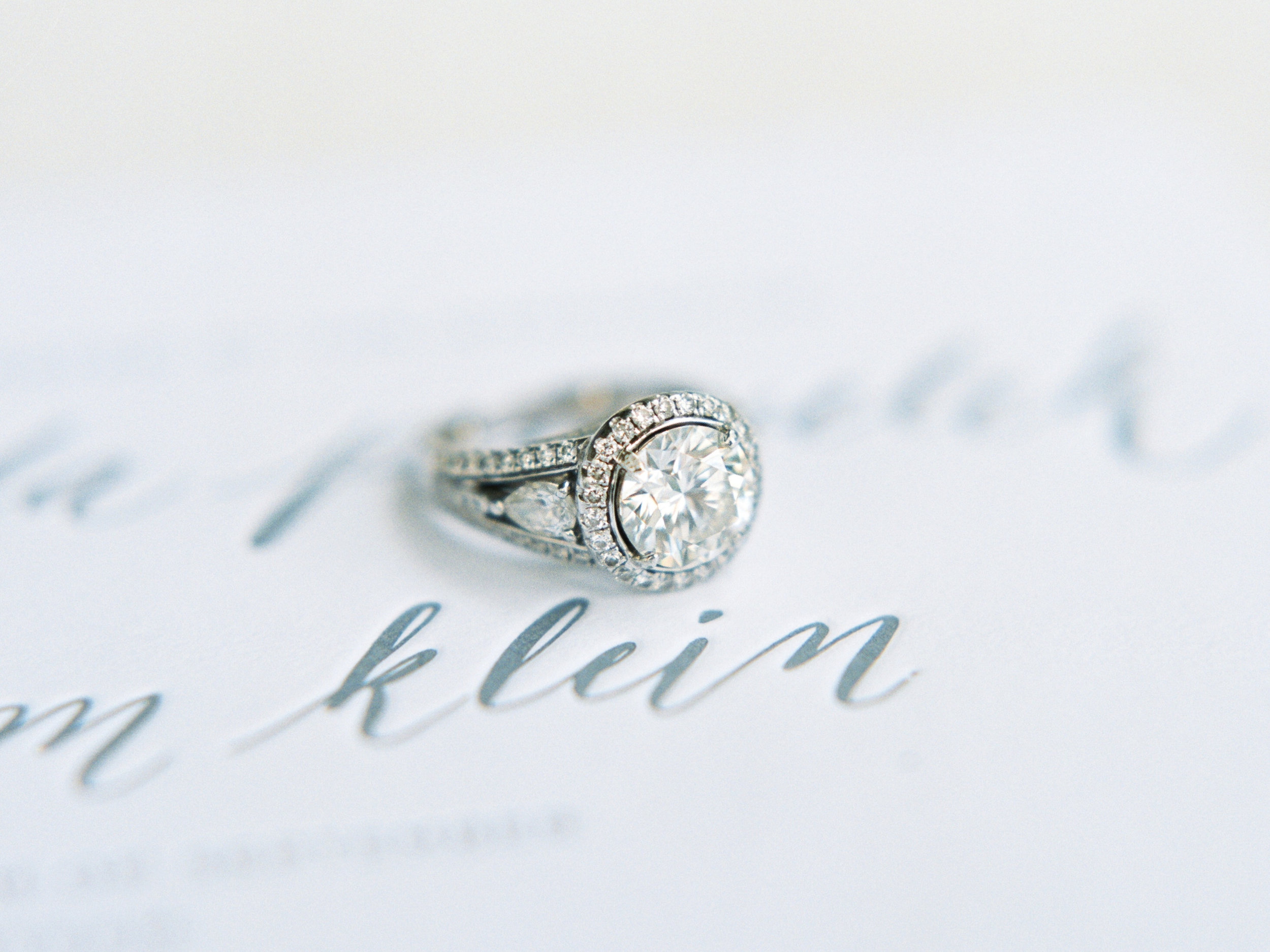
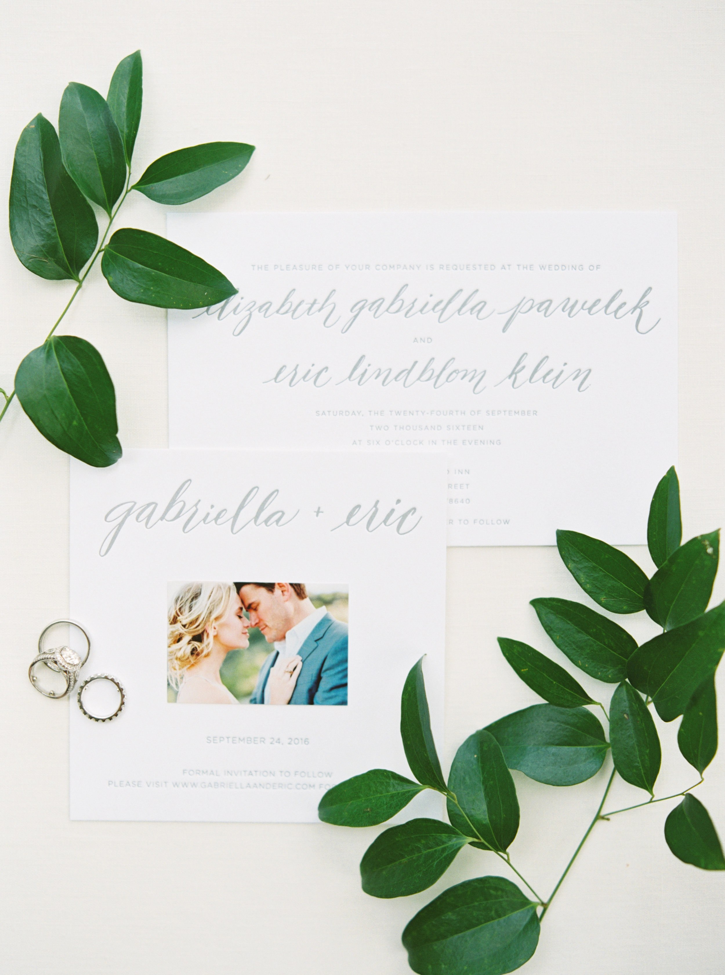
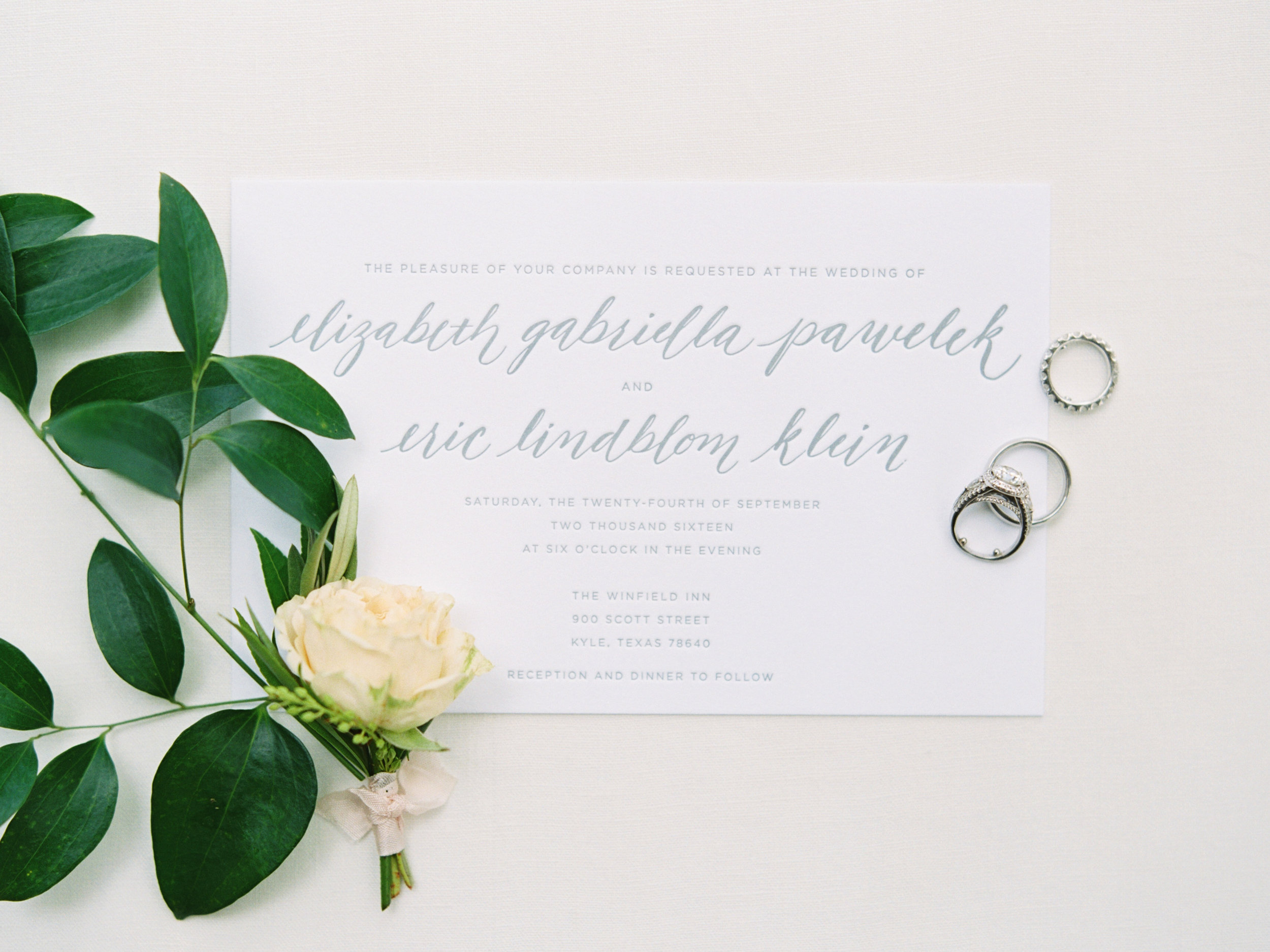
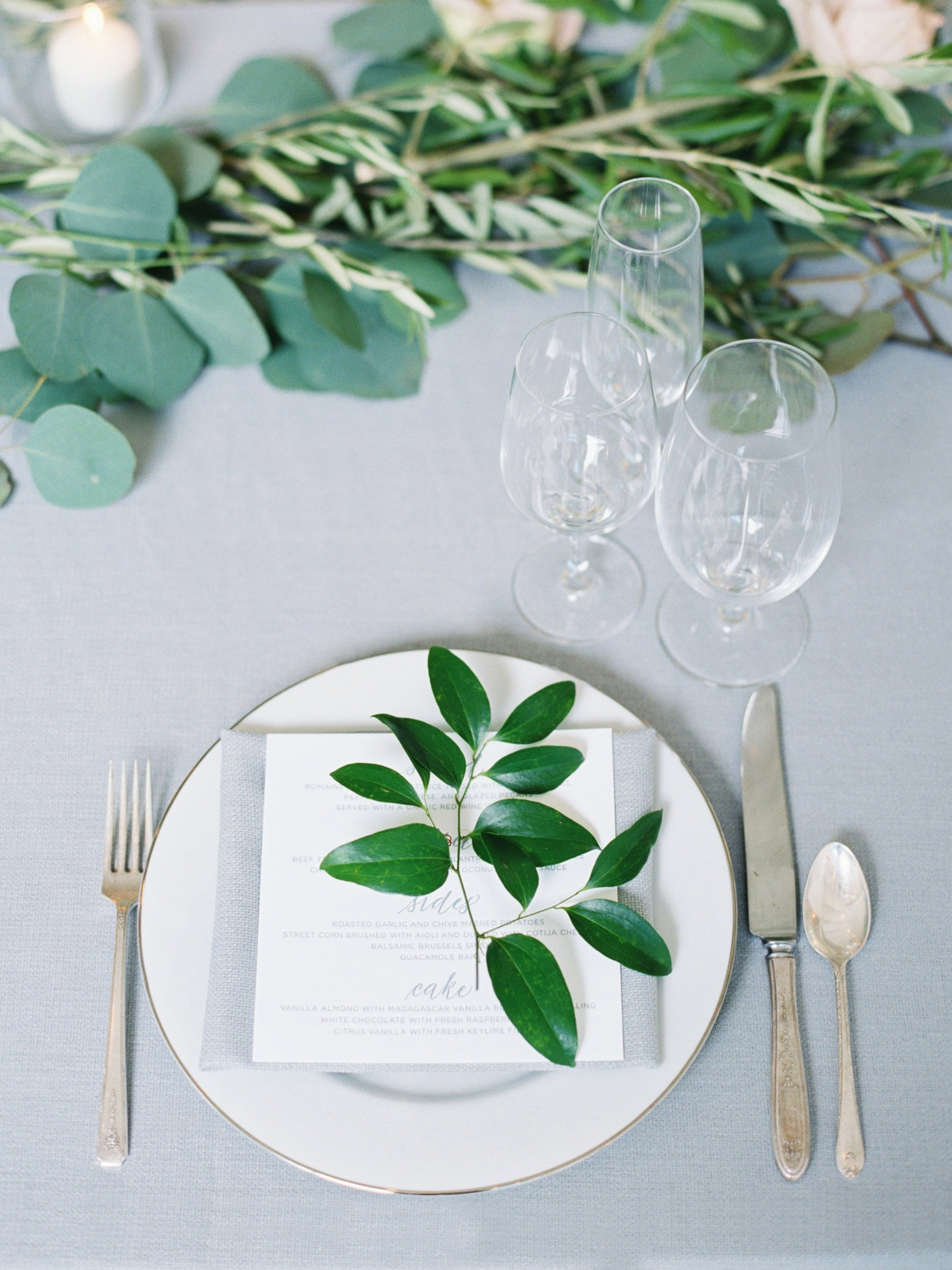
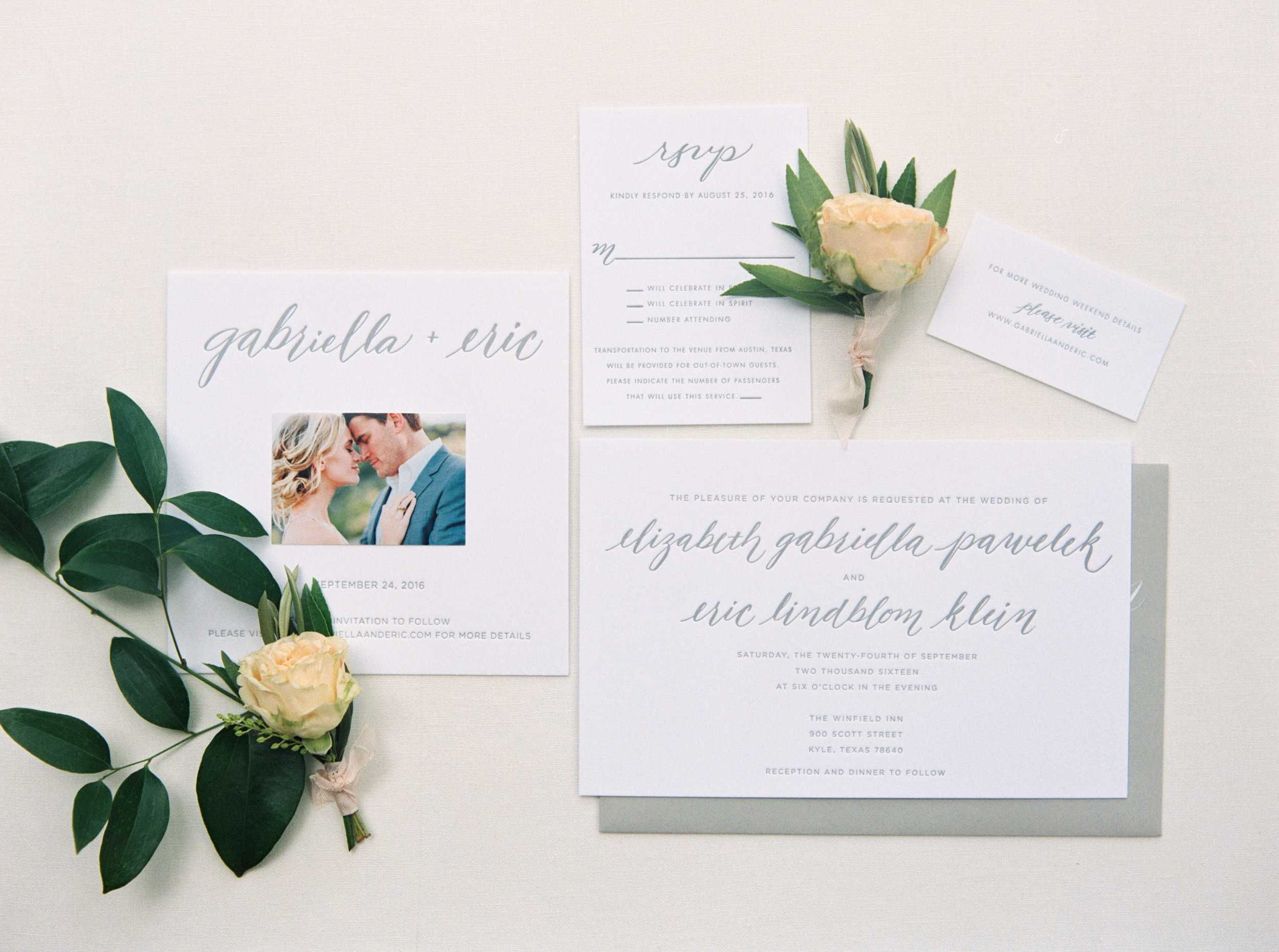
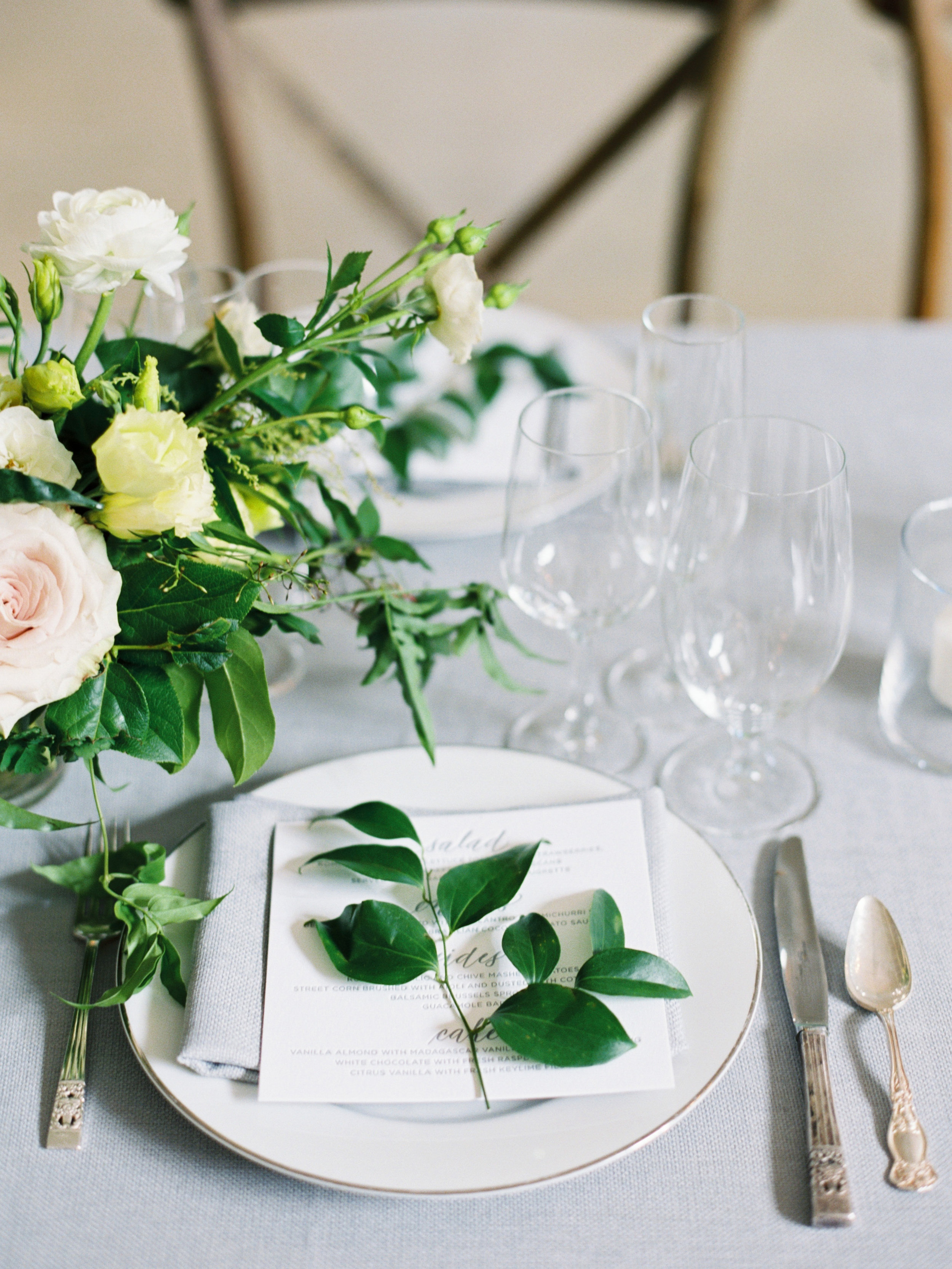
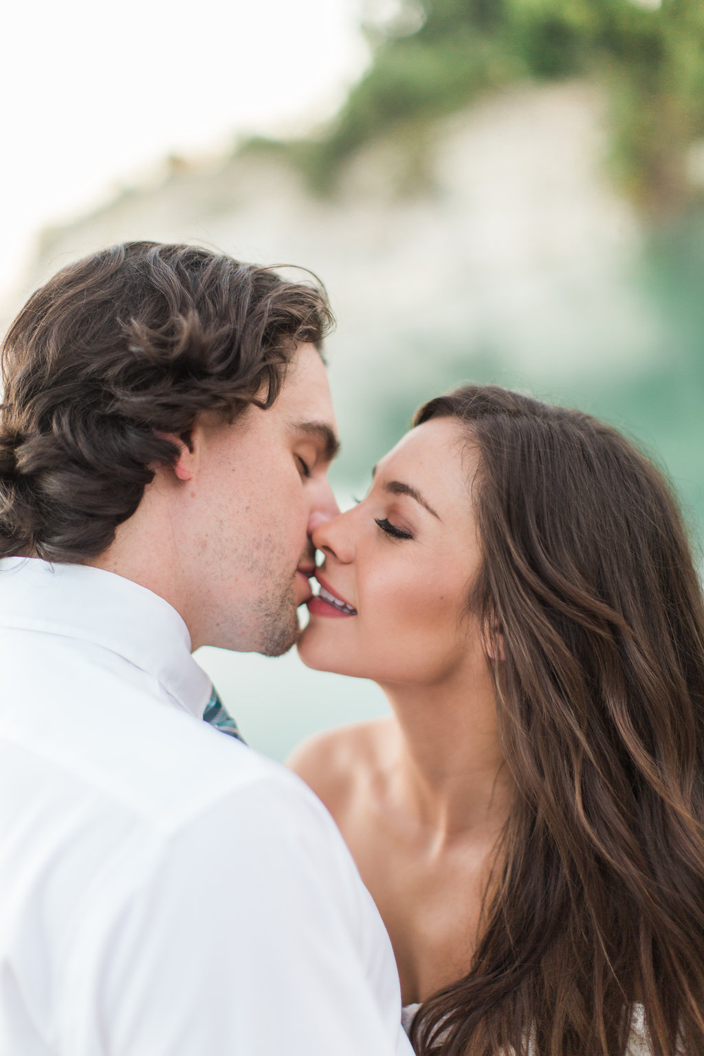
As my focus moved this year from weddings to corporate event calligraphy work, it's been a whirlwind to say the least.  However a few weeks ago, a bride that I worked with near the end of last year (and part of this year) was kind enough to send pictures from her wedding of my work.  As most artists that work in events know, it is not frequent that you see the end product of your calligraphy work...in one place...all together.  You may have completed your portion, shipped it/scanned it and moved on to the next 3 projects that were waiting on you that same day just hoping to keep your head above water :).  So this was a bit of a delight.  Take a peek.  Cheers!

Vendor Love:  Photography by Michelle Boyd

Enter your email address:

Delivered by FeedBurner

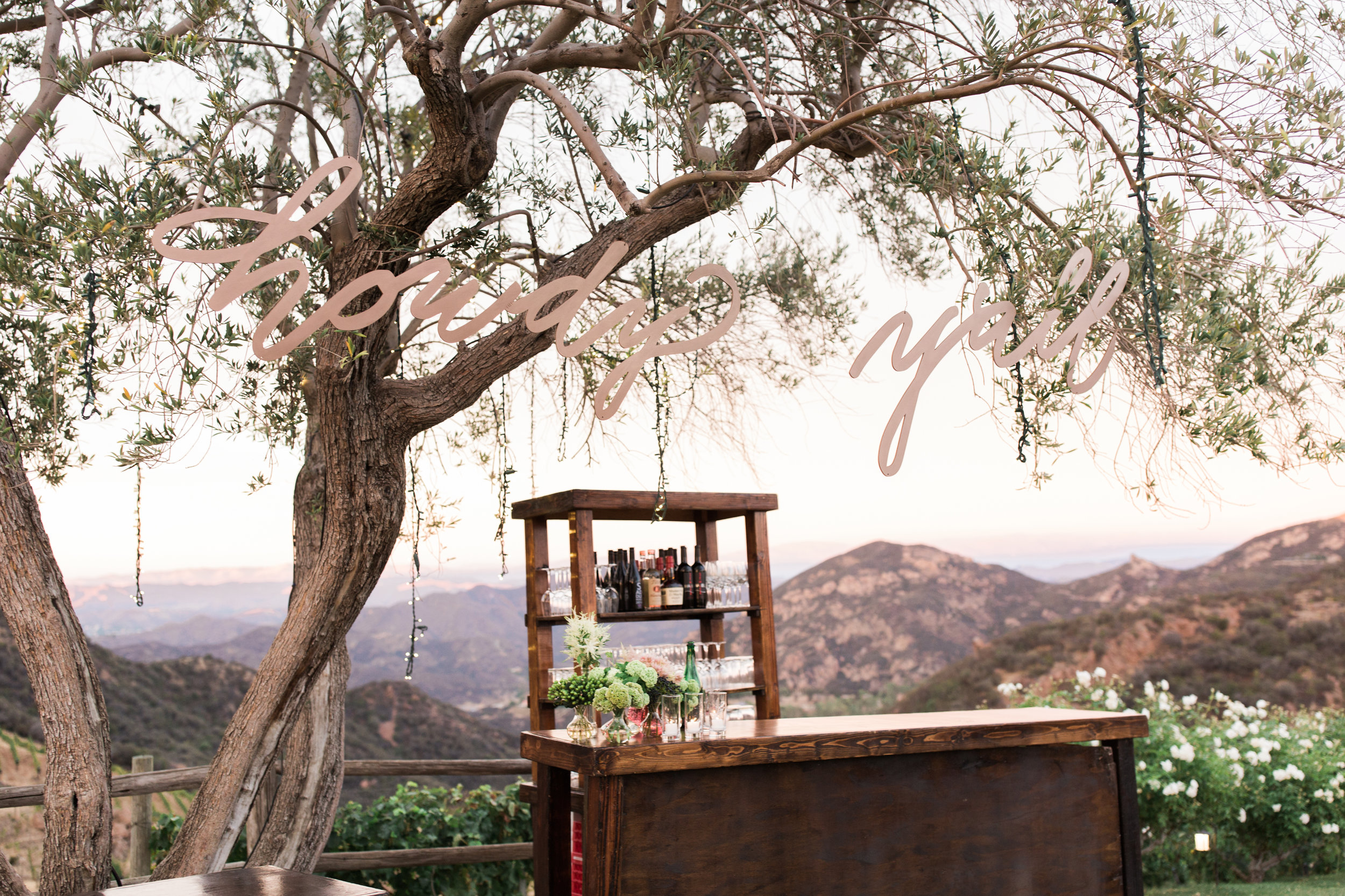
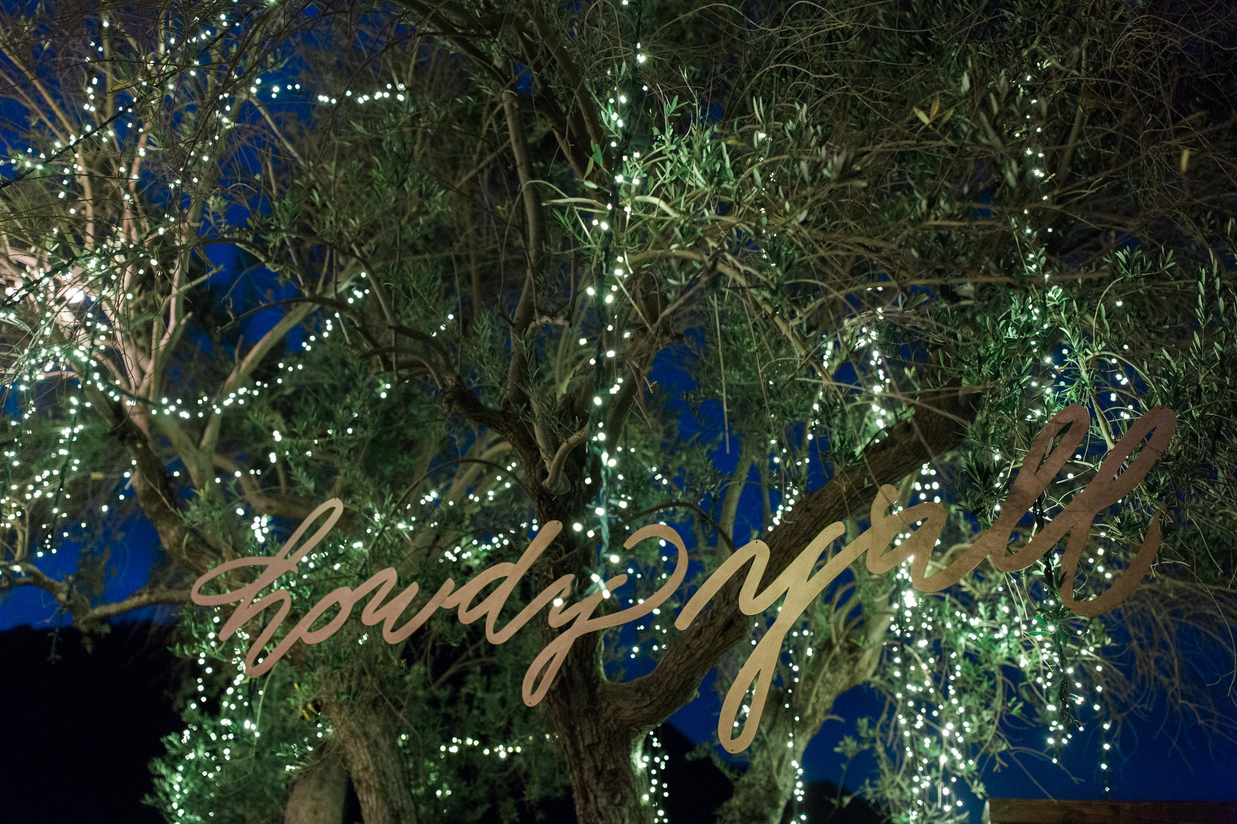
Howdy Y'all Lasercut Calligraphy Sign - Houston Calligraphy

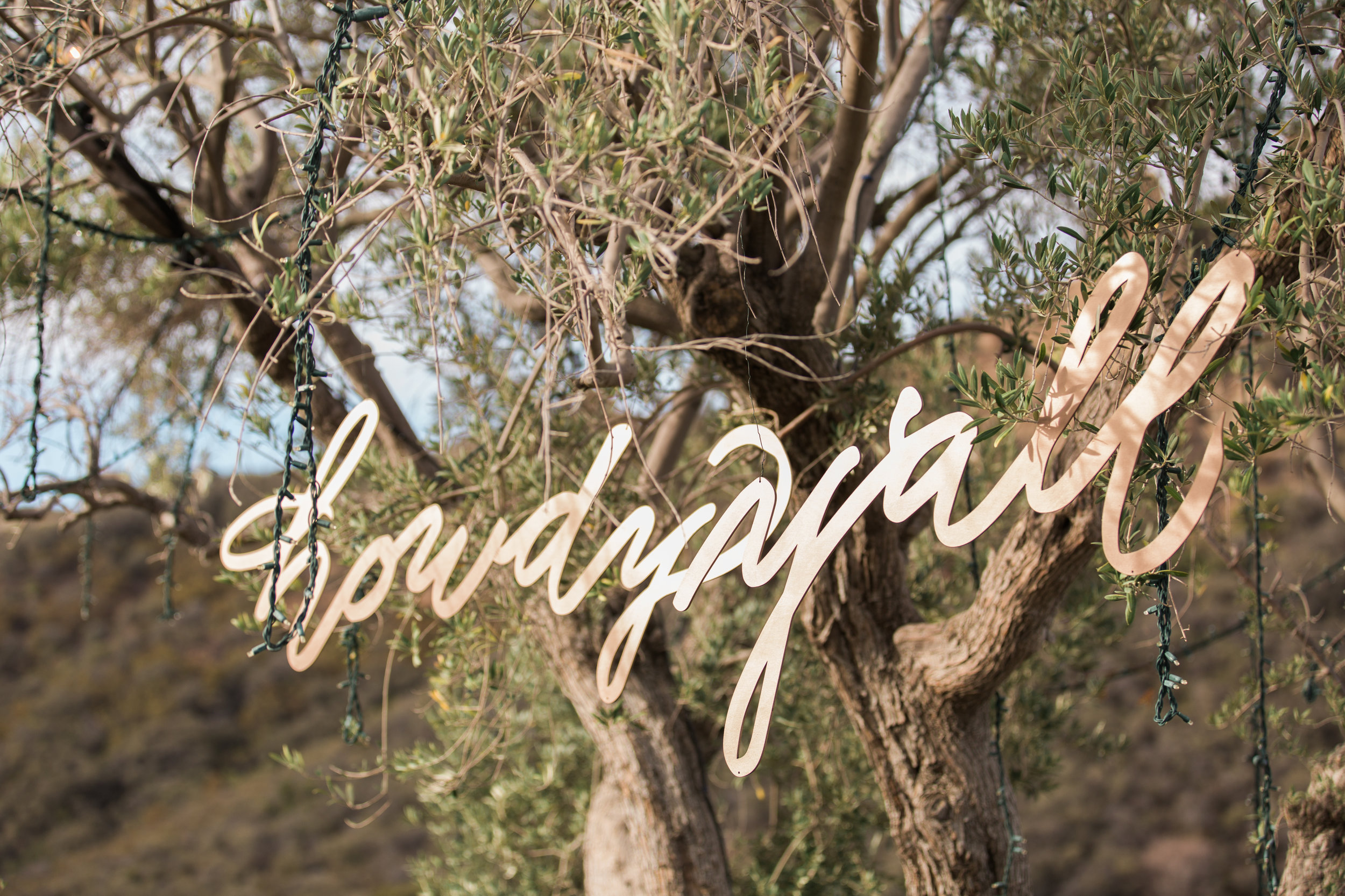
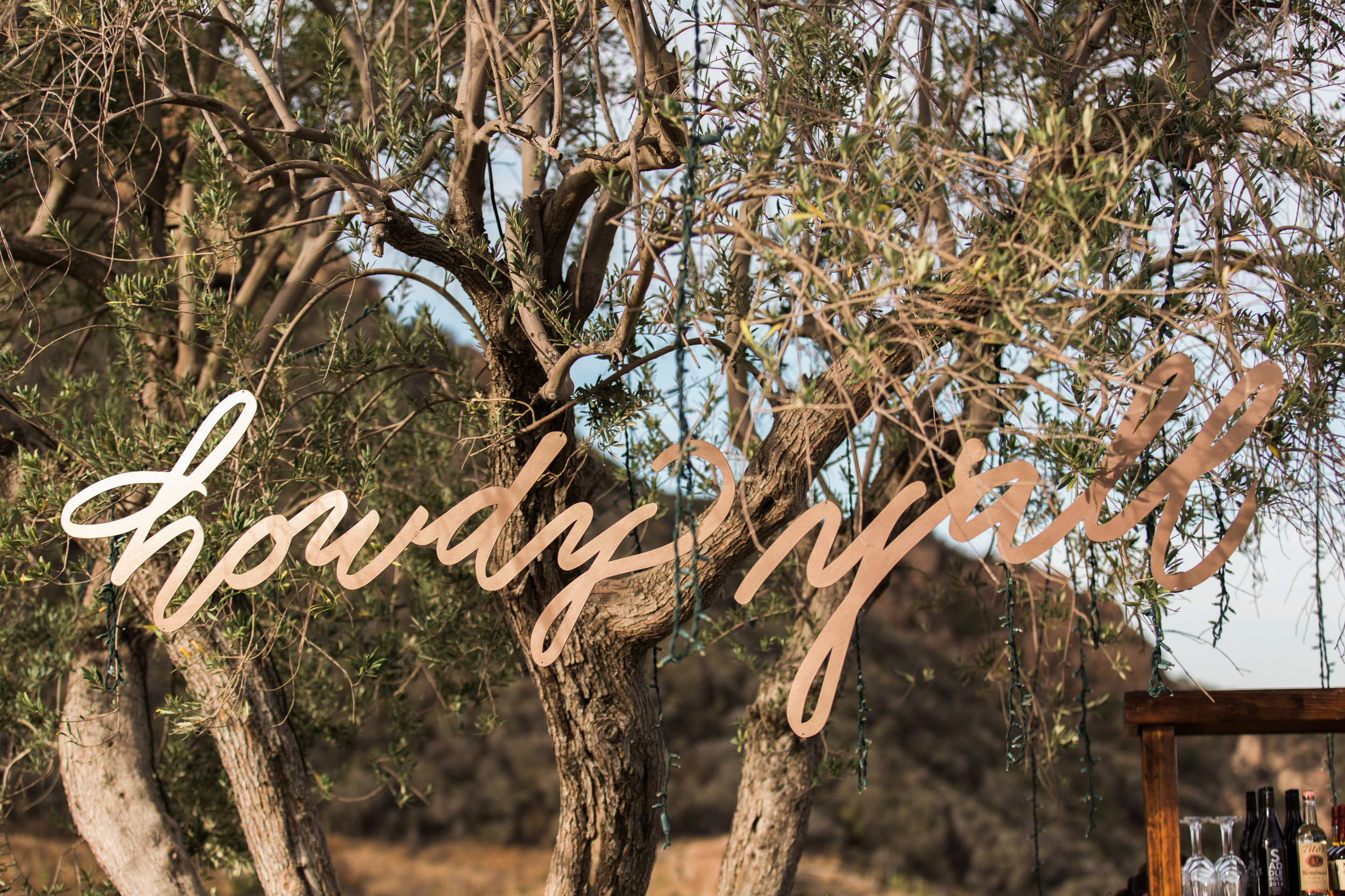
A few months ago, my services were retained to create a large laser cut sign (each word was roughly 2' tall & 5' long) that said "Howdy Y'all" in modern brush calligraphy.  It doesn't sound like a big deal and honestly I didn't see it as a big deal either.....until I had to load it into the back of my vehicle...pack it .....& ship it to Los Angeles, CA.  Yes, so it was a big deal :).  It was really groovy to see the end result.  I think that it came out nicely.  Cheers!


Vendor Love

Photographer: Vis Photography

Planner and Designer: Bliss Productions

Florist: Marks Gardens 

Rentals: A1 Rental Connection

Tableware: Casa De Perrin

Linens: Luxe Linens

Howdy Sign: Slinging Ink™ Calligraphy

Enter your email address:

Delivered by FeedBurner

LCI Luxury Paper Review - Houston Calligrapher

It's no secret that I am particular about my paper.  Honestly, any respectable calligrapher will shout the same from the rooftops.  I love writing on "anything but paper", but I obviously use paper for correspondence, etc ALL of the time.  So when I do use paper, it has to be of a certain level especially when used with pointed pen.  The nemesis of a pointed pen calligrapher/penman is paper that snags or bleeds/feathers.  These are bad signs, I tell you!

In that spirit, I was contacted by LCI paper company as they are launching a line of papers that are expected to fall on the luxury end.   I was actually supplied with LCI paper during my first year in business for a wedding envelope job.  To be completely honest, it got the job done but it didn't rank high on my list of preferred papers.  Fellow penman & calligraphers know exactly what I mean...  So when they contacted me last month, I was skeptical, but open to try it.  SO GLAD THAT I DID!  This is NOT the same paper from years ago....not by a long shot.  Want to hear my thoughts blow by blow?  Here we go:

DISCLAIMER:  I am providing these pictures with mistakes and all as I want for you to see where I experienced snags etc and also, I didn't have an abundance of papers to provide multiple chances for "perfect work".  So check out the "human" side of penmanship :)  Also, the pictures have received minimal to no editing to ensure that you can see the reality of what happened with the paper.
MATERIALS: So my background is in Microbiology (crazy, I know) and I worked in that field for a decade.  With that said, the scientist in me felt that it would make sense to ensure that the only "variable" with testing the LCI paper should be the paper.  I used a tried and true ink and nib--- a fresh Tachikawa G nib and Moon Palace Sumi ink.  The nib is a hybrid of Nikko G and Zebra G providing moderate tine flex with great hairlines.   Moon Palace Sumi ink is the gold standard for production work etc.  Plus, sumi ink is heavier than most inks & used by calligraphers around the world for envelopes, commission works etc.

Let's cover my pleasant surprises first.

Gmund Colors Felt Paper - Let me just skip to the point....I LOVE THIS PAPER!  This paper has a texture to it.  Yes, I know.  Pointed pen calligraphers and penman prefer minimally textured paper.  But let me tell you that this textured paper was a DREAM to write on.  The version that I tested was the "cover weight".  I seriously want some of this in the studio moving forward.  So after I got over the fact that the texture was beautiful, I was pleasantly surprised to learn that my nib just glided across this paper.  Seriously, I want more of this paper.  I tried to take pictures where you could see the texture.  Not an easy feat.  Look at the word "smooth" in the 2nd picture to see the lined texture.  ADORE this paper!!!

Gmund Colors Felt - ADORE THIS PAPER!!!

Gmund Colors Felt - ADORE THIS PAPER!!!

Gmund Colors Metallic Paper - So let's just rip off the bandaid.  I don't care to calligraph on metallic paper.  I'm not alone.  Peruse through the online portfolios of calligraphers and I assure you that the calligraphers that post their work, rarely if ever do so on metallic paper.  I can only think of 1 or 2 calligraphers that have.  Why you ask?  When compared to traditional, cotton based paper, there is no comparison.  The hairlines and even the shades look cleaner.  When it comes to metallics, calligraphers are often asked to use metallic, acrylic ink (relatively waterproof) and maybe you can get away with sumi...maybe.   So what better test than to use Moon Palace Sumi on this metallic paper?  This metallic paper is (wait for it) the best metallic paper that I have written on.  And again, I don't typically care for metallic paper.  This one performs exceptionally well.  It yielded clean hairlines and the paper was so smooth that it didn't snag and the shades were pretty clean as well.  Take a look:

Gmund Colors Metallic - To date, best metallic paper I've written on...Hands down.

Gmund Colors Metallic - To date, best metallic paper I've written on...Hands down.

Colors Matt Euro Flap Envelopes - Surprisingly, I really liked this envelope.  Remember that my first introduction to LCI was an envelope job years back.  These are very different.  Granted, I have my own stationery custom made, but in a pinch I would generally run to the local Paper Source for envelopes.  Paper Source envelopes are not the smoothest, but they are OK because I don't have to worry about bleeding, but they will snag without a doubt.  The LCI Euro Flap Envelope puts those to shame.  These are smooth....  I like these quite a bit.  (Please forgive my flourish mistakes  :()

Gmund Colors Transparent Vellum: I was introduced to tracing paper a few years ago and used it for work where I needed to replicate what I'd already done....exactly.... somewhere else.  Yeah, right...  And I'm a "vintage soul", so I have used Photoshop/Pixelmator, but it is not my strength and I reverted back to the vintage methods that have been used for centuries....tracing paper was my friend.   Then Michael Sull, Master Penman introduced me to vellum, tracing paper's sexier, yet more durable sister.  Sold!  So I love vellum and didn't realize that LCI made one.  They provided 2 weights: 30 lb and 54 lb card stock vellum.  ......And because I wanted to see how durable it was, enter sumi ink.  Well, my friends, the 30lb held up well.  Didn't wrinkle much or at all on the back side.  And of course I was curious to compare it as I am a die-hard Canson paper fan, so I pulled out my Canson vellum 55 lb.  Yes, the weights are different but that is what I had lying around the studio.  I like the LCI version, especially for that performance at the lower weight.  Canson is still my favorite, but the LCI is seriously solid.   

I also tried the LCI Vellum Card Stock (54 lb).  Definitely heavier if that is what you need and it performed exceptionally well.  

Yes, flourishing mistakes all around, but I wanted to see the comparison of the vellum....not bad.

Yes, flourishing mistakes all around, but I wanted to see the comparison of the vellum....not bad.

Gmund Colors Matt  -  The "text weight" honestly performed much better than I expected, especially at that weight.  I felt that it was solid.  Not luxurious, but solid.  I call it solid because it didn't bleed/feather or wrinkle upon placement of the heavier sumi ink.  This is not my 1st choice for paper, but I would not complain about it AT ALL.  It didn't become fibrous upon ink placement at all.  It'll get the job done with pointed pen and heavy ink.  

LCI Gmund Colors: Text Weight

LCI Gmund Colors: Text Weight

Let's play with the other various weights within Gmund Colors.  The weights provided were 89, 111 and 130 lb.  My favorite out of these was actually the 89 lb.  I have found that you don't need an incredibly high weight of paper for great execution.  TO BE FAIR, most papers will have a possibility of snagging.  It's just part of it, but some will snag more than others.  I believe that for the money and having had the ability to compare performance between these 3 weights, I would put my money towards the 89 lb vs paying for the higher weights....UNLESS the client just wanted a stiffer, heavier feel to the paper. 

LCI GMund Colors 89 lb

LCI GMund Colors 89 lb

G Mund Colors 111 lb

G Mund Colors 111 lb

Gmund 130 lb

Gmund 130 lb

In summary,  LCI dipped their toes into the higher end of stationery.  I found some pleasant surprises with the metallics, Euro flap envelopes and felt papers.  Honestly, I'm crazy about the felt paper!!!  The vellum was definitely solid (although I still have a preference for Canson) and Gmund colors were good, but I would put my money towards the 89 lb over the others for my needs.  Well, that's it.  Cheers and happy writing!
Enter your email address:

Delivered by FeedBurner

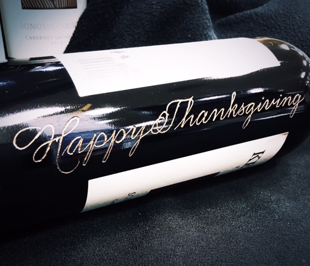
'Tis the Season for Kenwood Wine Bottle Engraving by Hand - Houston Engraver

Hello Wine Lovers!  It's that time of year again!!!  I will have the immense pleasure of engraving for Kenwood Wines this month.  So far, I have engraved calligraphy in wine bottles for this company at Randall's grocery stores in the Houston area and they have been well-received.  

So if you know anything about my style of penmanship, you know that I have a preference for derivatives of Spencerian style script.  It's rare that I will go with a Copperplate....usually when I desire a change of pace.  I'll either go with Copperplate or go to an upright script Copperplate.  I digress...  

So this bottle was for a client that wanted to get an early start on Christmas bottles for friends and family.  Hope she liked it!!!!  
I look forward to seeing you at the next few Kenwood events (Dec 9-11).  Click here for the event calendar and locations.  Cheers and have a groovy day!
Enter your email address:

Delivered by FeedBurner

Top 50 Calligraphy Blog - Houston Calligraphy

Sometimes you know when something good is coming and other times you don't.  It's a nice surprise that someone was watching and thought well of your work or business.  

With that said, I am pleased to announce that I was recently awarded the #9 spot for a "must follow" Blog in the FeedSpot Awards for Top 50 Calligraphy Blogs.   Love it!  Thank you! 

Enter your email address:

Delivered by FeedBurner

Oh how I love white marble - Houston Calligraphy

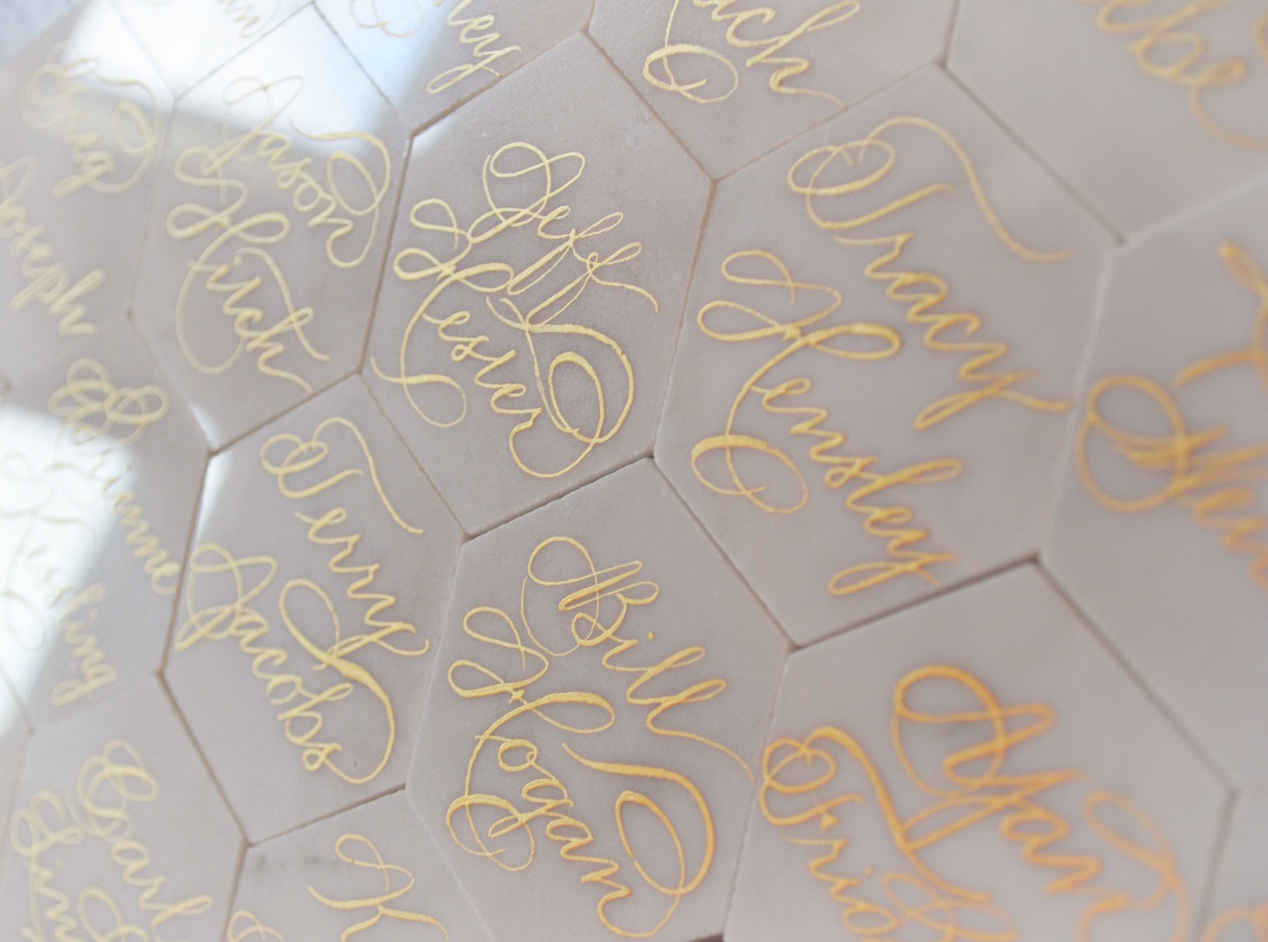
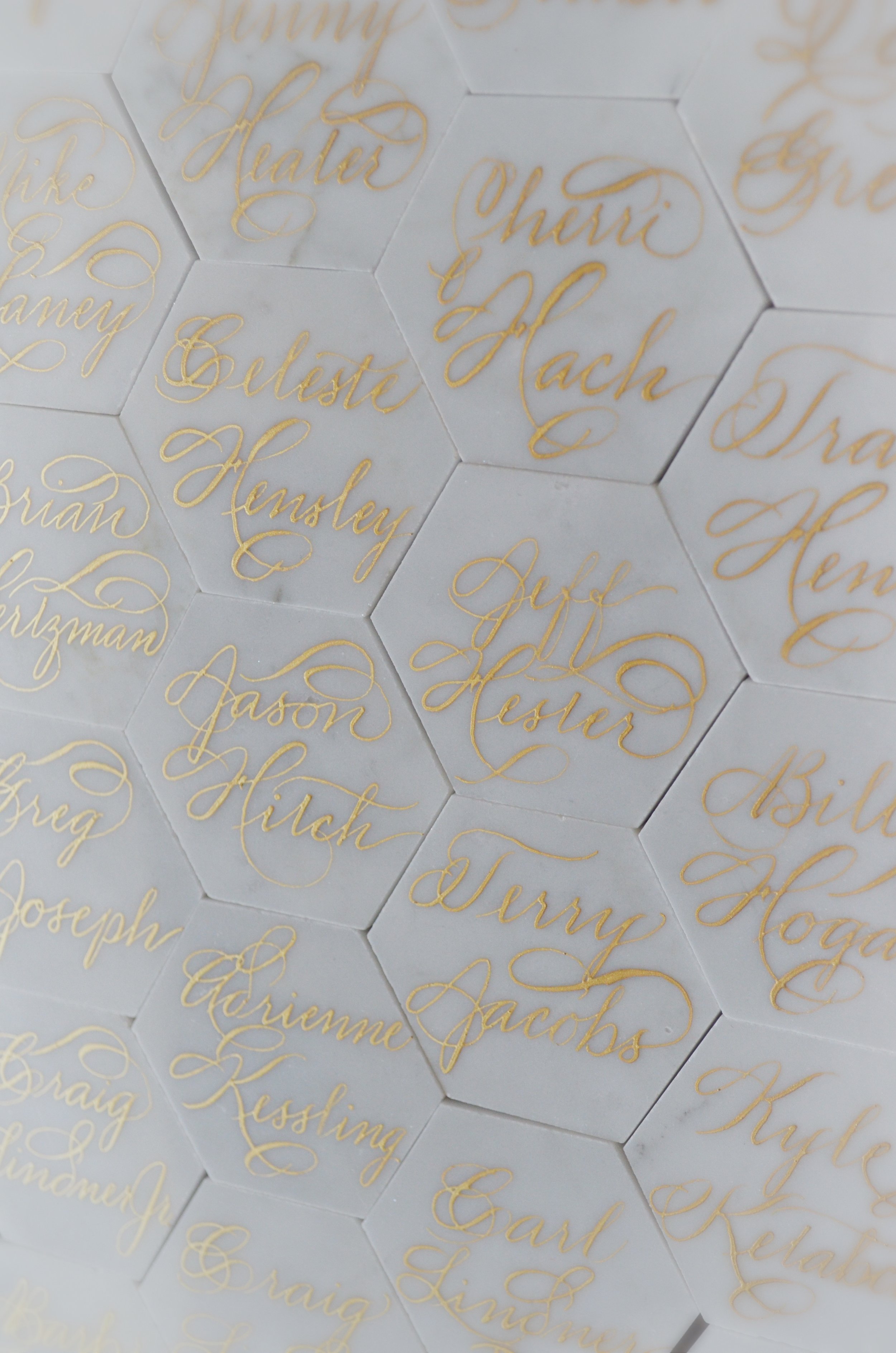
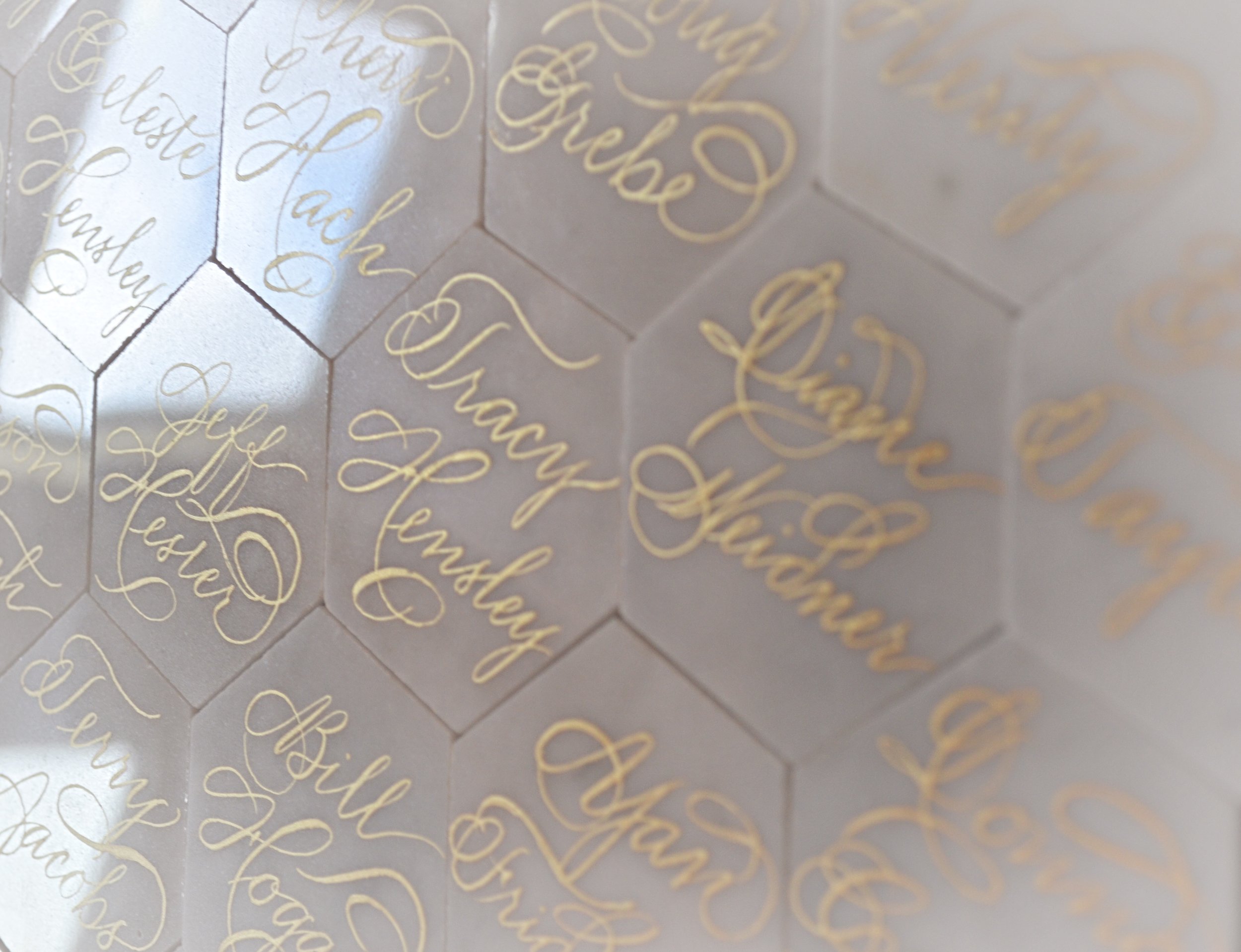
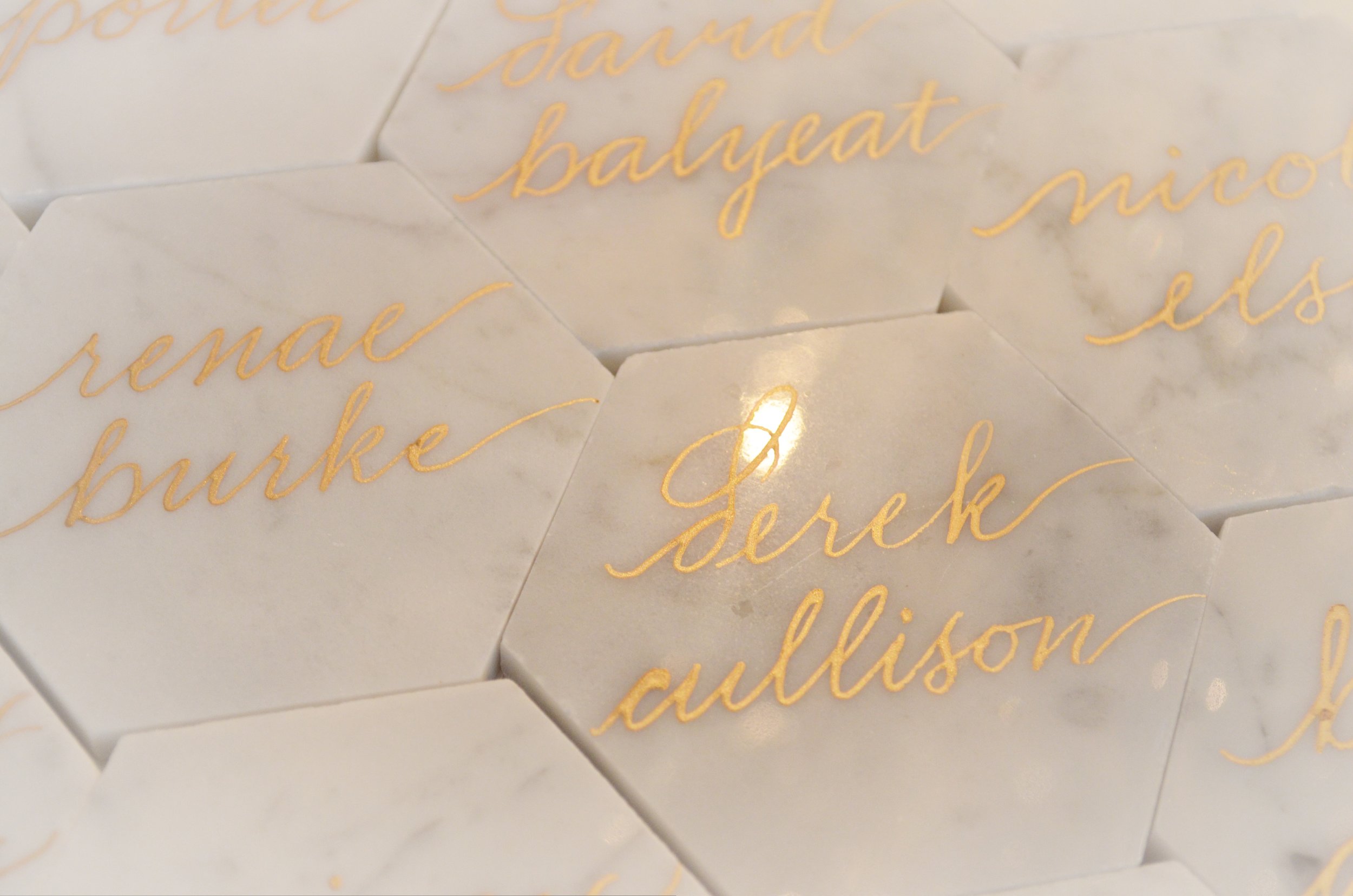
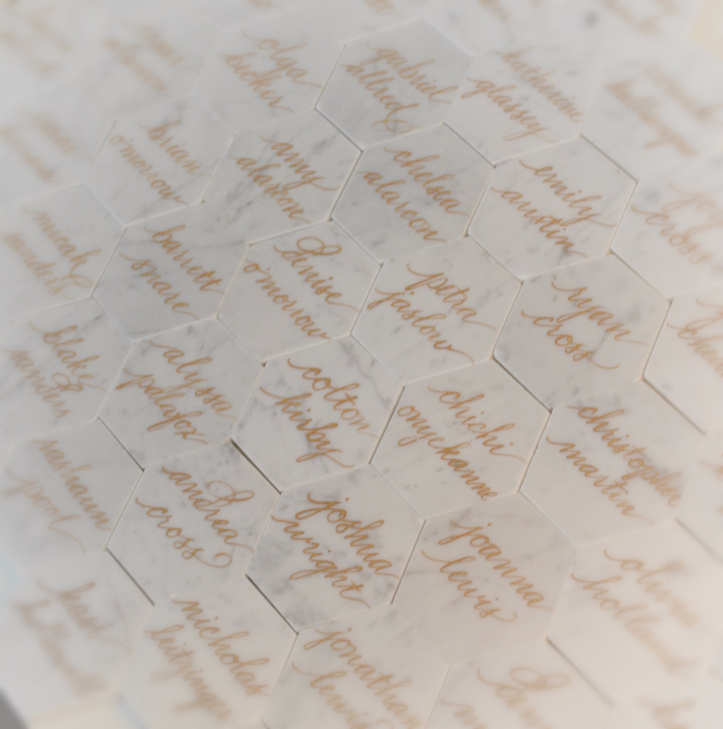
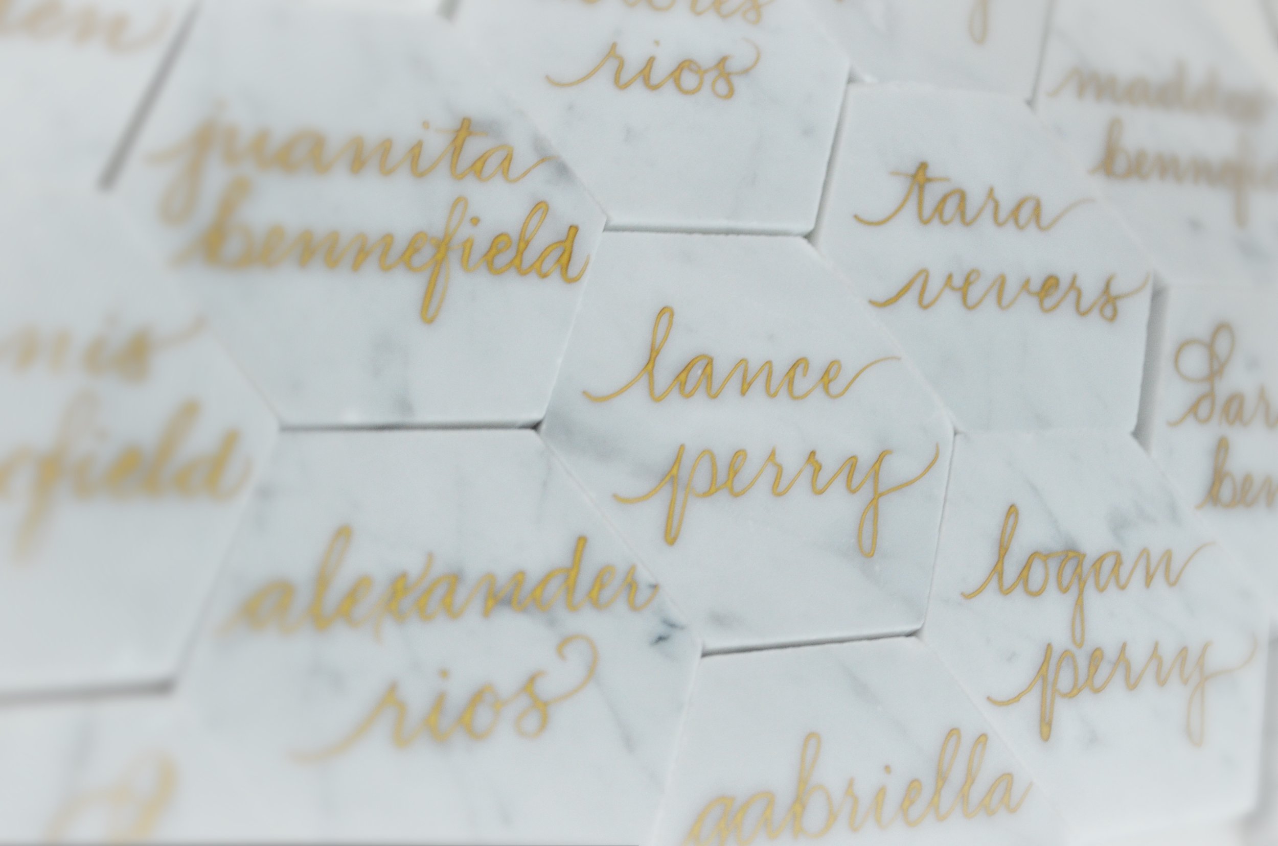
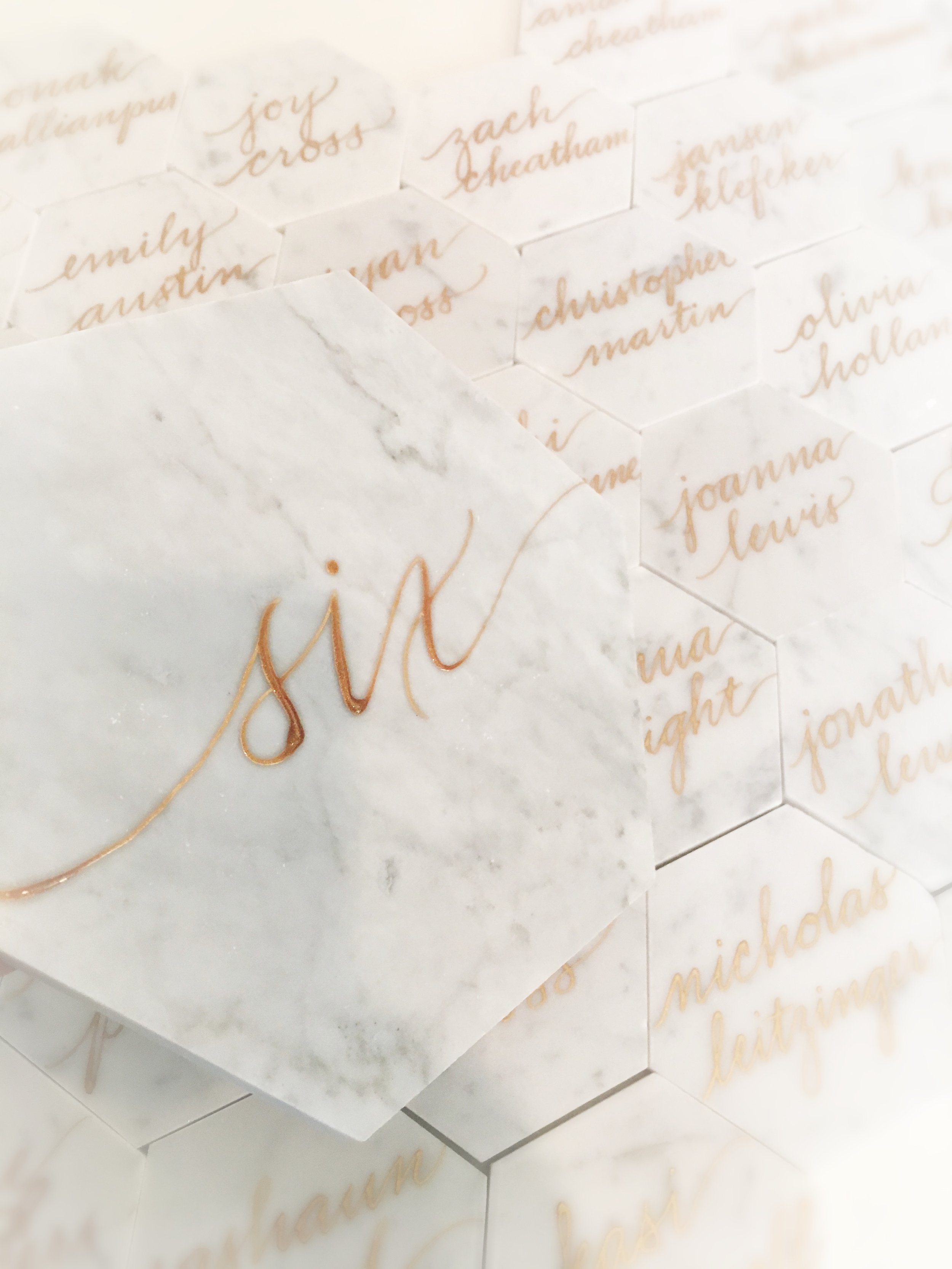
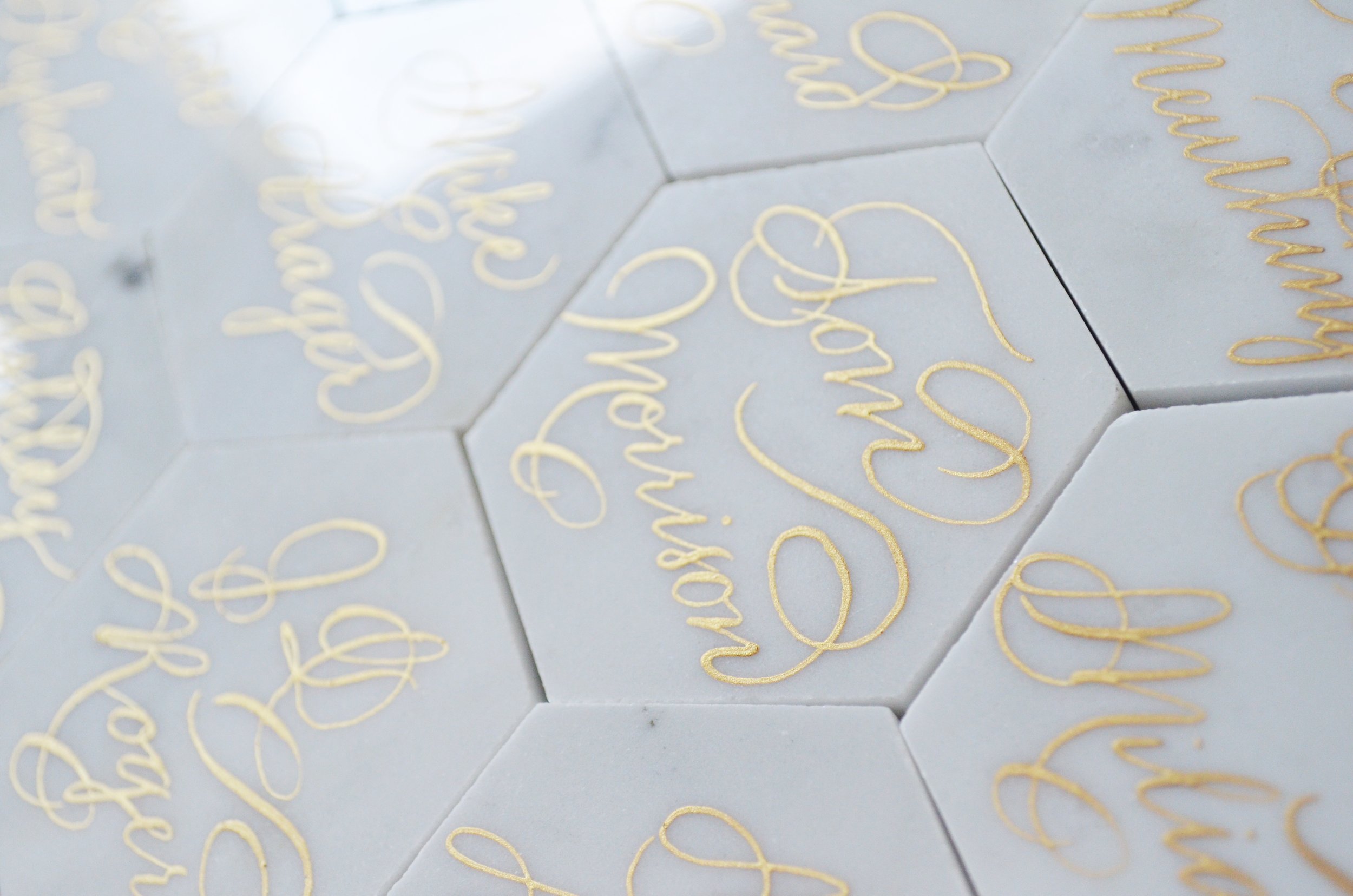
These white marble tiles were calligraphed with gold ink with a play on an ornate hand that I like to execute.  And these beauties are out of the door!  I really do love how these look with gold calligraphy.  Cheers & congratulations to the Chicago Cubs as the 108 year drought is OVER!

White Marble Calligraphy Place card Houston Los Angeles New York Miami 2.JPG

Enter your email address:

Delivered by FeedBurner

Wine Bottle Engraving - Deutsch Family Wines: Josh Cellars

It was such a pleasure engraving calligraphy in wine bottles this weekend for the Deutsch Family Wines (Josh Wines).  As usual, it was so busy that I forgot to take a picture until the VERY end.  This was the very last wine bottle.  I believe that we engraved about 40 bottles that day in 3 hours.  It was a busy day!  Cheers!

Enter your email address:

Delivered by FeedBurner

Villain/Halloween Agate Stone Table Names - Houston Calligrapher

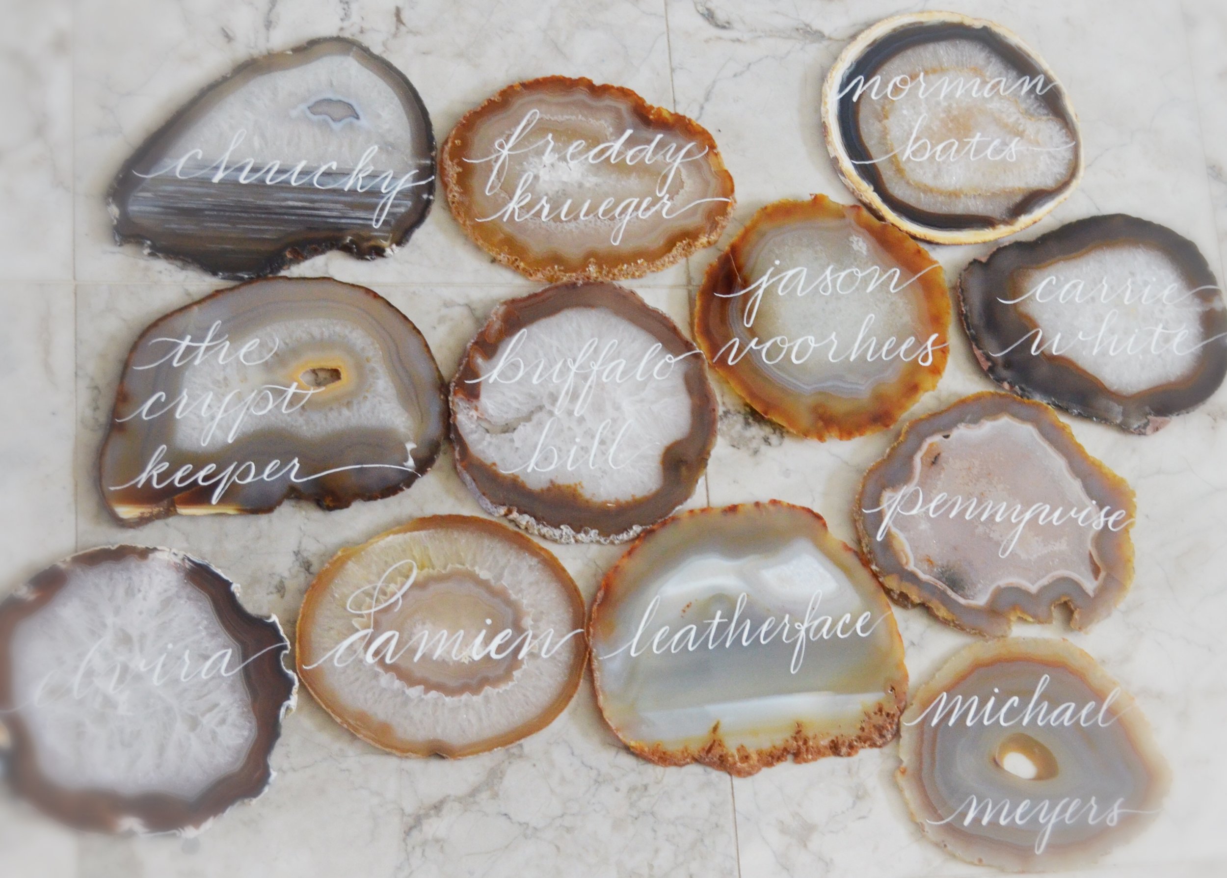
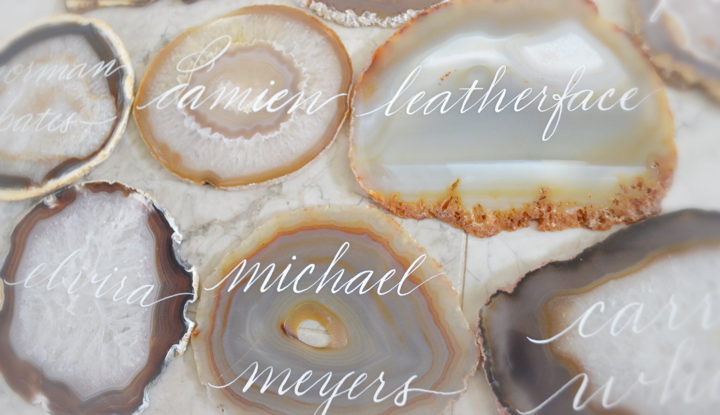
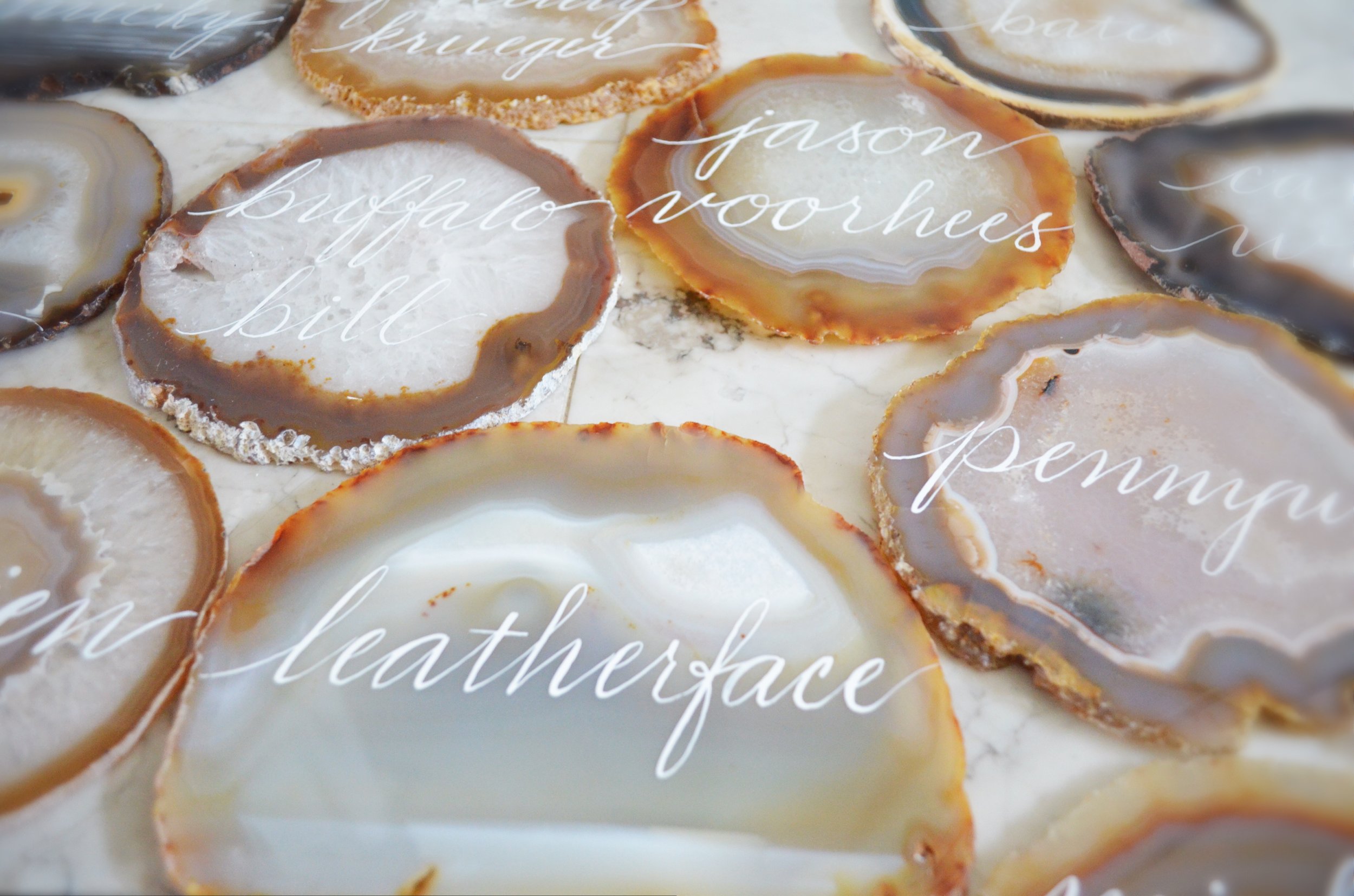
I just LOVE IT when clients contact me with interesting ideas that are not the garden variety.  This client wanted 5-6" agate stones in the natural color family for table names.  The most interesting part was that the event planner informed me that they wanted to use villain names in calligraphy for the table names.  So cheers to Freddy Krueger, Pennywise, Carrie White, Buffalo Bill and Leatherface!   And guess what...these are for a wedding!  How cool!  

Agate Table Name Number Houston Calligraphy 2.JPG

Enter your email address:

Delivered by FeedBurner

Geode Agate Stone Work Featured in The Everyday Hostess - Houston Calligrapher

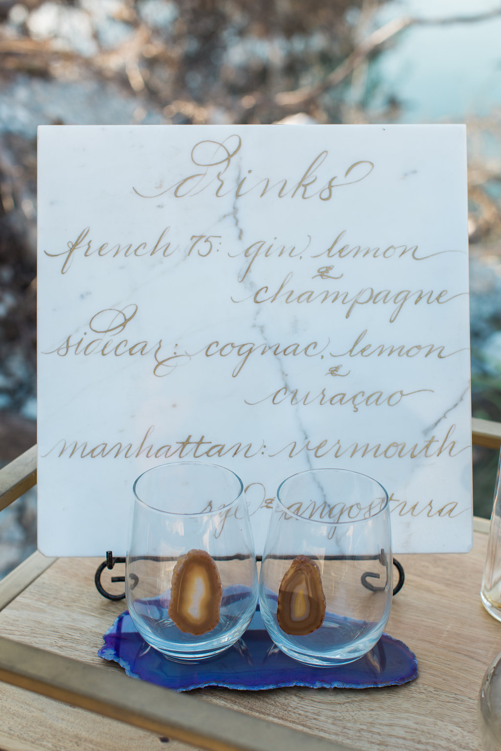
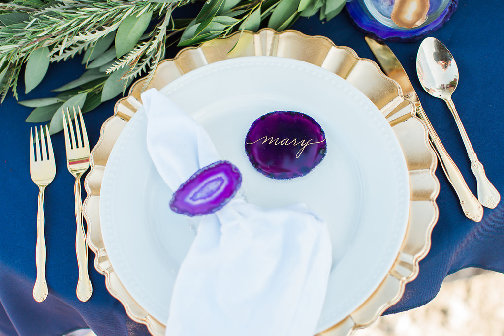
I just adore working on featured shoots....especially with The Everyday Hostess publication!  It is always so much fun!  This one featured work with agate stones, which of course is one of my favorite things to work with for calligraphy.  Take a peek at my work and the work of great vendors mentioned below in the "vendor love" section.  The link to the feature is below.  Cheers!  

 http://www.theeverydayhostess.com/geode-styled-shoot/

Vendor Love

Photography: Ashley Rutland
Styling: The Everyday Hostess
Vintage Rentals: Gold Dust Vintage Rentals
Florals: Fox and the Fleur
Agate Glasses and Barware: On the Rocks

Calligraphy: Bella Grafia, LLC

Enter your email address:

Delivered by FeedBurner

Dry Baby Dry......White Marble Tile Calligraphy - Houston Calligrapher

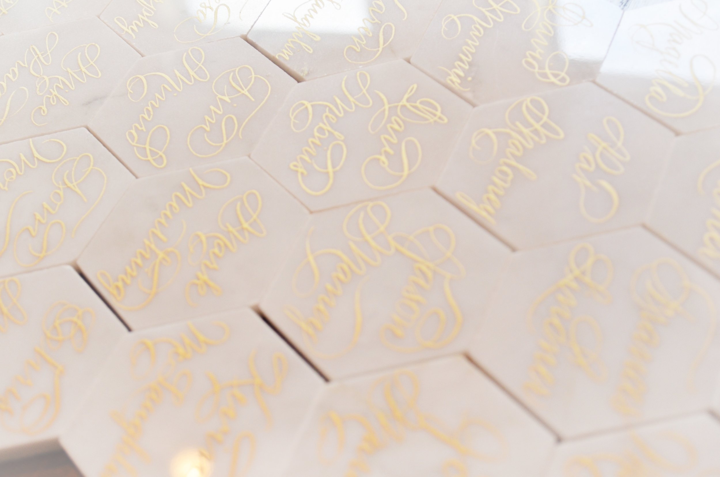
Another project featuring calligraphy on the white marble tiles drying before shipping out.  I absolutely adore working with marble tiles.  Cheers!

Enter your email address:

Delivered by FeedBurner

Subway White Marble Tile Calligraphy - Houston Calligrapher

Yes, I am having a moment with white marble tile right now.  I bore easily and needed something new to write on :).  This time it's what they call subway tiles.  I love the elegant simplicity of the white marble and making it rectangular yields a chic aspect as well.  Isn't it just great that calligraphy & hand lettering can take so many forms?  Cheers!

Enter your email address:

Delivered by FeedBurner

Color Me Groovy - Houston Calligraphy

This style came about because in art (not life) I LOVE mixing a little bit of chaos with beauty.  The result is often so so cool & groovy.  On these I placed a rose gold/copper under the Bella Grafia calligraphy script that of course I calligraphed by hand.  (Anything else would be uncivilized :))  

I've done something similar to this before, but with modern calligraphy and a bold "relaxed" title name.  "Modern calligraphy" is not my go-to...I'm a bit of a purist, but once you understand traditional calligraphy, "modern calligraphy" is a cake-walk.  I digress....  Here's the result!  Have a groovy day!

I don't address envelopes too much anymore, but these were for my favorite client, Lola :).  Obviously, certain numerals have been omitted for privacy.

#IPimpMyPen

Enter your email address:

Delivered by FeedBurner

Dessert Sized Lasercut Names - Houston Calligraphy

When I was contacted about providing names in calligraphy for an event, I had no idea as to how they would be used.  These dessert sized laser cut names were placed in little ornaments and served as place cards for an event in Los Angeles.  Very cute!

Enter your email address:

Delivered by FeedBurner

Calvin Klein Perfume Engraving Event - San Antonio & Houston Engraver

I recently had the pleasure of engraving for Calvin Klein fragrances.  It was such a great event!  Here is a bottle of Eternity and the client & I came up with this cute line for her husband.  Cheers!

Houston Fragrance engraving engraver.JPG

Enter your email address:

Delivered by FeedBurner

How to begin Lasercut Names - Houston Calligraphy

I do quite a few Houston calligraphy projects laser cut out of wood and sometimes acrylic.  I was asked the other day how I start that process.  Sounds so artsy :)  Well here is how I start.  I just calligraph them on paper....  Pretty simple, see!  Just ignore the ones with x's...those would be the lovely mistakes. It happens.  Cheers!

Enter your email address:

Delivered by FeedBurner

Slinging Ink® of Bella Grafia Calligraphy is a Houston Based calligraphy firm that was established on the idea that sometimes the vintage way of creating art is the best. Handwritten calligraphy is the most elegant form of communication and an event focused on the art of others deserves nothing less.  As a Houston calligrapher & engraver, I believe in doing it beautifully or not at all.


Slinging Ink®  Calligraphy & Engraving of Bella Grafia, LLC retains all rights to the content of this web site, as well as all calligraphy and engraving artwork we produce on behalf of our clients. Our artwork and designs may only be used for each specific job we created them for. The client, stationer, graphic designer photographer, and printer agree that our artwork will not be copied, re-engineered, re-purposed, edited to create derivative works, resold, reprinted, given away or re-used in any way that would violate our copyright.  Photographs of our artwork are to include artwork credit to Slinging Ink® - Bella Grafia, LLC.

CITE YOUR SOURCES, Darling. © 2023 Bella Grafia, LLC. All Rights Reserved | SEO by WPamplify