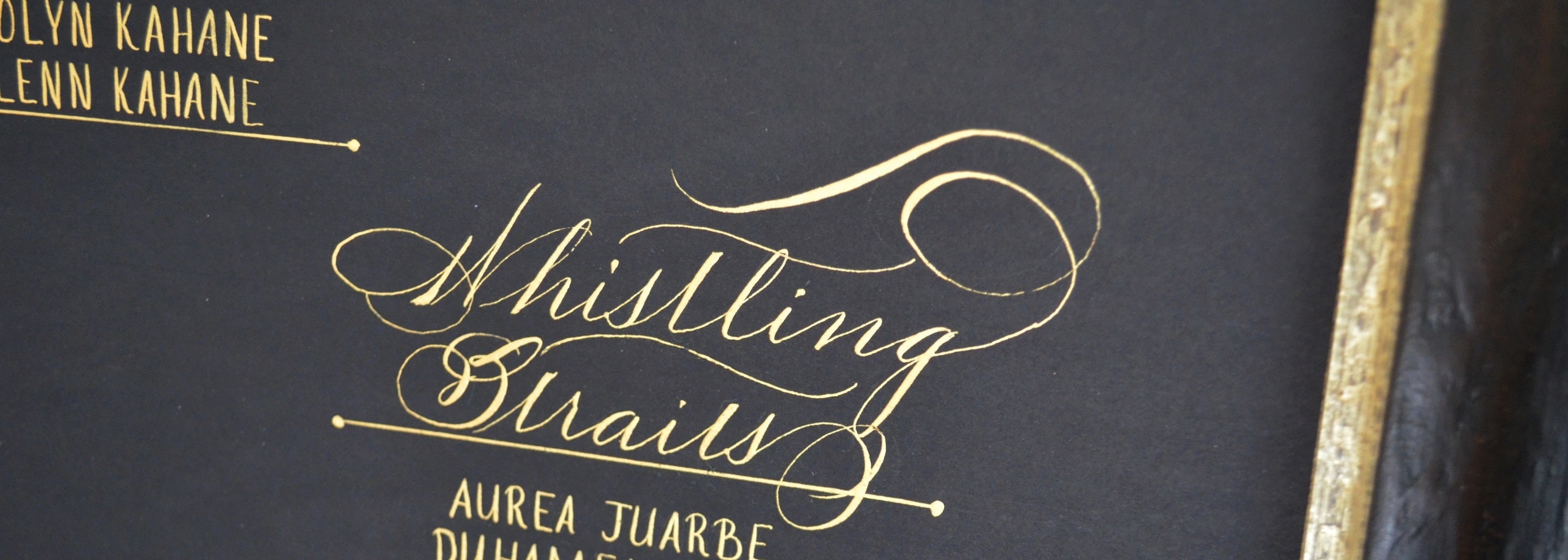
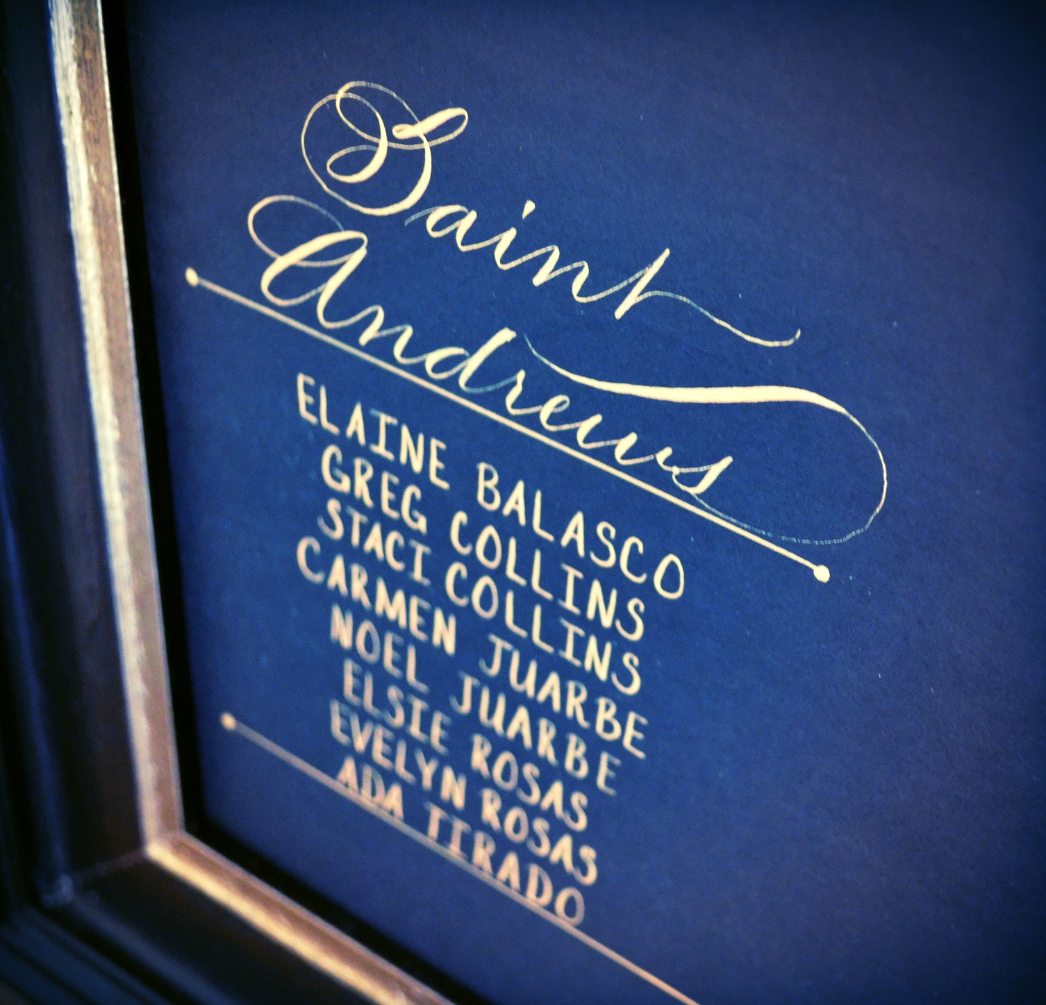
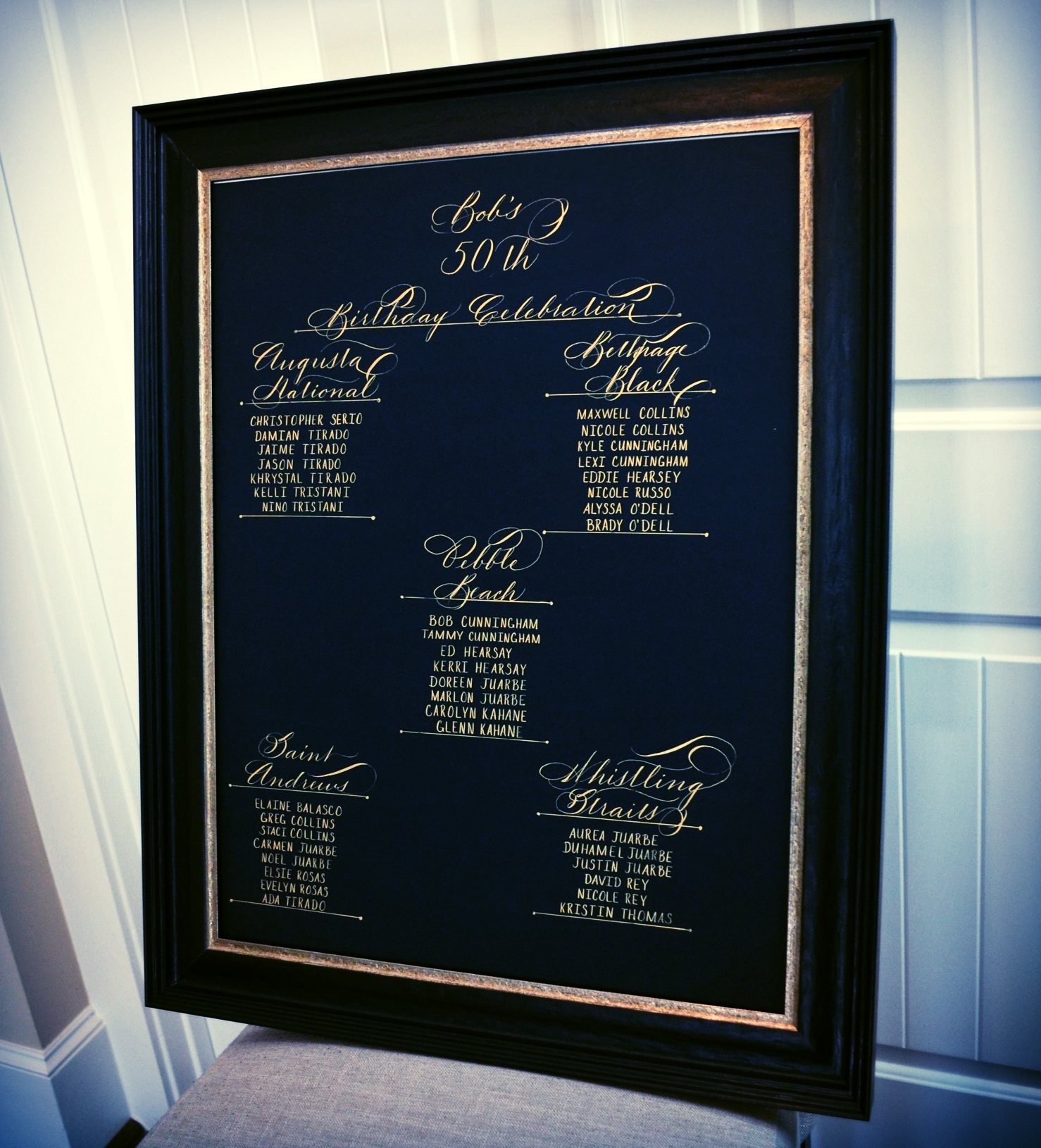
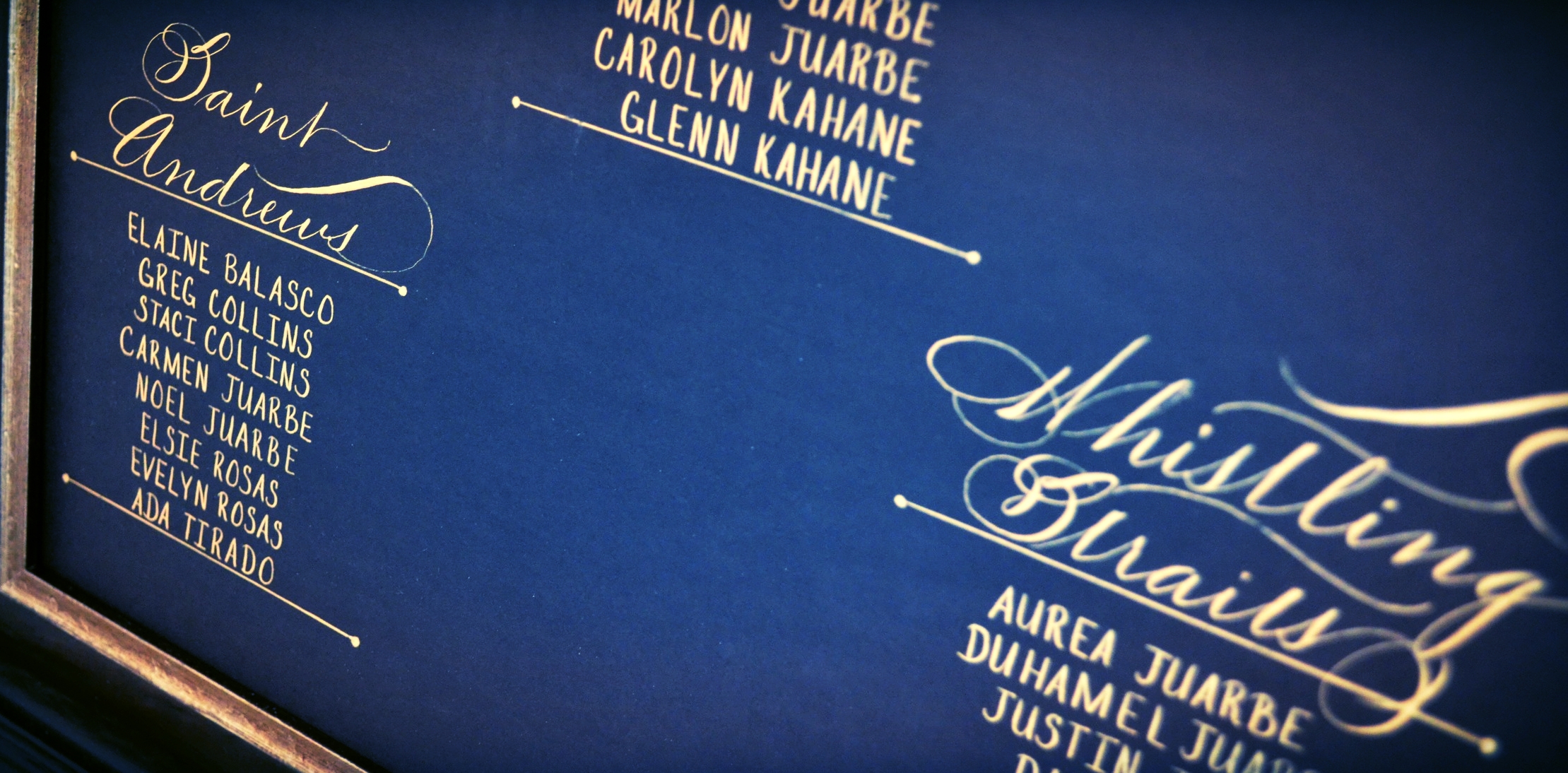
This Long Island, NY client wanted to have a seating chart created for a birthday celebration. The request was for gold ink on black paper with script headers. I don't play golf but I totally dig the theme! I think that it came out nicely. Now off to the post office this will go. Cheers!
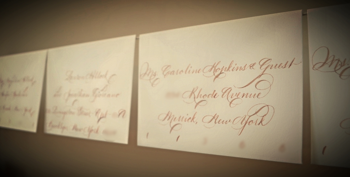
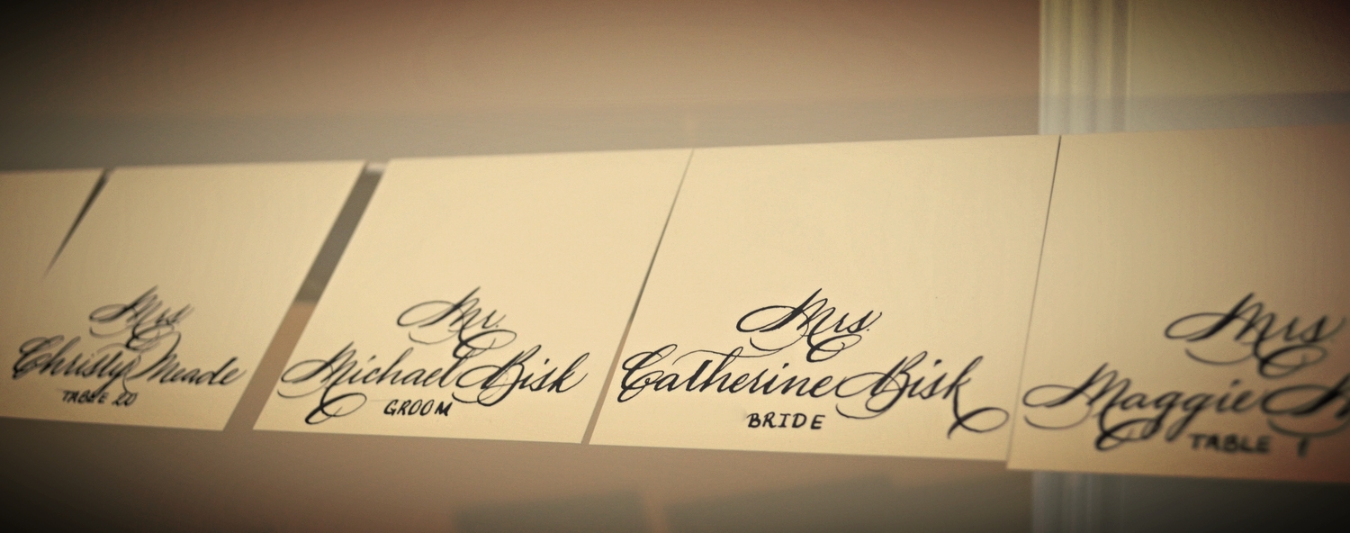
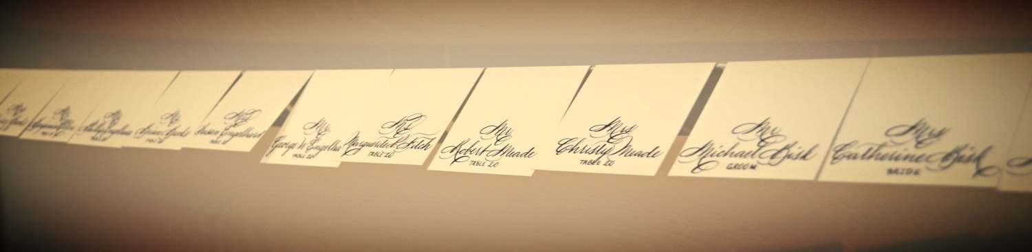
This bride from Atlanta had a preference for the "Elis" style. This is my favorite this year as it shows a contrast of 2 hands and can be made informal with dropping the titles from the guest names and shifting the lines etc, if desired. We executed it in gold ink on beautiful off-white heavy cotton paper. Love it!
So this was my office yesterday afternoon. Grand Marnier hosted a dinner and requested that I provide the on-site calligraphy for the event. It was my pleasure to oblige. Adrenaline was high as my work began amidst the event planning & restaurant staff prep, but it was fun and they liked my work. So sorry, but of course this was a quick iPhone pic as I was leaving before guests arrived. Not quite photography competition material, but I got a picture.
I'm really trying to get better about consistently posting my work. Work gets so crazy that a lot of times it doesn't happen. Must get better about that. Cheers!
These are a great idea for place cards as they are different from the norm and they provide a wonderful keepsake for your guests. Now to add the ties to finish it off :)
During my typography class today, my instructor began to talk about serifs which encouraged me to doodle in pencil. Must stop doing that! Pay attention, Janet! I digress.
During my doodle session, I thought about a potential tattoo for myself since I have been designing tattoos for so many clients lately. Maybe for my 40th birthday.....or never. Probably never, but who knows......
How do I calligraph my work if I don't want to deal with erasing graphite lines you ask? I just pull out my Austin Powers "Laser" :) Sorry that I couldn't figure out how to enlarge the screen. This is what happens when you are holding the camera in one hand and writing with the other....
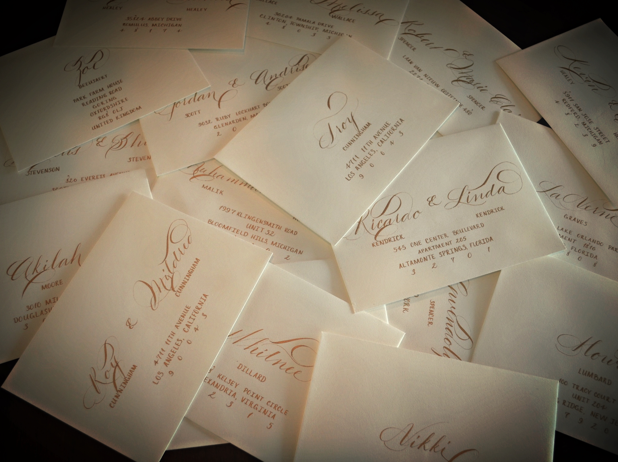
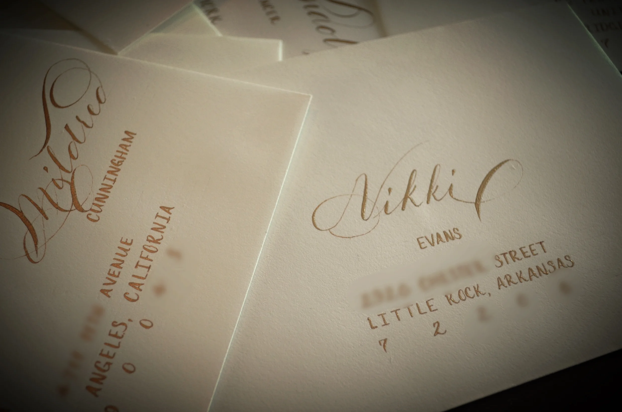
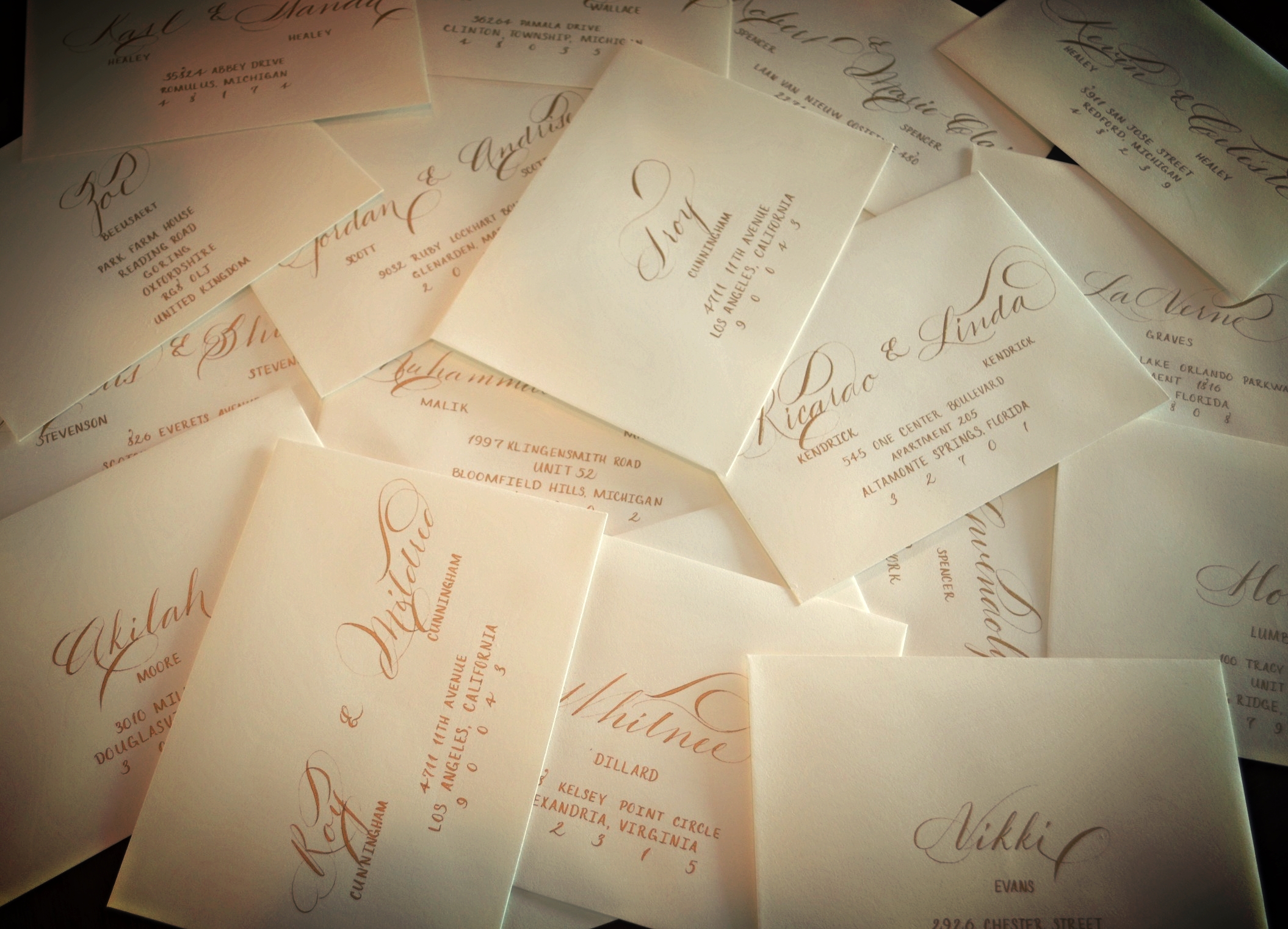
I've been pretty swamped and haven't posted the last few jobs....must get better about that. This project is for a wedding in NYC. This couple opted for bronze ink in Ornate Roundhand on Crane lettra paper. I love bronze. Who doesn't love bronze? I'm still on the hunt for the best bronze ink that has a minimal hassle factor, flows well and looks beautiful. Today, I'm using Fine-Tec pearl color disks. They are beautiful once you dilute the disk down, but the hassle factor is a little high for me especially when you consider that you still have to mix after each envelope/line as with most metallics (that's why so many calligraphers charge extra for metallics). I may have to return to "creating" my bronze (secret recipe). We'll see. These are beautiful though, aren't they?
This NYC bride opted for wood reception signs (which I adore) and hand calligraphed table numbers in Ornate Roundhand. I love it. Really sets the tone for the wedding!
Here's a sneak peek into a styled shoot that will be taking place in New York next week. I was honored to have been asked to participate and look forward to seeing the end result along with the laser cut wood pieces that I created design work for as well.... The calligraphy is in a "modern" style to suit the mood of the photo shoot.
It's no secret that I love Burgundy wine. Today, I took an "end of the day detour" from the wedding that I am working on for a quick doodle :).
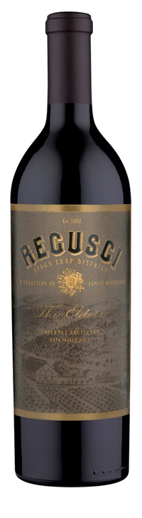
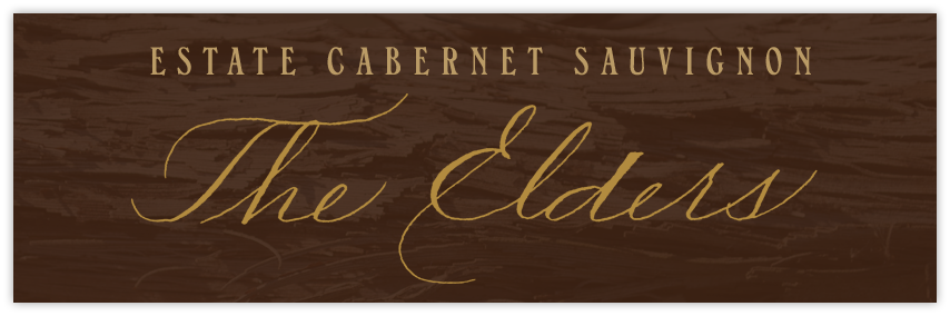
Last Fall was absolutely insane....in absolutely wonderful ways. I had a lot of transition personally and professionally in a positive direction. During that time, I calligraphed design work for a few wine labels in Napa under the Slinging Ink commercial side of my business. Business was so crazy that I honestly forgot about these until I saw them online. Here is one of the ones that was chosen for Regusci wines. Looking forward to receiving pictures of the other labels that I calligraphed earlier that year. Cheers!
So I finally got around to doing a project for my daughter Lola :) I figured let's give this white envelope a bit of something unexpected. A blush of pink watercolor! Off to the post office these go.
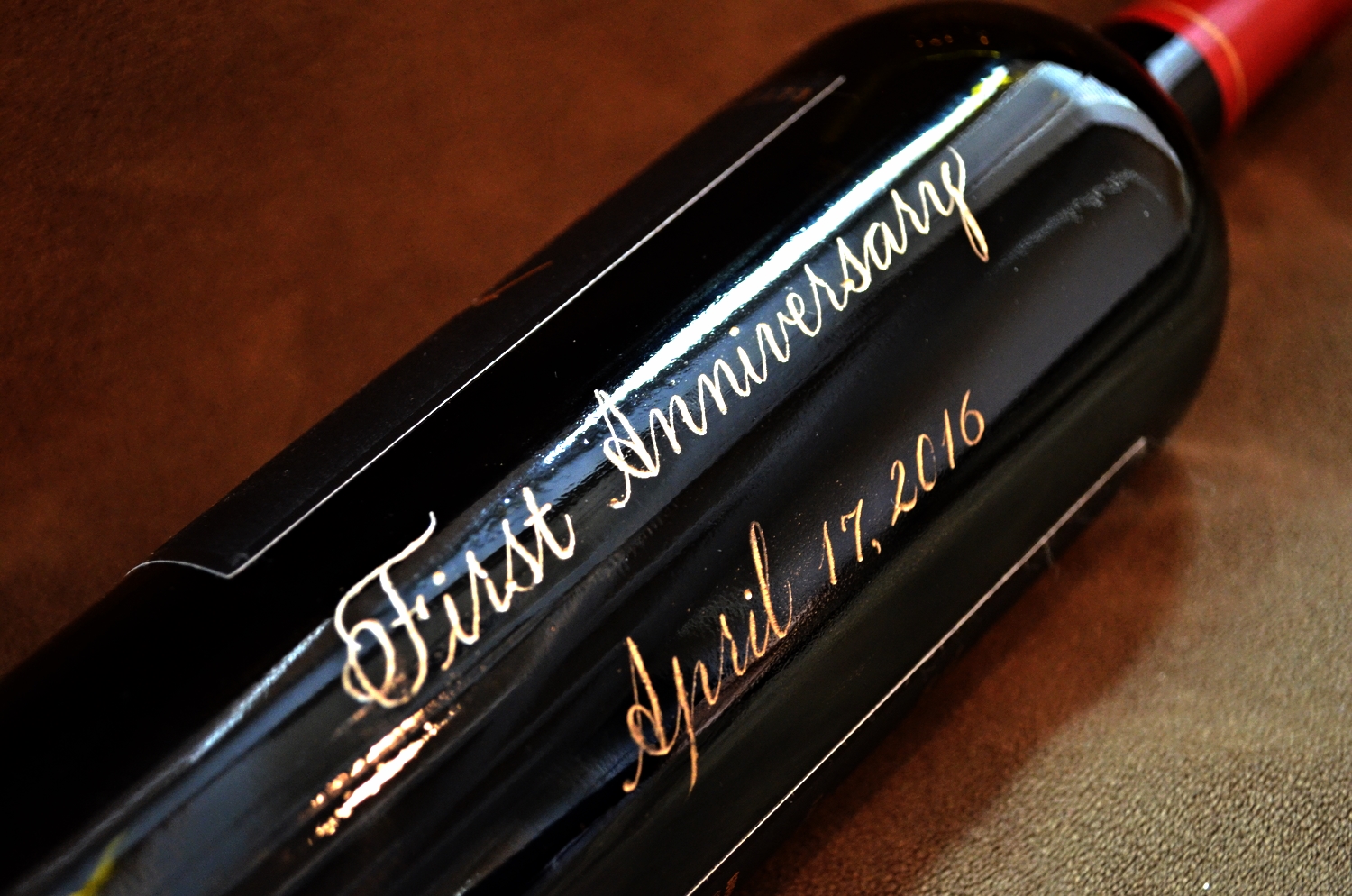
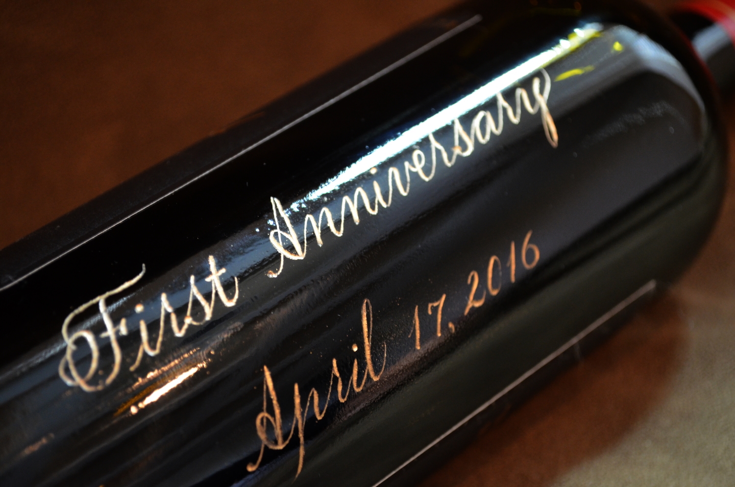
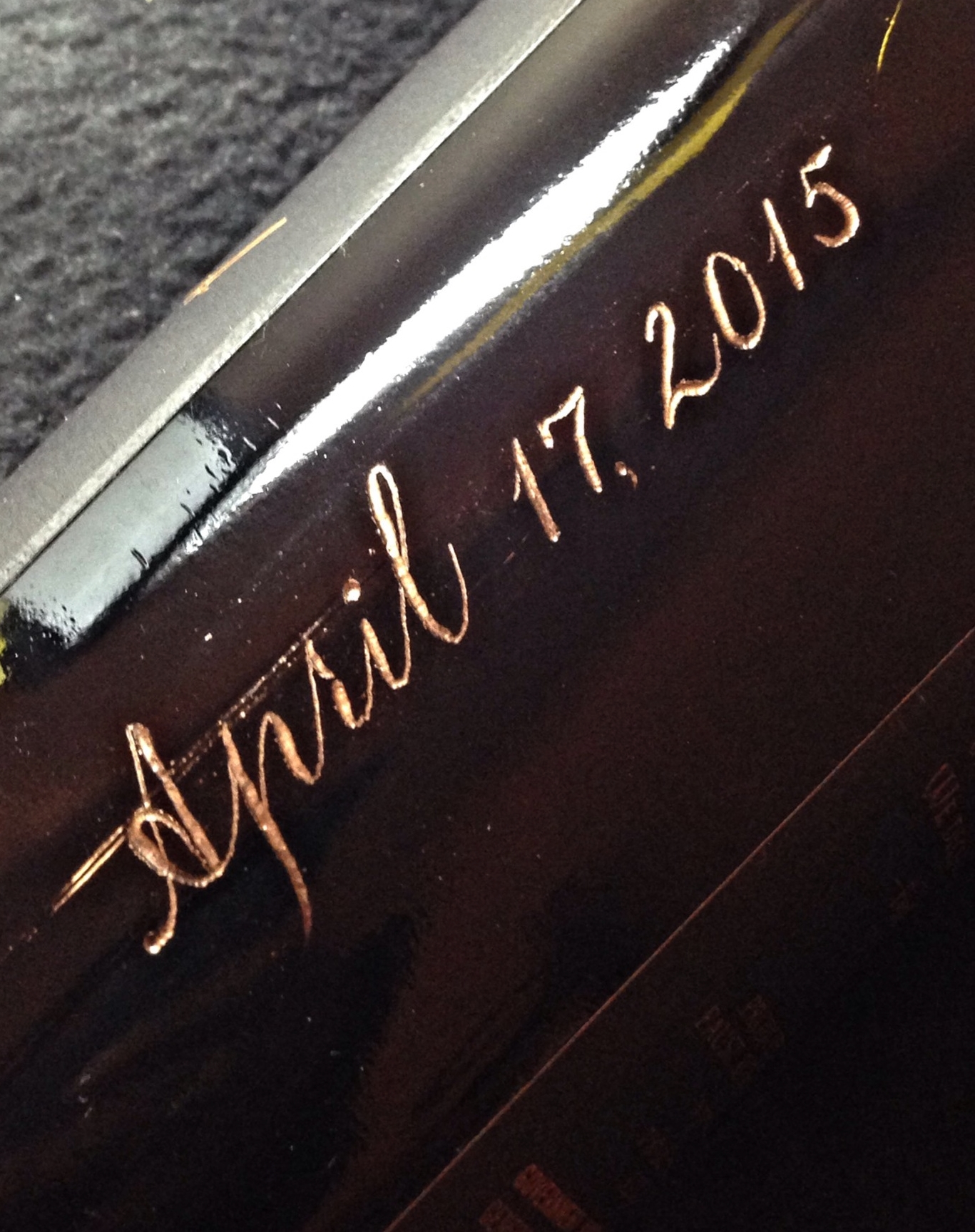
I love when clients plan ahead :) This client had a bottle engraved for her wedding but also had a 2nd bottle engraved for their 1st anniversary. It engraved beautifully and I know that their first year will be even more beautiful!. Cheers!
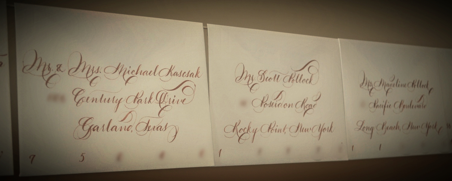
This Florida bride decided to have me calligraph 220 place cards and leave adequate space at the top for a wax seal. What a great idea! I wish that I had thought of that....maybe I'll start offering something like that. Anyhow, my portion is complete and now to send them to her to complete the magic.
I like this style due to it's contrast. Brush lettering is an area that I have been interested for in the last few years for both wedding and commercial work. The name of this style came about from one of my favorite Jimi Hendrix songs.
I am often asked how I engrave wine bottles. "This one time I'll let you ask me about my affairs".....Just couldn't pass up the chance to use a Godfather quote. I digress. Want to see it? Here it goes!
Here & there I am asked if "I can just write something simple". My answer to that is one of my newer styles for this year which is "Nothing Serious". It's laid back and unpretentious and is what has become my "handwriting" over the last few years. This was executed with a Micron pen in black...no inkwell, oblique pen or nib this time. Just a thin tipped marker. Granted, this is not most of what I do by a long shot but it has it's place. This bride wanted it for her laid-back wedding. I can dig it!
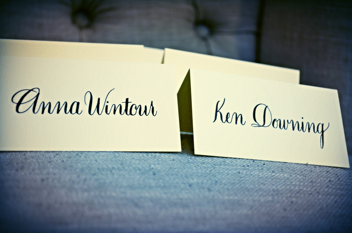
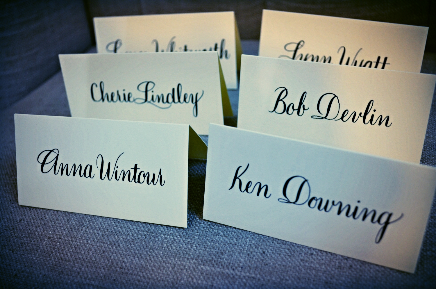
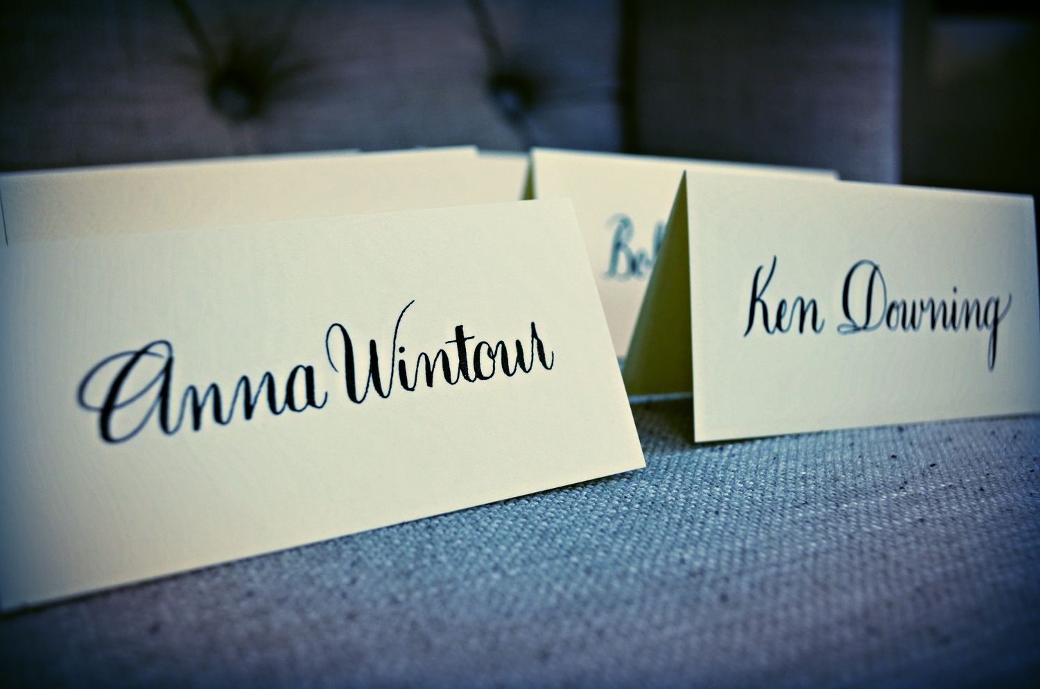
When I am asked by Neiman Marcus to assist them with their events, I am always elated to do so. They are extremely easy to work with and are just a great team all around. However, for this luncheon they had a few very special guests so I was honored even more so to assist. Anna Wintour, Vogue Magazine's Editor-in-Chief, along with Ken Downing, Fashion Director and Sr. VP of Neiman Marcus......Need I say more.
Honestly, I rarely truly read the pieces that I am asked to calligraph until I begin the project. Mostly because I am usually booked 4-6 weeks in advance & life is crazy and chaotic.
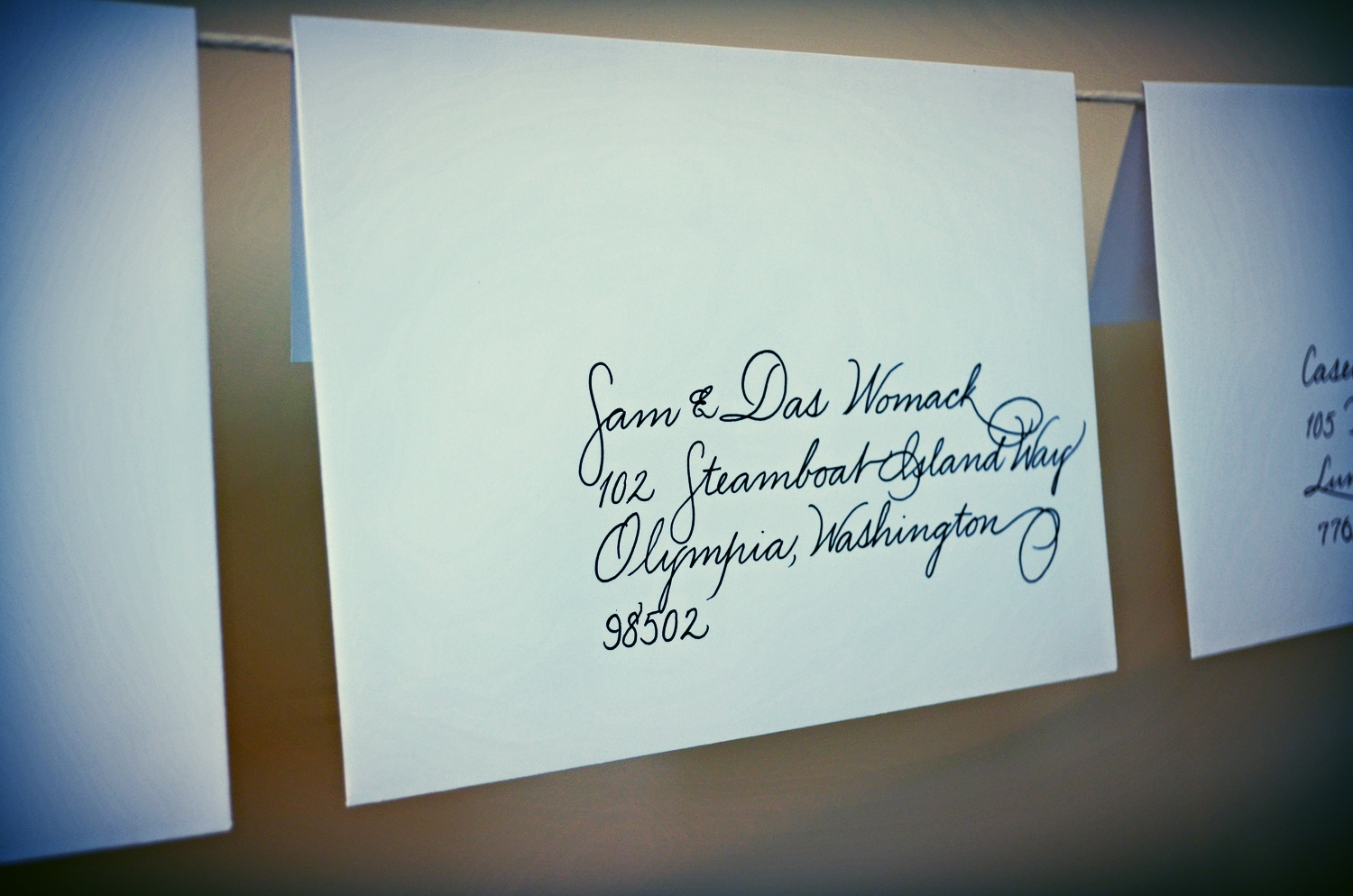
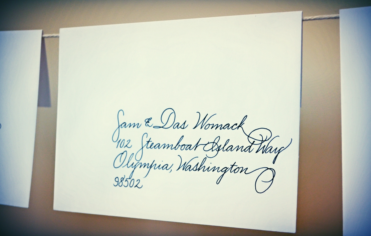
I read this one as I was writing and it is just beautiful. This was requested in copperplate script in black ink on ecru paper. Of course I had to go with the paper with the beautiful deckled edge across the top.
Beautiful quote for a wonderful client out of Tennessee!
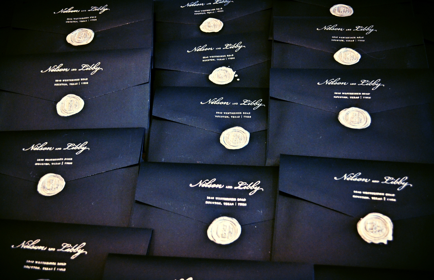
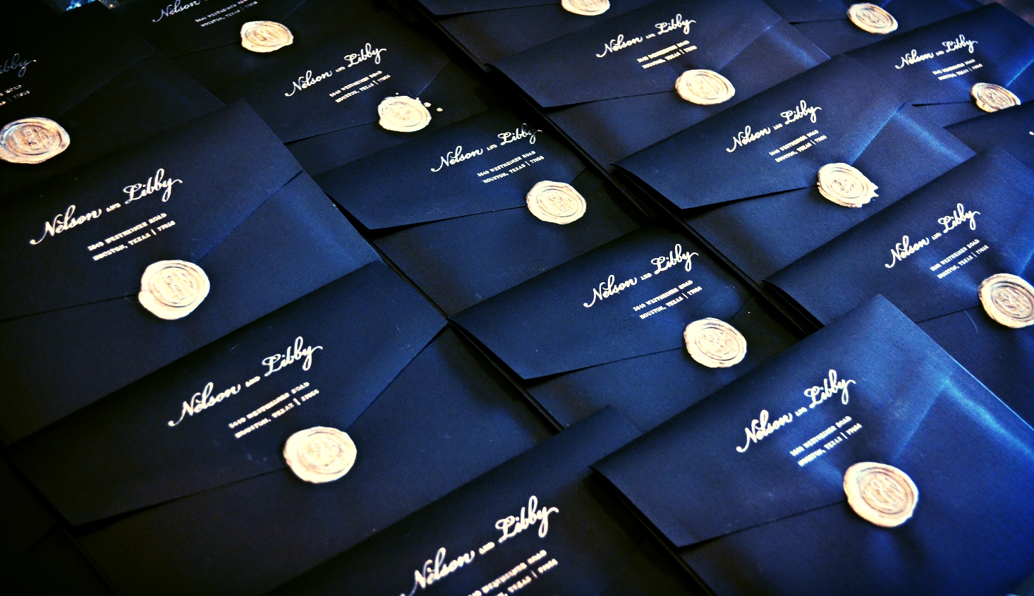
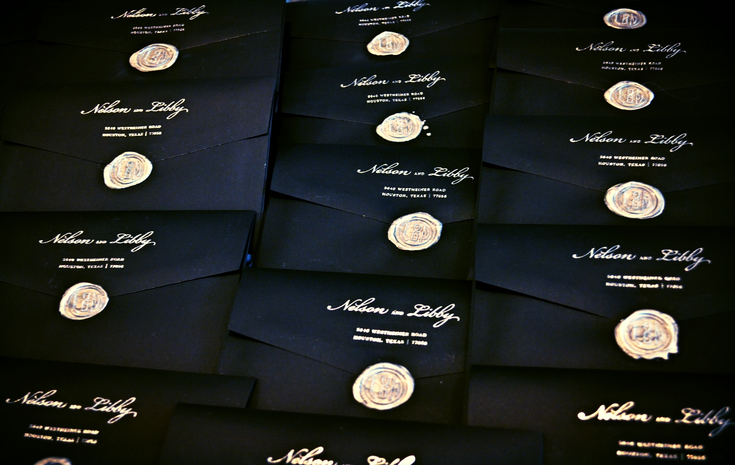
I take my stationery VERY seriously. I guess that's obvious. Well, I have been using wax seals on all of my correspondence for years and always receive compliments and questions. I started offering these to my clients this year and they have become one of the most popular requests...outside of calligraphy of course :)