This Spencerian and casual script style has been requested quite a bit lately. With that, I'm loving it more and more. This is great for either a casual event or a wedding with a relaxed feel.
I had the privilege of working with celebrity event designer Lisa Vorce (www.lisavorce.com) on an absolutely gorgeous wedding. Here, I completed a few last minute calligraphic details hours before guests arrived at the reception. Here, I was literally watching paint (ink) dry before her team would intricately place my work throughout the reception. It was such a privilege and a joy to work with her & her team.
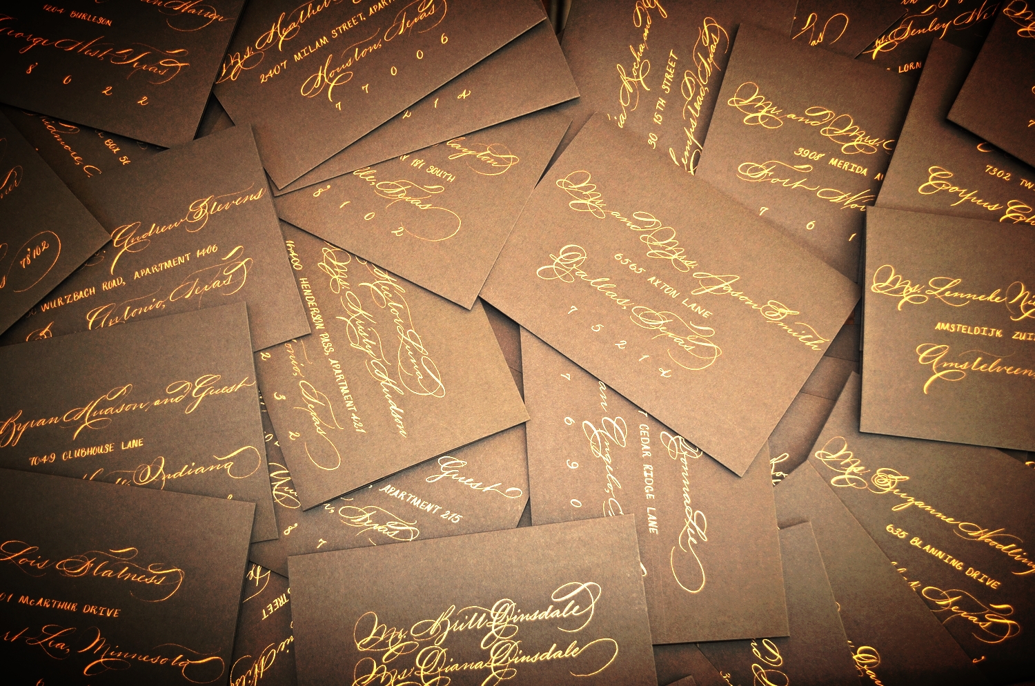
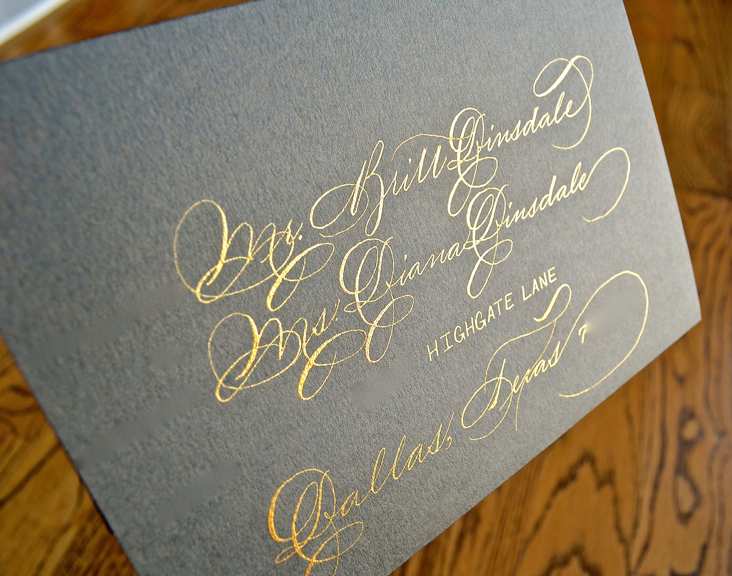
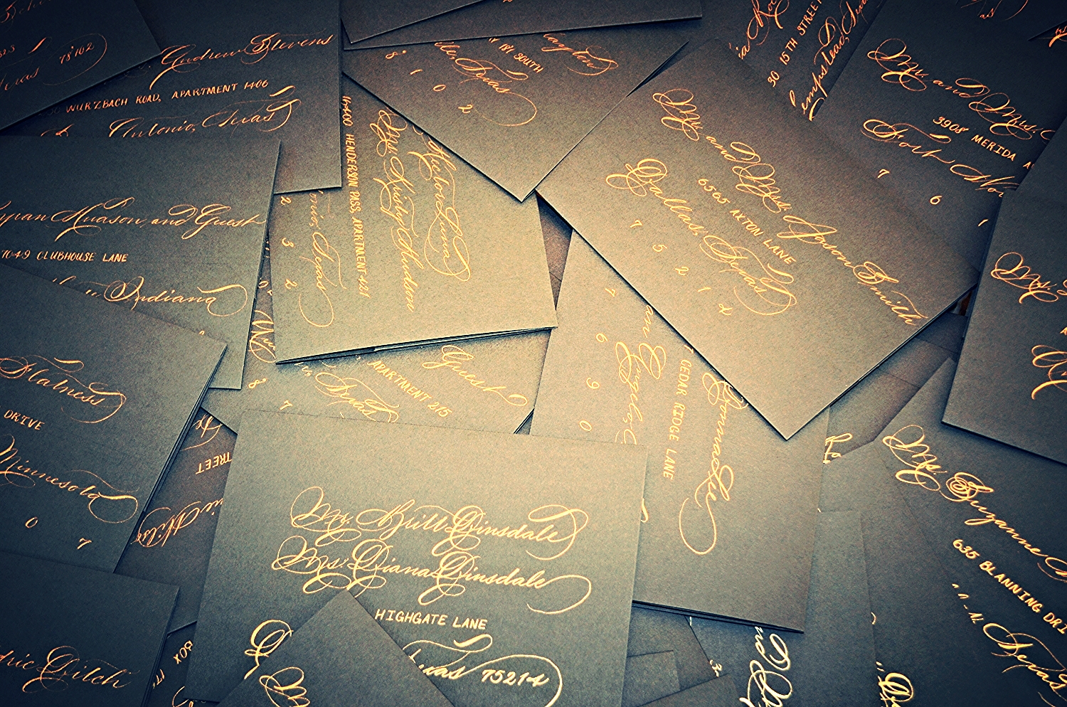
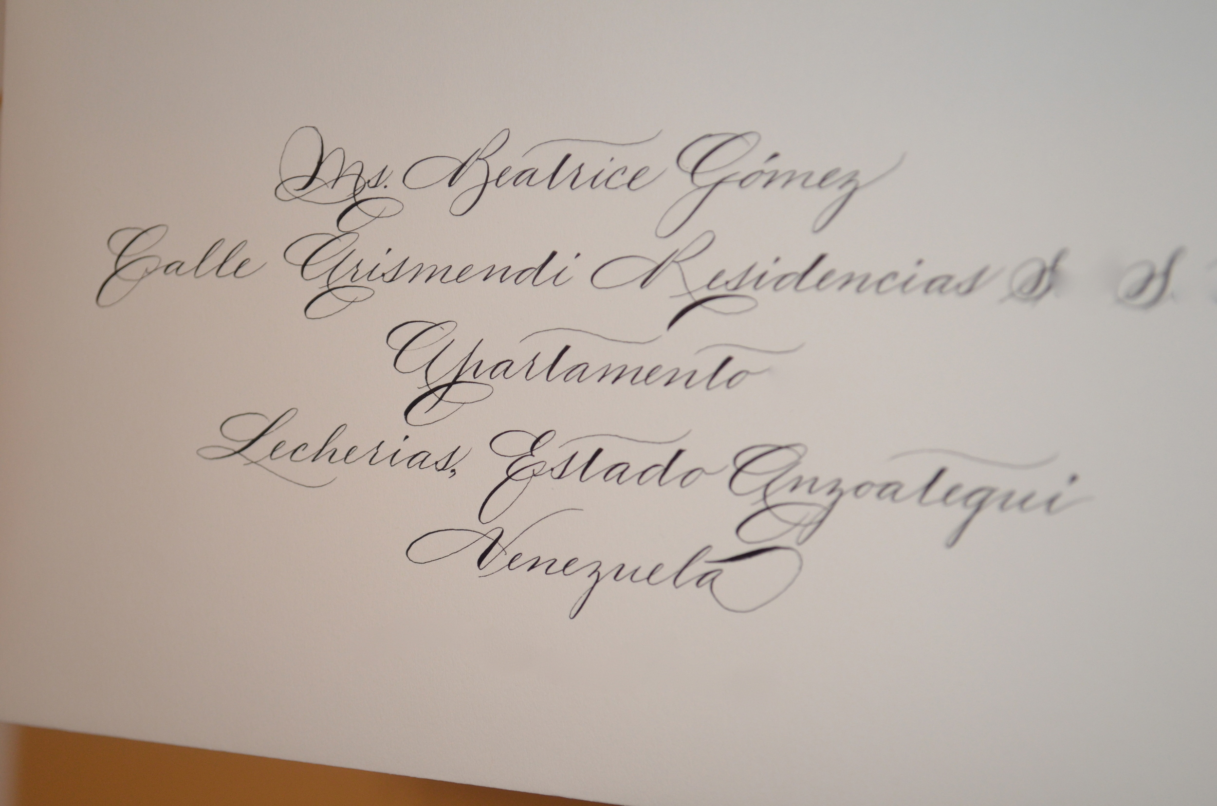
This client opted for Traditional Spencerian calligraphy with casual writing for the address in a metallic bronze. I used acryla gouache to create this custom color. I like this style for casual occasions. Some details were digitally removed for address privacy.
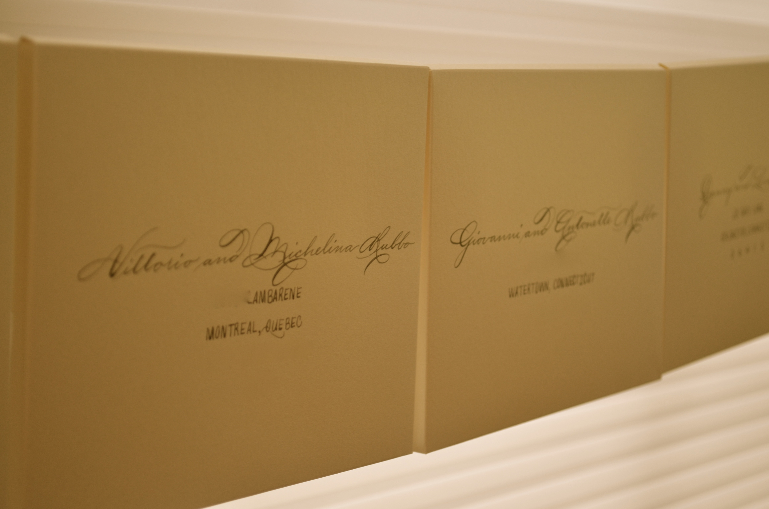
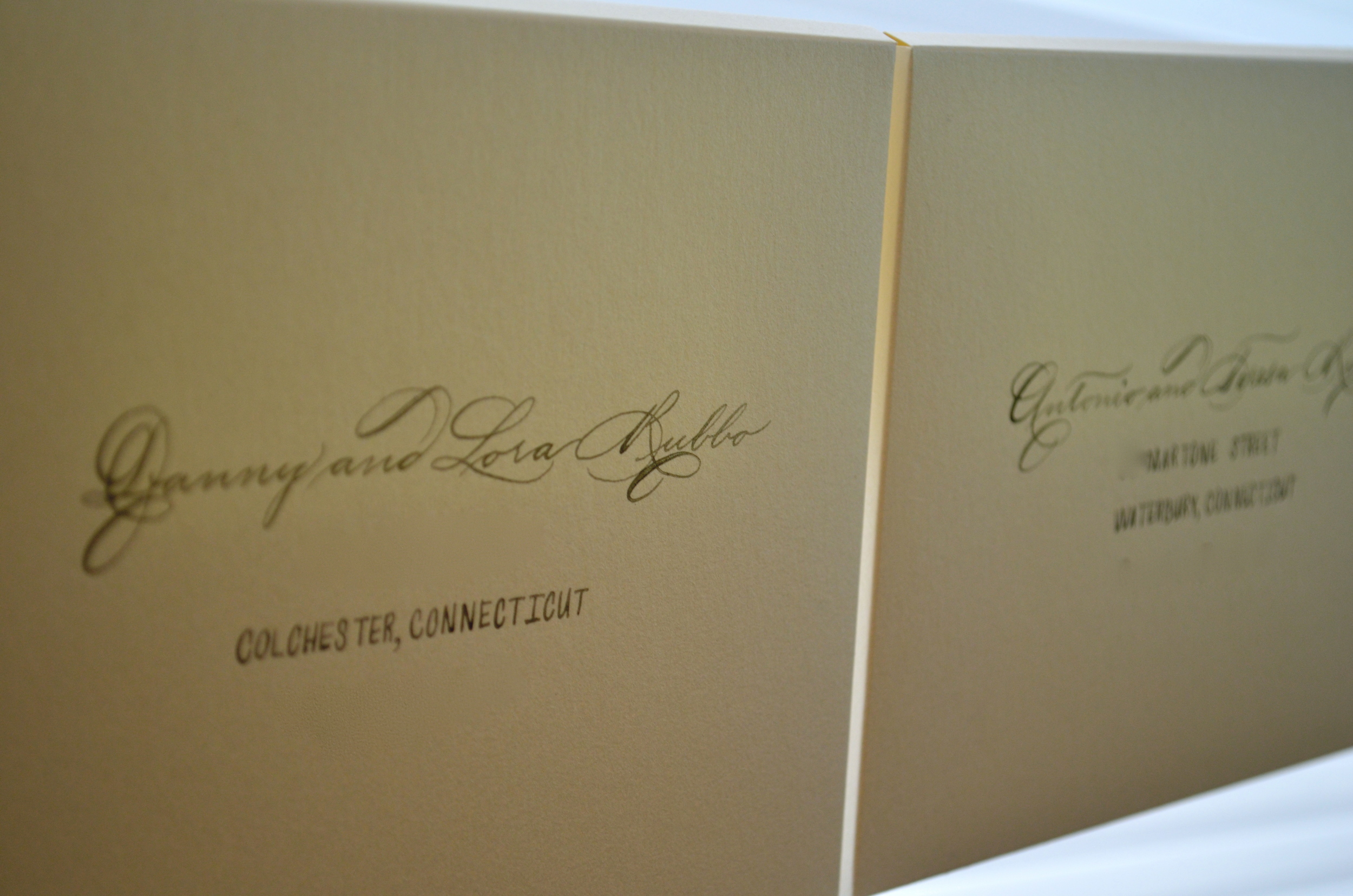
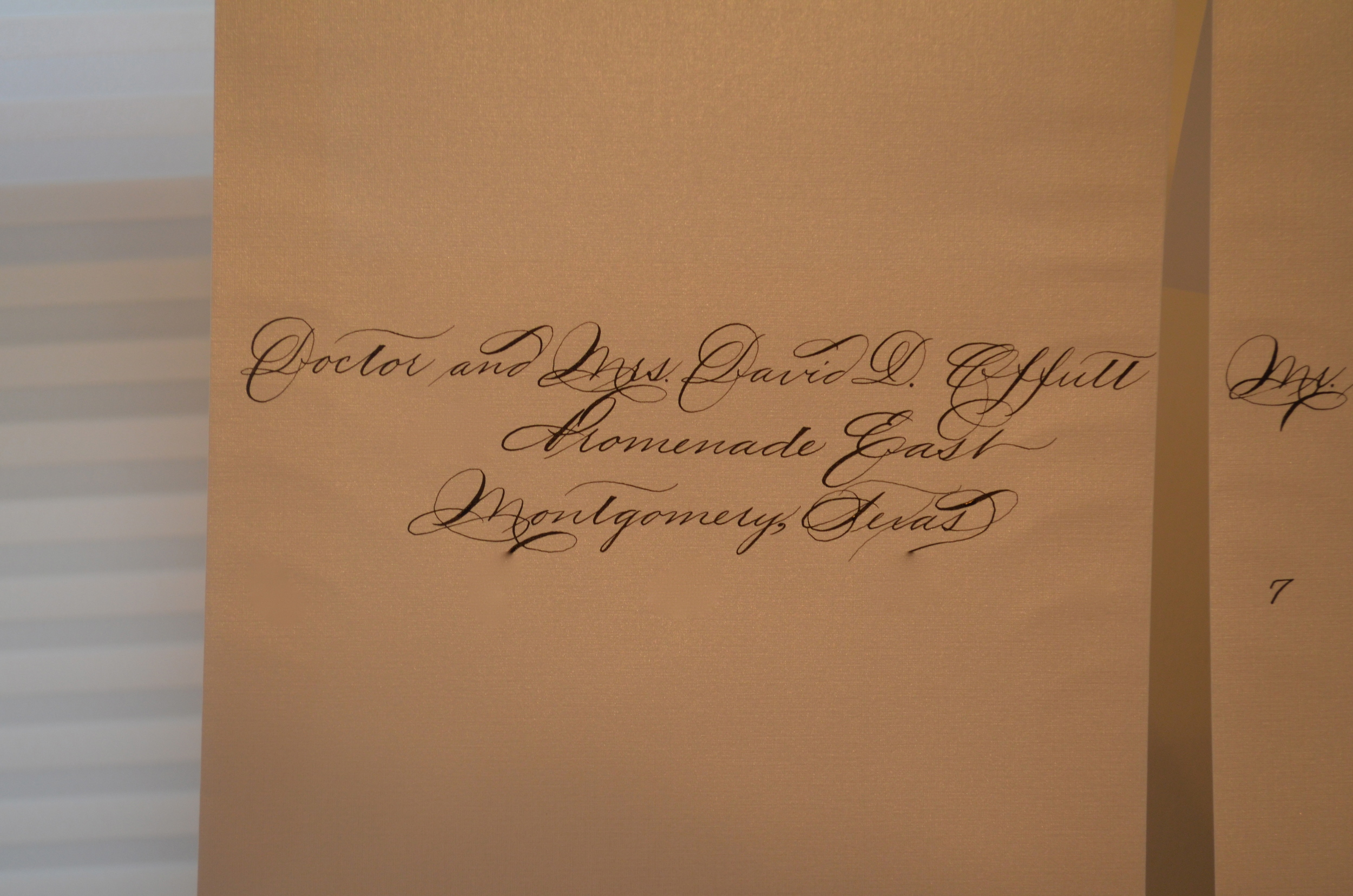
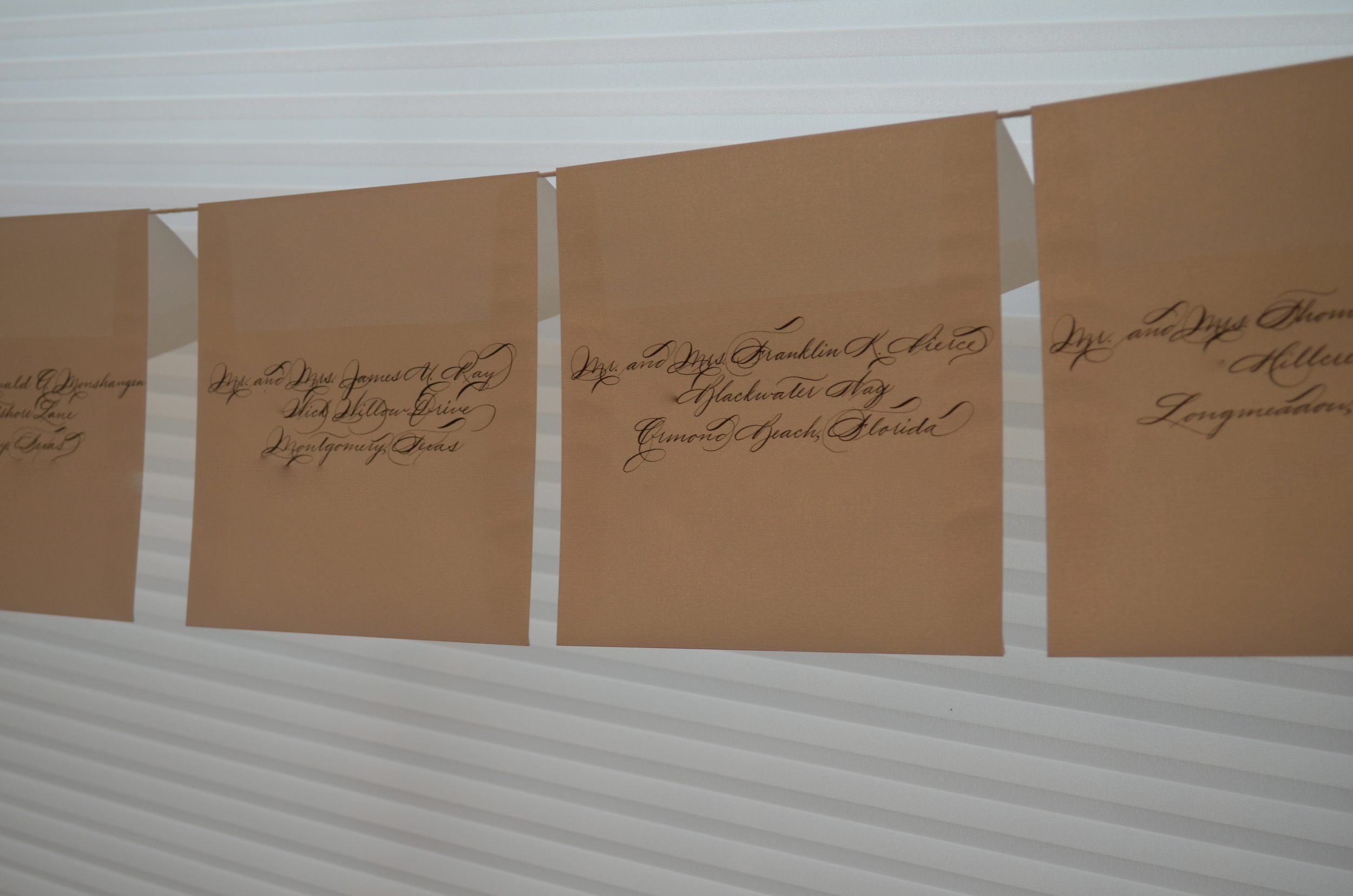
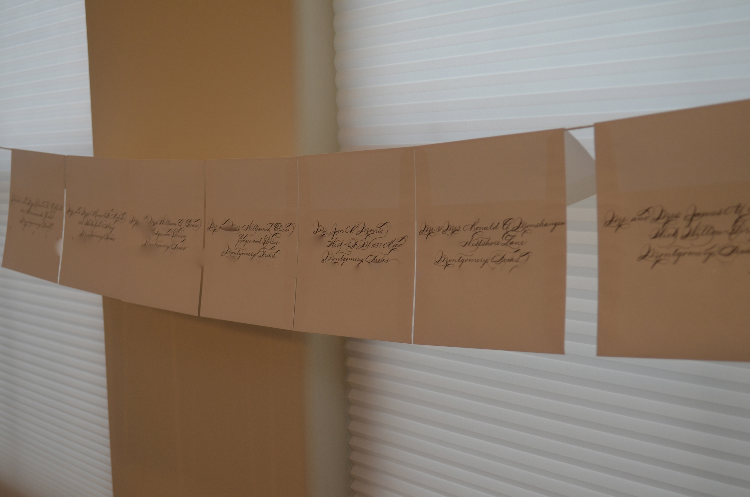
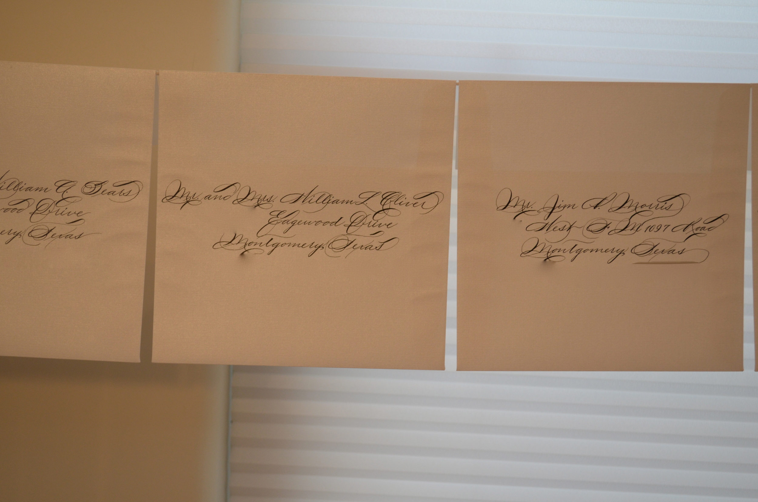
This client was such a pleasure to work with. She chose Traditional Spencerian for her wedding addressing. She and her fiancé wanted something elegant but simple and conservative. Hence, I had to hold back on the flourishes. Only minor flourishes appeared here and there :). Some address details have been digitally removed for privacy.
On my continued quest for the smoothest black paper (as I love inverting colors from the garden variety), I have been introduced to Artagain Series 400 paper. It's the smoothest that I have found thus far. I'll favor this until I find something as smooth as Canson Pro-Marker Layout (white). That will be a challenge, I know…
I have yet to truly indulge in port wines. I've only had a few. However, I do like this bottle. It engraved beautifully and this client came up with a great quote for it. Cheers!
Purple…..If you know me at all, you know that I LOVE color! This gentleman decided to opt for purple ink as the invitation was in a deep purple. SO we did a custom match on the purple and it looked really cool with Traditional Spencerian writing. I LOVE WEDDING SEASON. Don't tell anyone….. Now to go back and remove my graphite lines :) Leave no evidence!
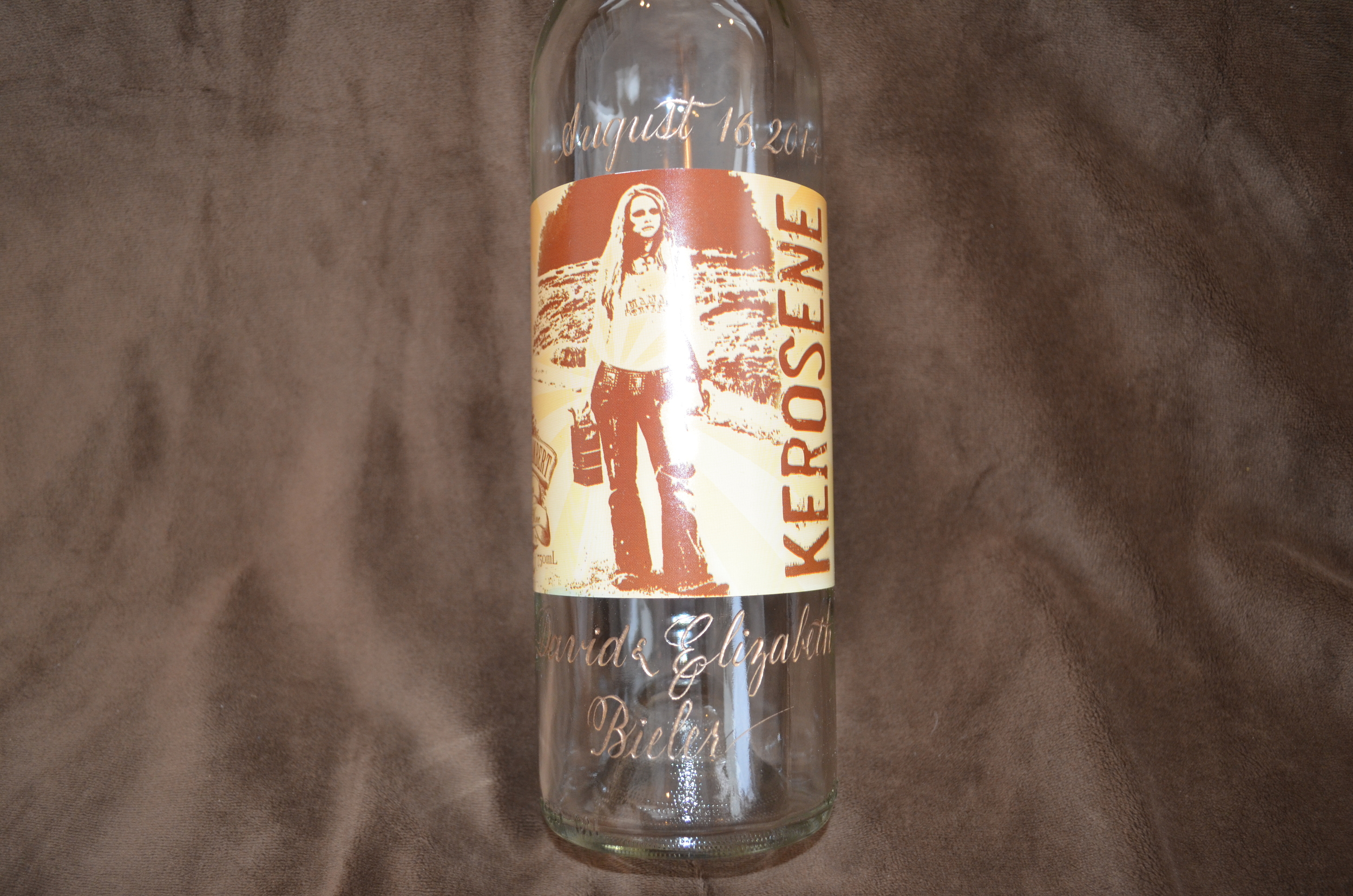
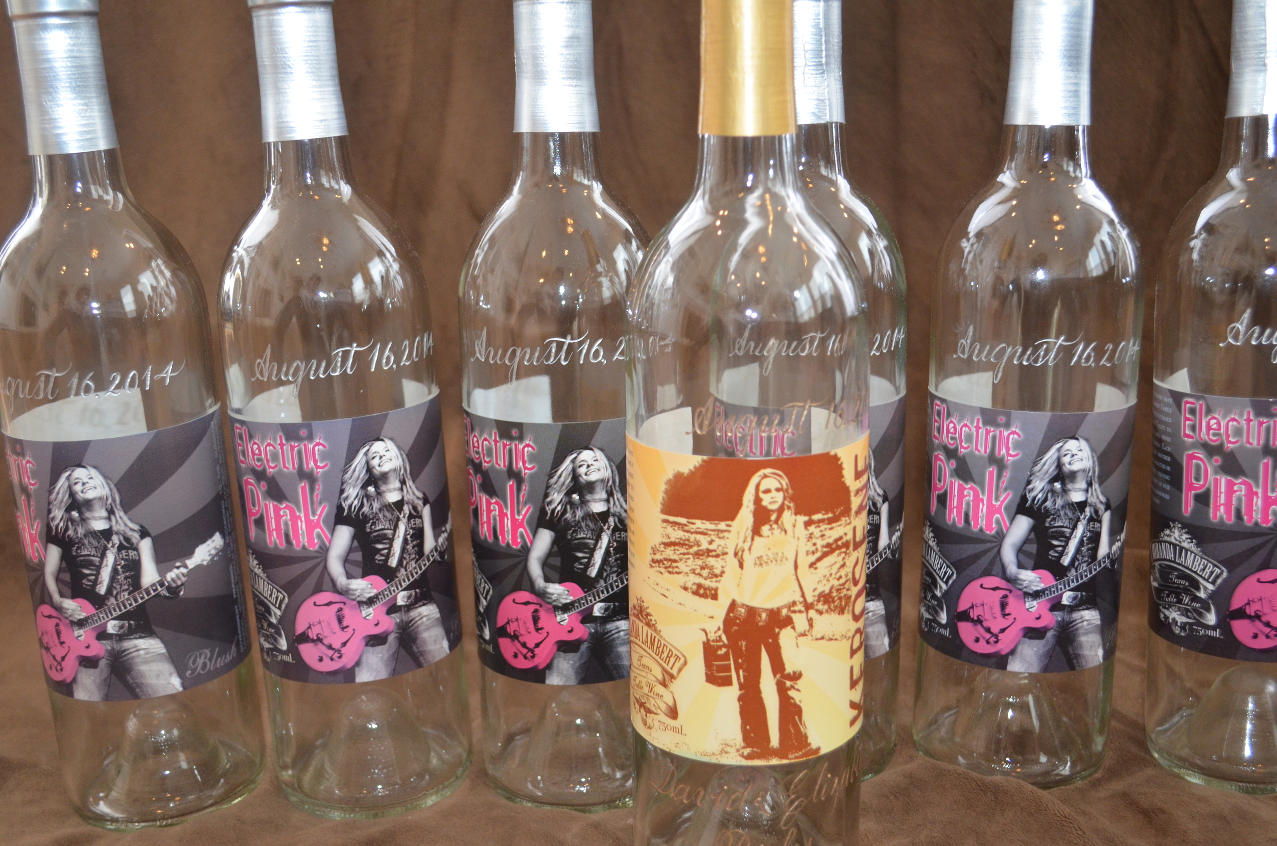
This bride wanted "previously enjoyed" Miranda Lambert wine bottles engraved with her wedding date. I had no idea that Miranda Lambert had a wine label. You learn something new everyday if you are lucky.
This couple opted for a custom "gumdrop green" ink based on a paint swatch that they provided. Of course, we added a cartouche on each envelope to make each recipient 1) know that they are special and 2) know that each envelope was crafted by hand. LOVE IT! Now to go back and remove my graphite lines once they have dried on the "drying line"….leave no evidence! Certain address and name details have been digitally removed for privacy.
Once I saw this cross in person, I thought that it was a beautiful piece. My job was simple. Write a few words around the cross in a circular fashion in a wine/cardinal red ink. I created a custom color with the client's ideas of the specific red in mind, drafted it in pencil and then inked it. I think that it calligraphed nicely.
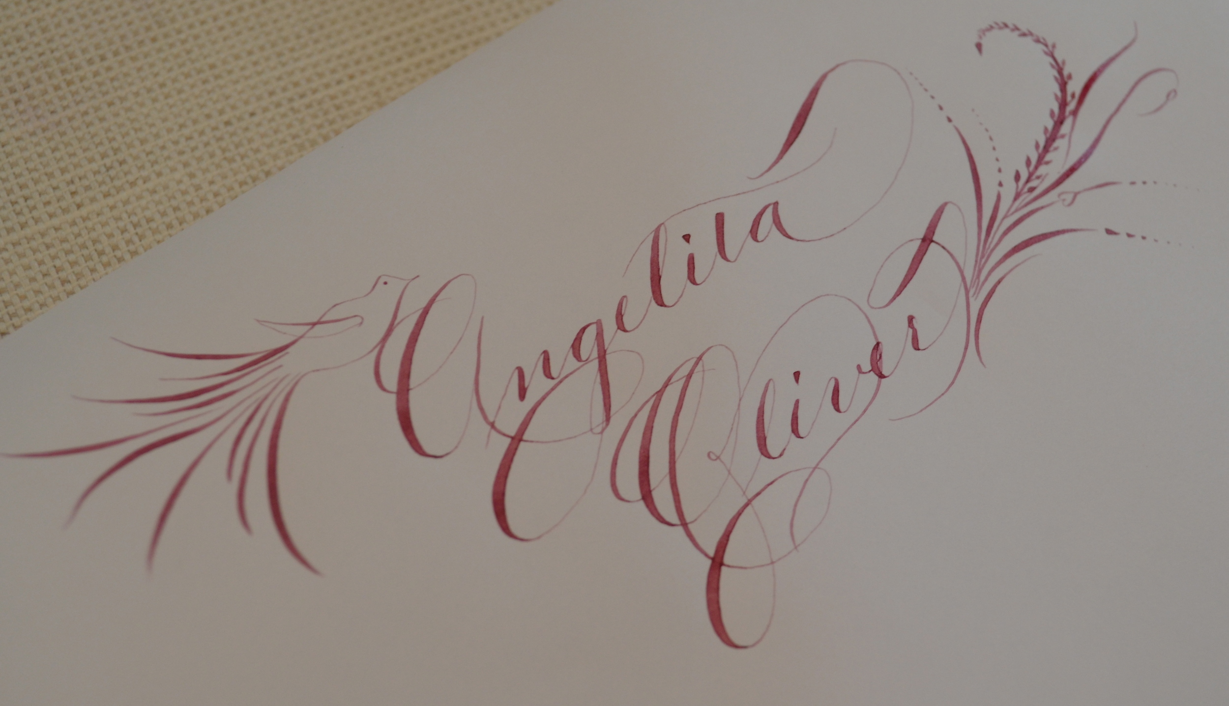
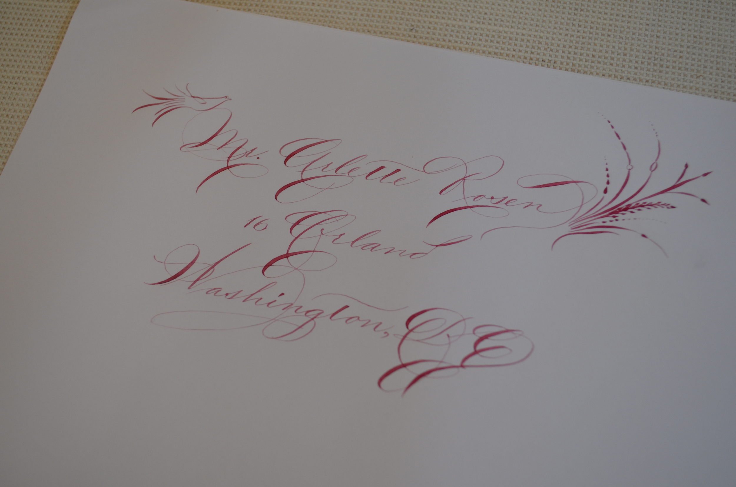
This bride wanted a sample for her wedding invitation envelope addressing that would include illustrations. She wanted "something awe inspiring, but not too much". I figured let's combine a little bird with a cartouche at the back. She approves! Looking forward to starting this project for her. Here are the samples that I provided her.
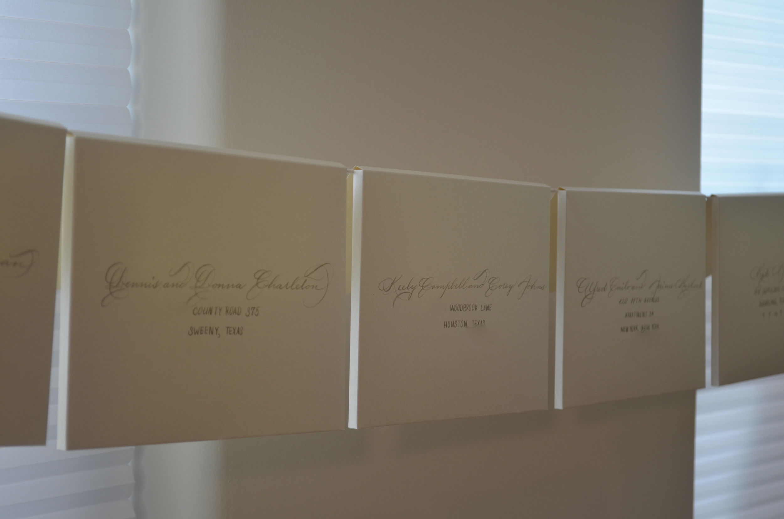
This bride requested Spencerian/Ornamental Penmanship w/o major flourishes. She wanted clean, but slightly fancy. I love this. In my opinion, Spencerian writing is the epitome of clean, gorgeous calligraphy. (The numerals have been digitally removed from these photos to protect the addresses.)
I always love to see ladies participating in a traditionally male sport. With that said, imagine my elation when a female golfer requested to have a club engraved. Thanks, Gabrielle!
This client wanted something dramatic to set the tone for her plans with the wedding. I can do dramatic on paper :).
Just received a new custom designed straight penholder from my pensmith, Brian Smith. I told him that I wanted a burgundy flame foot with a beige grip surrounded by mother of pearl accents and a burgundy flame tail. Mission accomplished! She's a thing of beauty!
I love writing in white ink on dark paper so I'm testing out German Ingres Black paper with a thank you letter to a friend. Not my preference for pointed pen so far. Still on the hunt for the smoothest colored paper....
Quite often, I am asked exactly how I hand engrave wine bottles. I made a video about it. If you'd like to see it, here it goes!
It's so nice having penpals. This is what calligraphers do when they have a free moment. I'm in love with white ink on either black or dark gray paper. It creates a striking, but classic look.
If you know anything about me, you know that Bordeaux wine is dear to my heart. Bordeaux was my introduction to French wine and it swept me off my feet. Of course later came Burgundy wine, which is where my heart lies, but my first French love was Bordeaux. It's like that boy that you kissed and thought "so this is what I've been missing". Between the earthy nose of barnyard funk and the taste of dark berries on the palette, it's just beautiful especially with age. AND especially a first or second growth Bordeaux…..
So imagine my elation when a client contacted me for wine bottle engraving and walks in with a 1966 Chateau Ducru-Beaucaillou. I was as giddy as a schoolgirl when I saw this bottle. As soon as we parted ways, I couldn't wait to get it back to the studio to engrave it! Now if only I could be around when it's opened. Cheers!
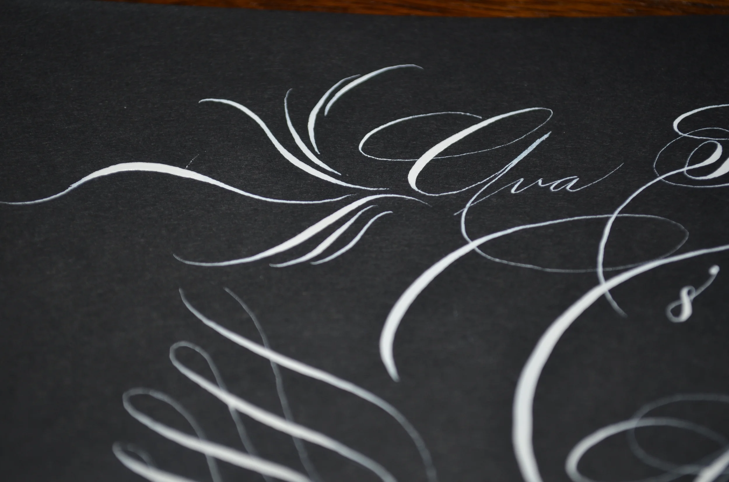
Ornamental penmanship is the art form that sprang from Spencerian writing in the late 1800s to early 1900s. This was where we began to see phenomenal penmanship trumping each other in their correspondence with seeing who could be the most extravagant in their writing.
You can take lessons in ornamental penmanship and learn the art of how to script these letters in different fonts. You can even make a business out of it. It's my favorite writing form. Here's a quick example by yours truly and a practice sheet. The "O" was my favorite part.