A Penman's Hand Lettering for Gold Foil - Houston Calligrapher
If you have ever created lettering that will later be used for gold foil, you know all about the giddiness that can ensue. Gold foil is just GORGEOUS!!! The lettering honestly doesn’t even have to be exquisite to illicit excitement with gold foil juxtaposed with the right contrast color. It’s just fun and gorgeous upon completion….
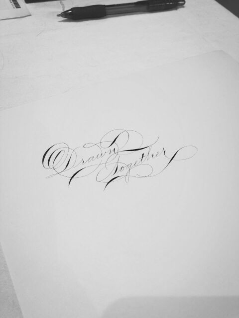
I was working for a Houston client in their office on a project for an upcoming event. While I was there, she asked if I could write something in calligraphy that would be used for a gold foil piece. It was a groovy day and I thought “sure, I’d be delighted to”. Right before I put nib and ink to paper she says, “can you use the D that has the 3 internal loops”. That specific D is relatively new to me. I LOVE that D, but it is one that if I don’t calligraph it for a while, I may desire 1-2 attempts before I calligraph it in a way that pleases me. This day was no exemption.
I calligraphed the desired words “drawn together”. On the first attempt, I thought…”it’s not too bad, but that isn’t it….but not bad for no warm-up”. Well, she saw it and decided to run with it. She gave me the impression that she would prefer to have it more “natural” vs worked or re-worked to something close to perfection. Granted, I am the first person to say that I have never presented anything that is absolutely perfect. I’m a human and a human that is still honing my craft at that. However, I can absolutely relate to embracing flaws and loving the work that is created with them.
I am looking forward to seeing the final result in a few weeks….
Peace & Love while Slinging Ink®
PS I used a Tachikawa G (my modern nib of choice) with flannel grey ink

